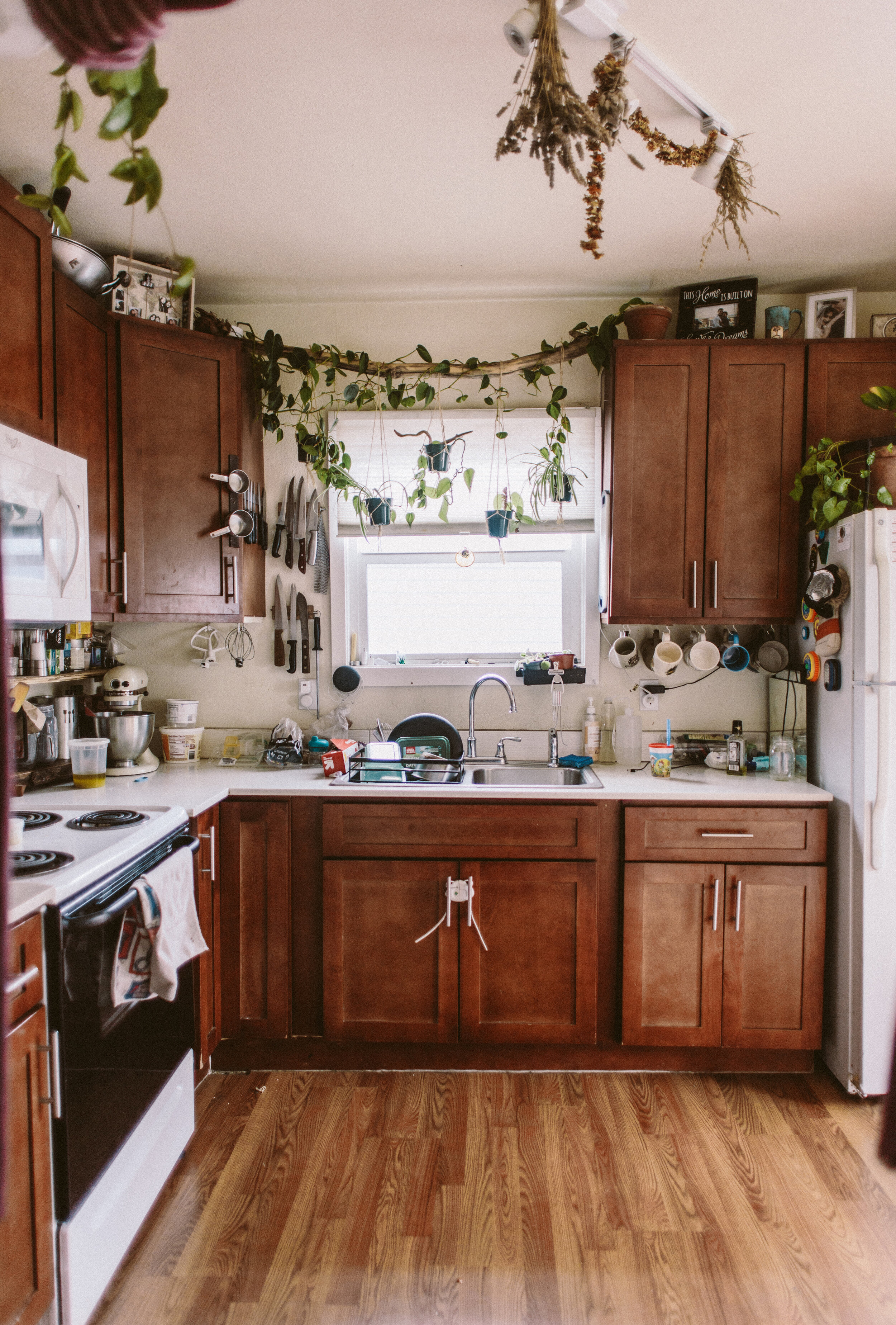
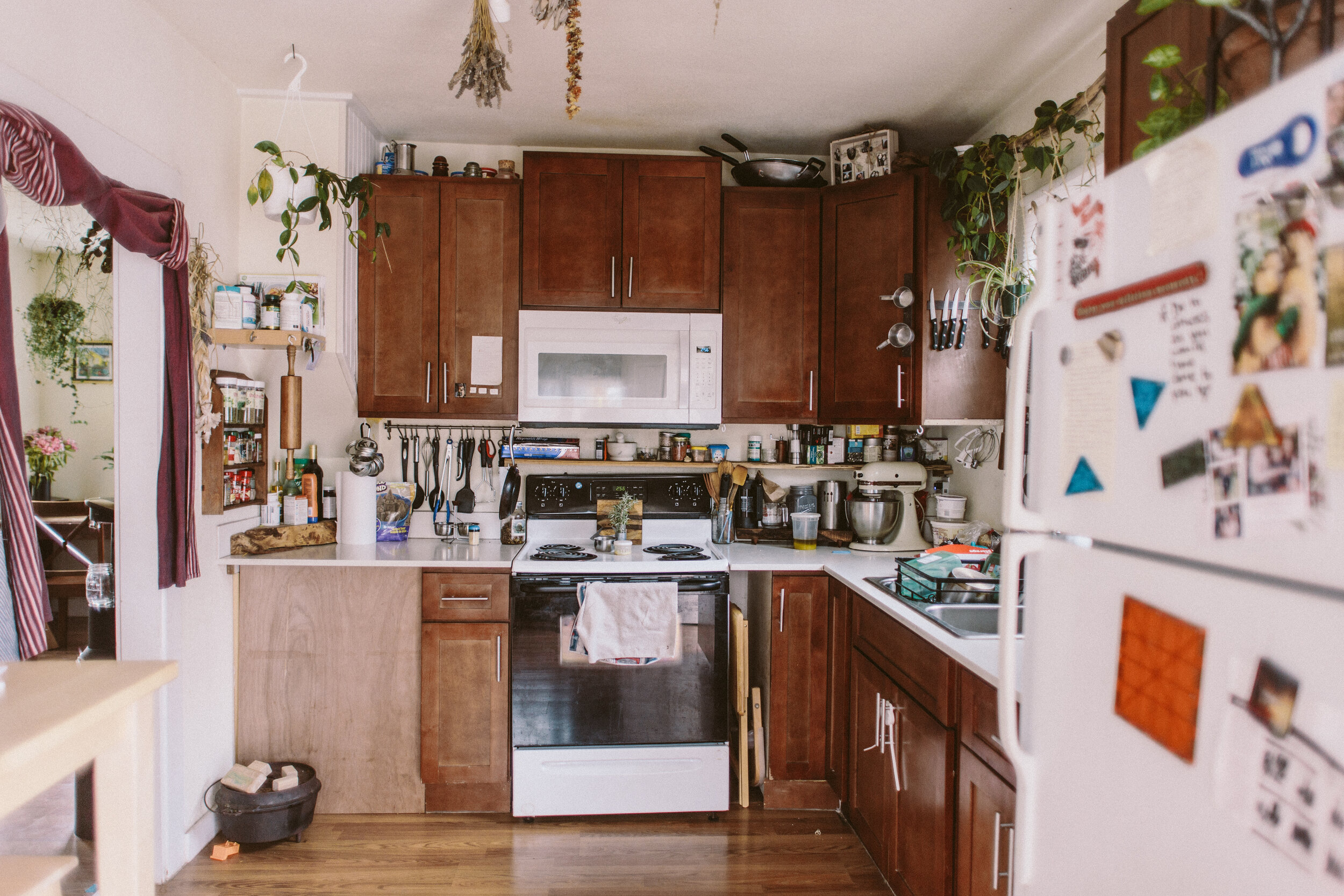
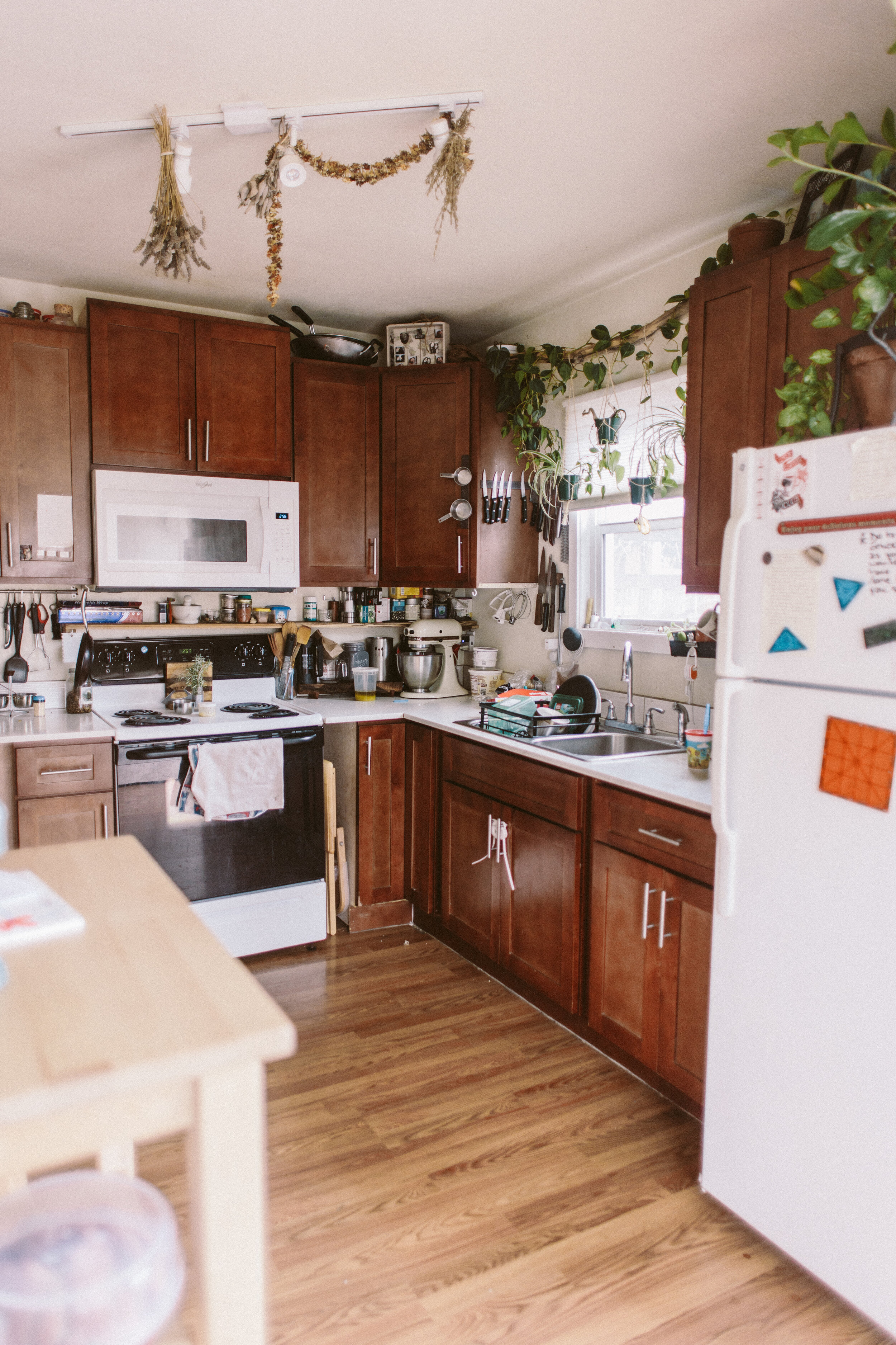
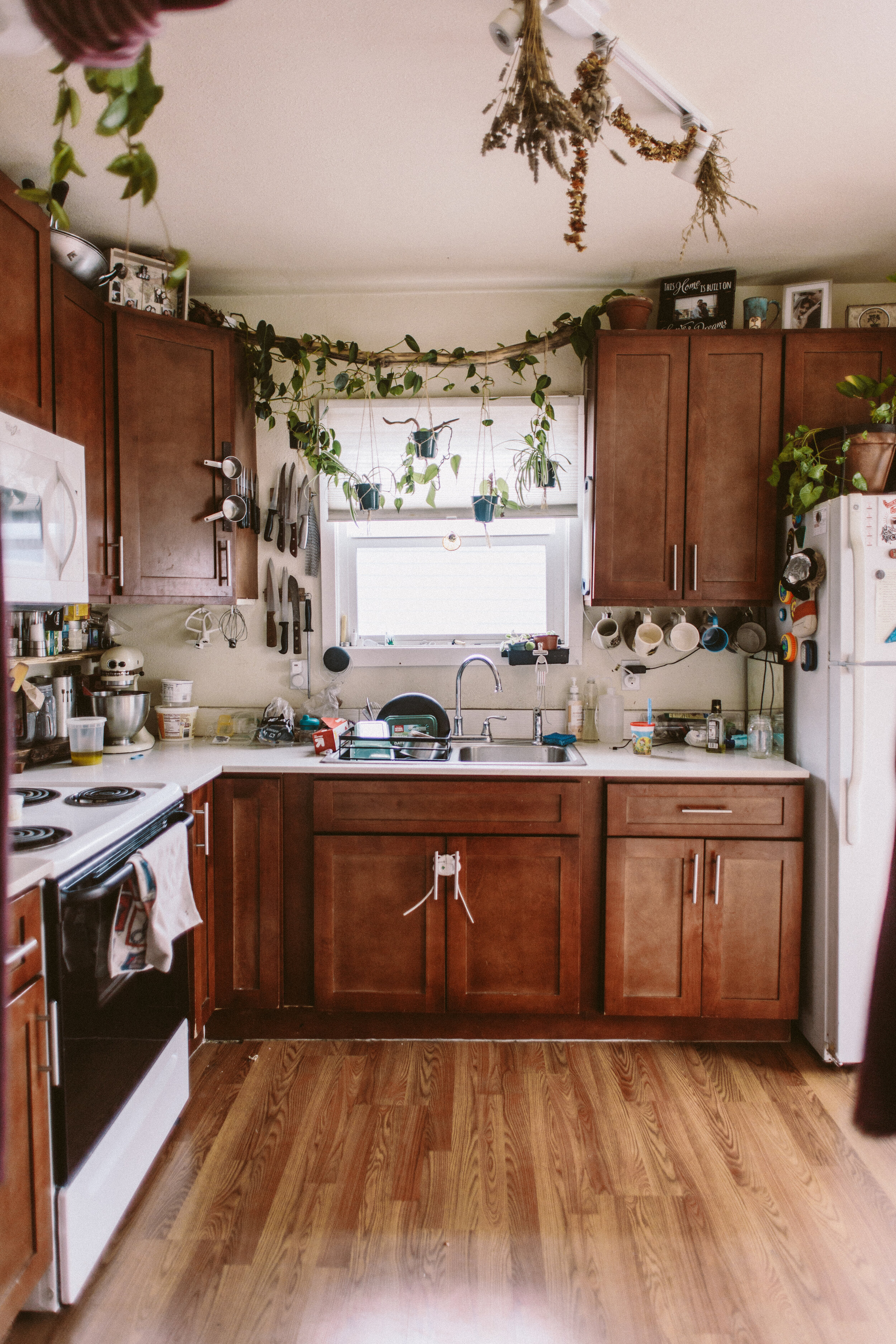
kitchen

DIY Easy click-connect laminate flooring install

Spring 2022 One Room Challenge | Week 2

There are a lot of nailed-down details on this One Room Challenge remodel, but one thing that was up in the air when I started- the flooring. The original flooring was, well, it was okay. The kitchen/dining/entry area had vinyl plank and the living room was carpeted. It all looked very worn down, and there was a noticeable hump in the floor right as you entered the kitchen.

We needed to decide on the flooring situation ASAP because I didn’t want to paint the cabinets and get those finished nicely and THEN go in and do flooring demo and potentially bang up the new cabinet paint. Since this decision was being made last minute, we also needed flooring that was in stock and available in the quantity we needed to do the entire space— kitchen/dining and the entry/living room.

Well, my parents found some beautiful waterproof laminate flooring at Costco and bought out the whole store (and had to hit up another Costco to get the remaining boxes needed), and we quickly decided to tackle the floors first thing.

Demo was pretty easy, the old vinyl planks came out super easily, and the carpet did as well. Once the flooring was out we were able to figure out what what going on with the lump in the subfloors by the kitchen. The carpeted living room also needed a 1/4in underlayment plywood added to bring that area’s subfloor up to the same level as the floor that had the vinyl planks, which was much easier than fixing the hump.

We ended up pulling out the 1/4in underlayment on either side of the lump, which brought the peak of the hump down lower and we were able to fill in that area with self leveler so the new floors are nice and level with no awkward hump. We ended up needing a couple coats of the self leveler (we didn’t buy enough the first time), so that took a couple days of prep work, which we folded in with prepping the cabinets to prime and paint so there wasn’t any lost time on the cabinet painting front.

I’ve done floating click-connect laminate flooring before in our house, so I had a pretty good idea of what to expect. These kinds of floors are very DIYer friendly. It’s hard to mess up the install, and it’s super straightforward, these were no different. We ended up with Mohawk Waterproof Laminate floors in Millport Hickory. They have the foam under pad attached to the bottom of the plank so you don’t even need to install a pad before going in with the flooring install!

I picked up a laminate flooring install kit from Home Depot, which was exactly what we needed to do the install, and Ryobi had sent over their flooring saw, which came in clutch. I was on cutting duty outside and my brother and Dad were on install inside and we made pretty quick work of the floor!

One thing manufacturers recommend, and I’ll second, is to use planks from different boxes as you work, and to inspect the planks as you install because there are only so many plank designs and you don’t want to end up with identical planks super close to one another. The other thing you’ll want to make sure of is that the gap you leave around the edges of the room (there should be a slight gap to allow for expasion) isn’t too big so that your baseboard trim is able to cover that. We weren’t super careful in a couple spots and had to to some tweaking to make it work.

Ultimately, click-connect laminate flooring is a perfect DIY project. It’s straightforward, relatively easy, and there are so many options out there now for different looks, as well as water-resistant or waterproof planks as well!

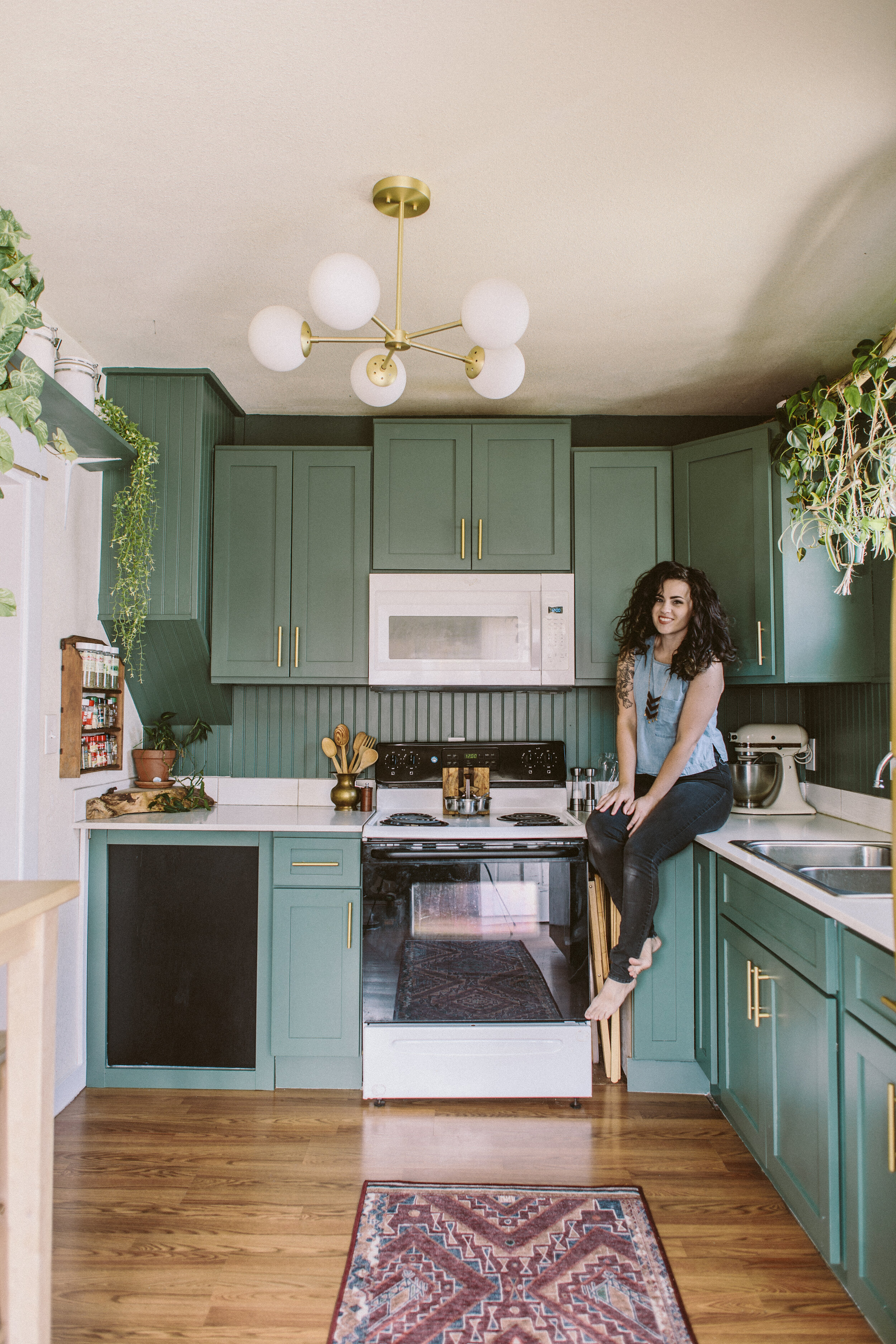
Botanical Kitchen Revival: A Rental Kitchen Makeover on a Budget

IMG_0133.jpg

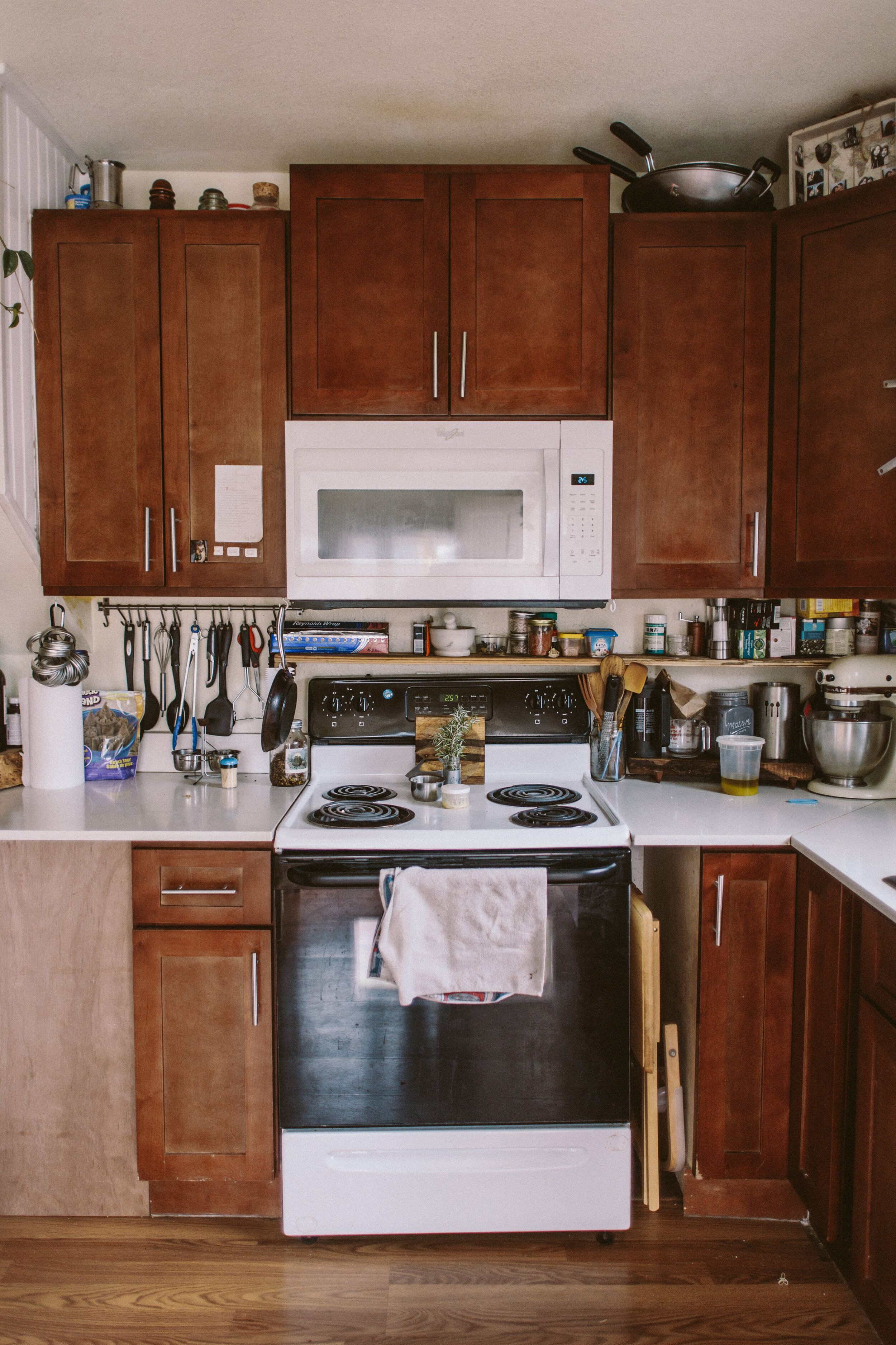
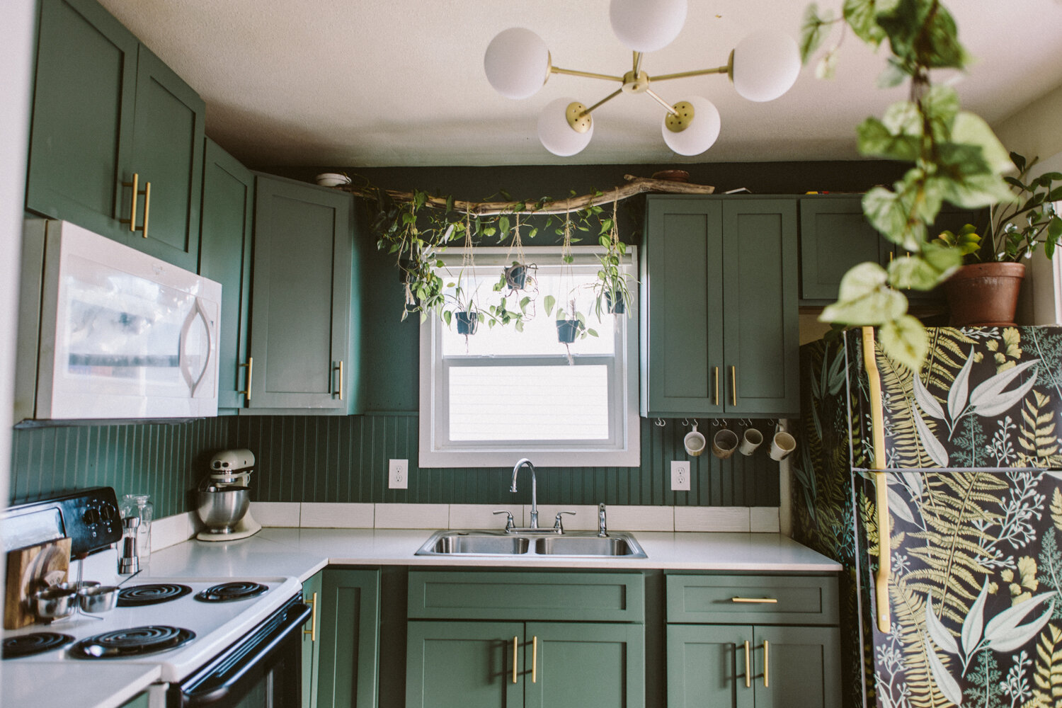
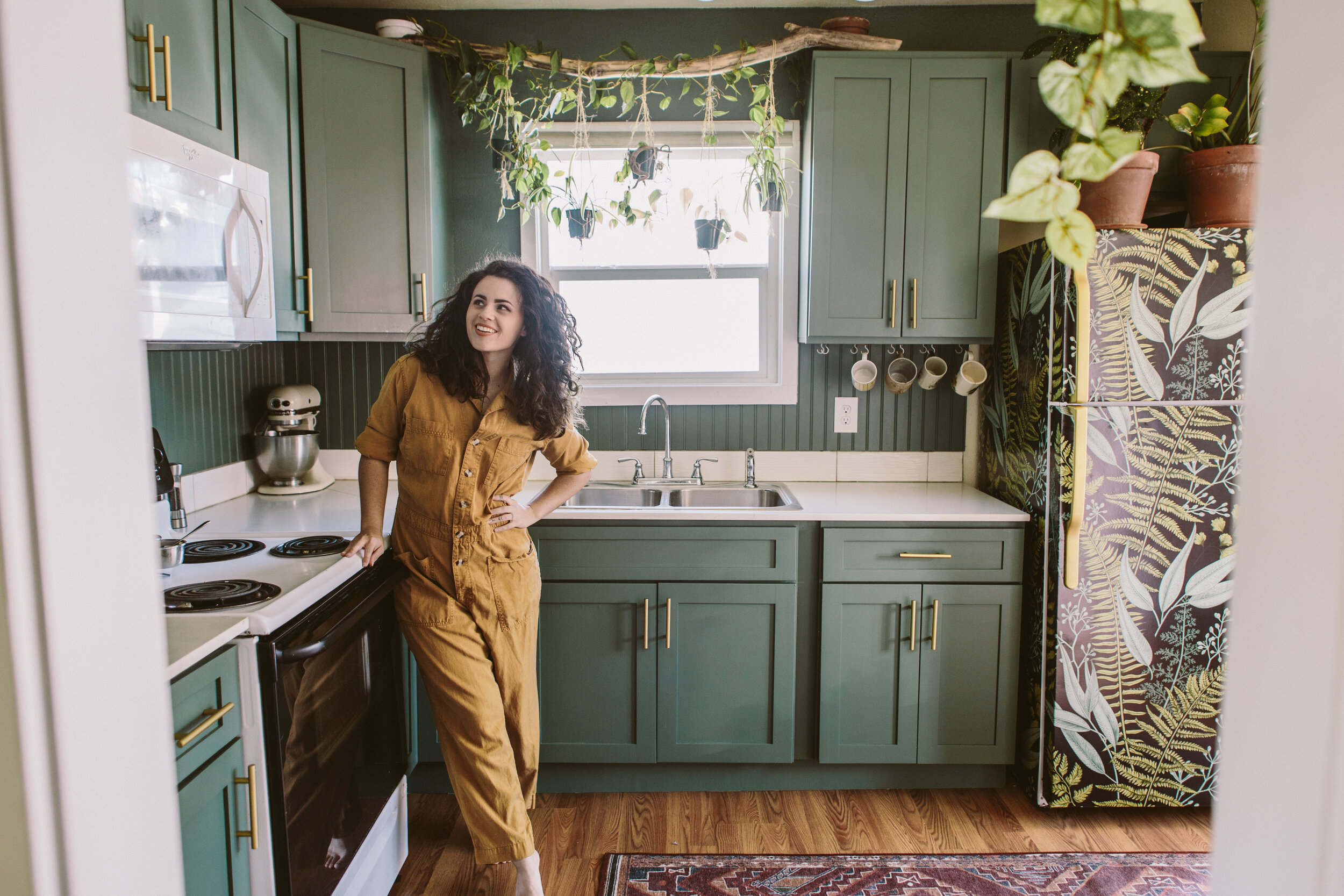
Transforming any space is fun, but transforming your lifelong BFF’s space is a special kind of fun. When Frogtape reached out to me to see if I’d be interested in being a designer for their annual Paintover Challenge, it came at the perfect time. My friend, Kristina, had been talking about wanting to update her kitchen in the rental home where she lives with her husband and son, and I instantly pitched her the idea of doing the paintover challenge in HER kitchen. We talked to her landlord, who gave us the greenlight for the proposed changes and we got to work!
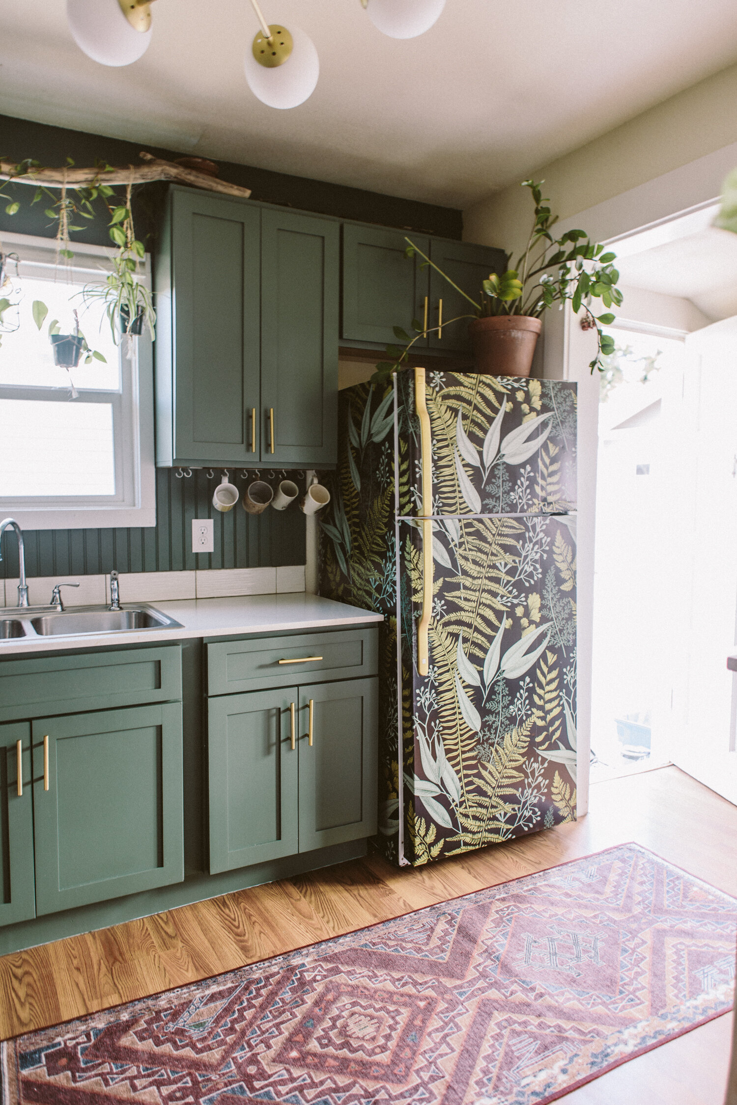
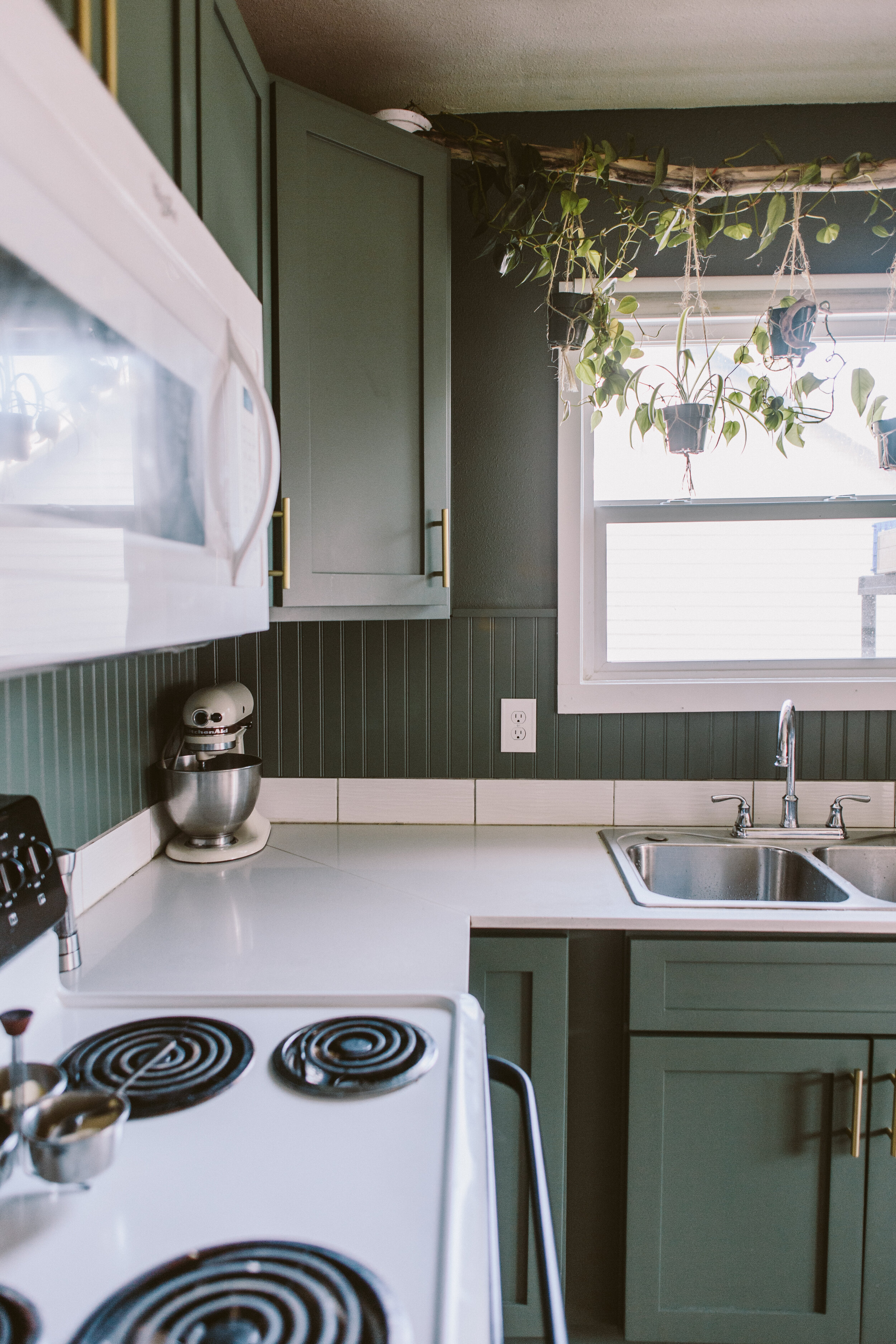
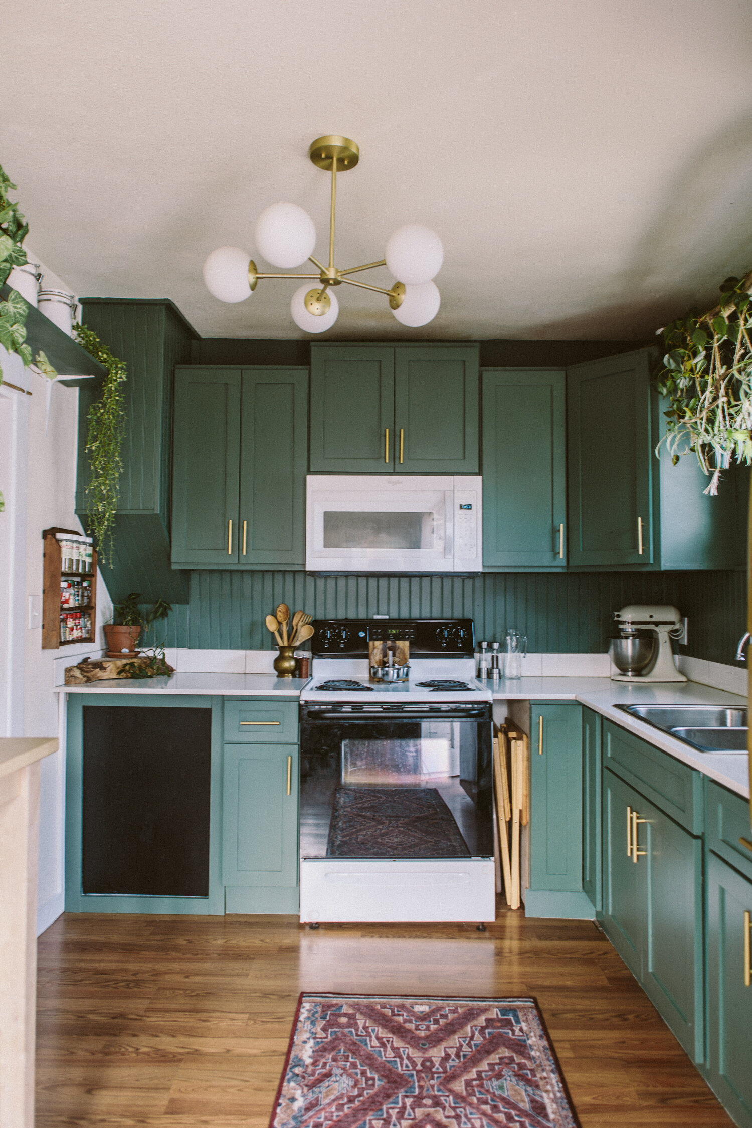
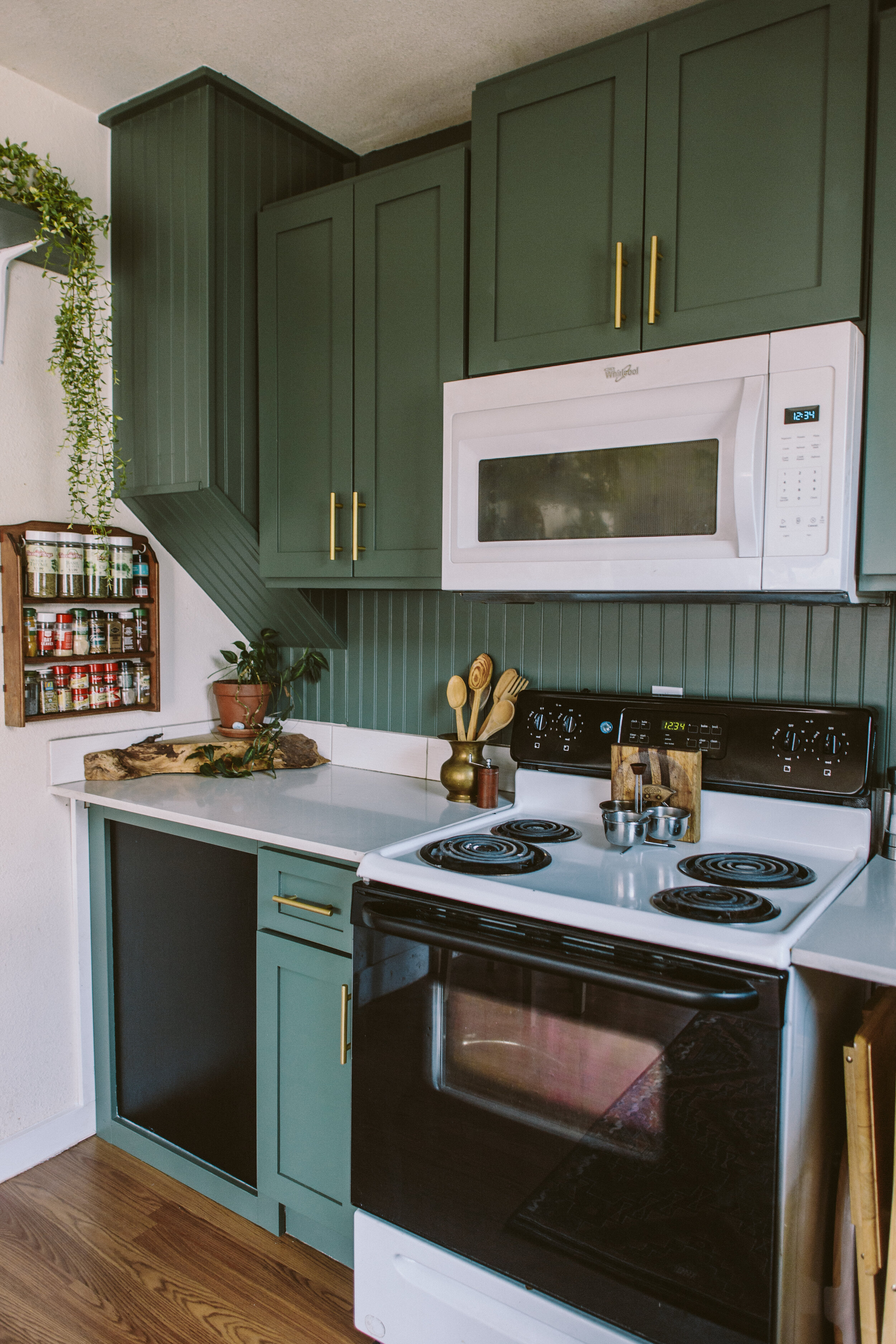
This makeover was primarily achieved with paint, with some honorable mentions from a few other design elements. I traded out the old overhead track lighting for a pretty new light that not only looked gorgeous, but offered way more illumination (which is a godsend come those dim PNW winter months). In lieu of taking out the meager tile backsplash and doing new tile (which probably would’ve required some drywall repairs, and a significant budget bump) I opted to keep the existing strip of tile, and add beadboard on top to fill the blank space between there and the bottom of the wall cabinets. Then, we painted it the same color as the cabinets and the walls, for a delicious tone-on-tone vibe. This basil color is super pretty, it feels lush and sophisticated.

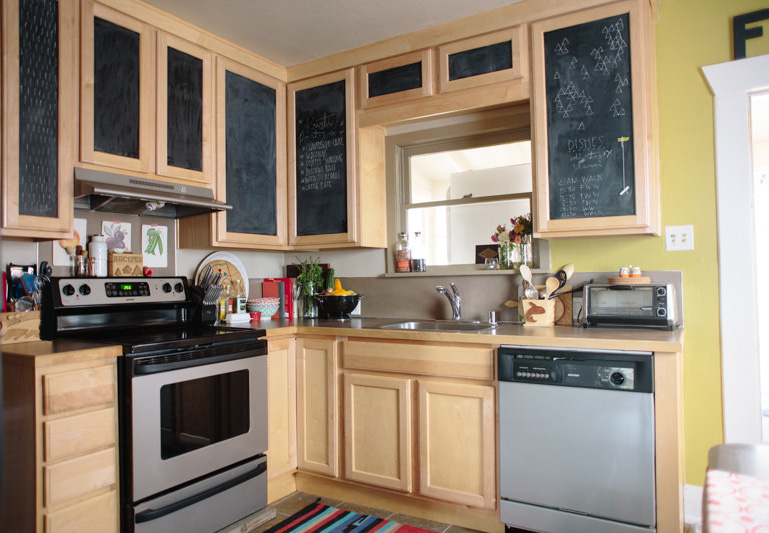
2before.jpg
2after.jpg

The big, unexpected showstopper ended up being her basic old fridge, transformed with a bit of removable stick-on wallpaper! Since we kept the existing cabinet hardware and painted it brass to match the light fixture, we did the same with the fridge handle to tie everything together. I used Rustoleum Vintage Gold spraypaint to paint both the cabinet door pulls and the fridge handle.

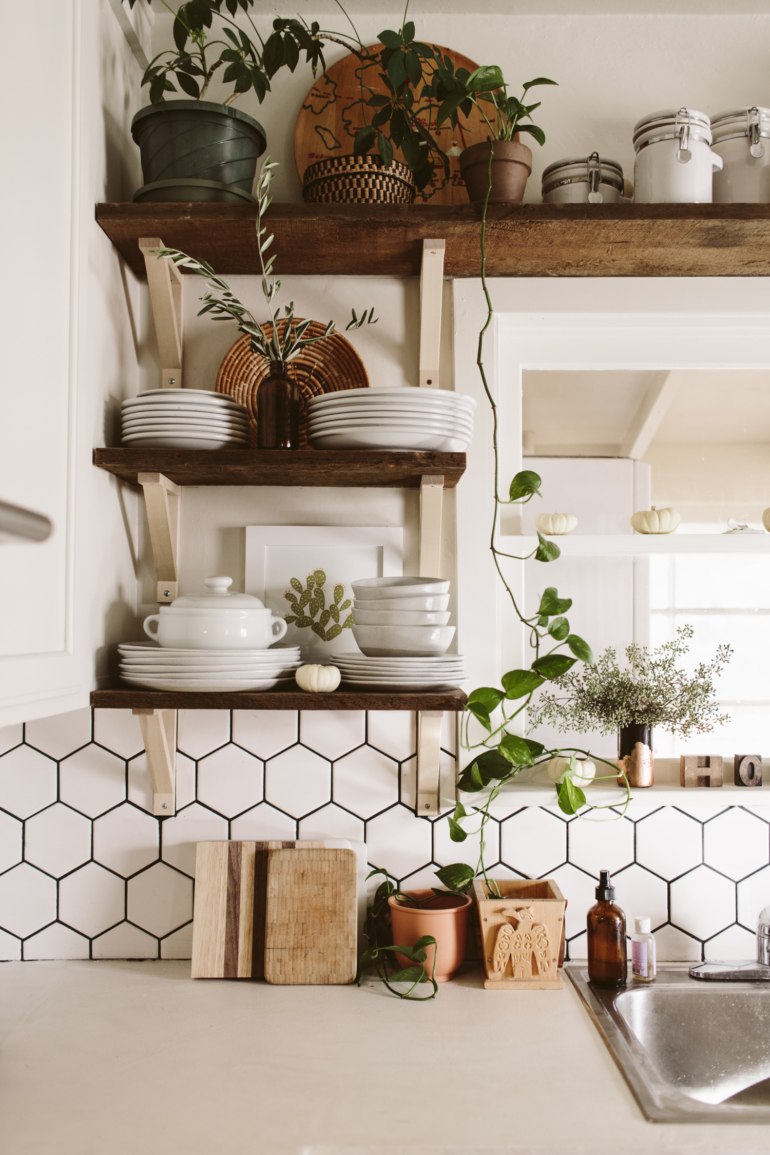
Another thing we did was add a whole wall of open shelving to give her a ton more storage. We painted those shelves the same green as the rest of the kitchen, but kept that wall white to give some contrast. Now she has a bunch of space to store all her pretty jars of dry goods, cute mugs and, of course, more plants.

And one more fun little detail: we put a chalkboard area in for her toddler to use! That panel is access for the water heater, so it was just an unfinished wood panel before, so we framed it out to match the shaker style of the cabinets and did the center panel in chalkboard paint so he could draw and have fun!

Projects like this have all the elements of what makes me most excited about design and remodels. Making a huge impact for not a huge amount of money, coming up with creative solutions, and doing really fun and out of the box elements (I’ll never get over that fridge).

I’m so thrilled that Frogtape brought me in on their Paintover Challenge this year so I could do this amazing project!

YOU MAY ALSO LIKE:

Fresh & light-filled Kitchen Before + After

White natural kitchen remodel

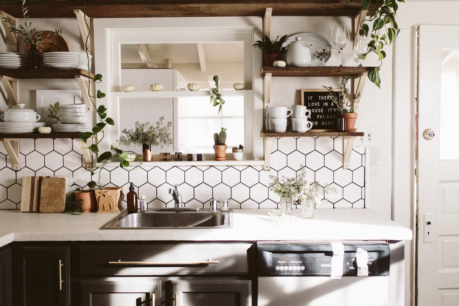
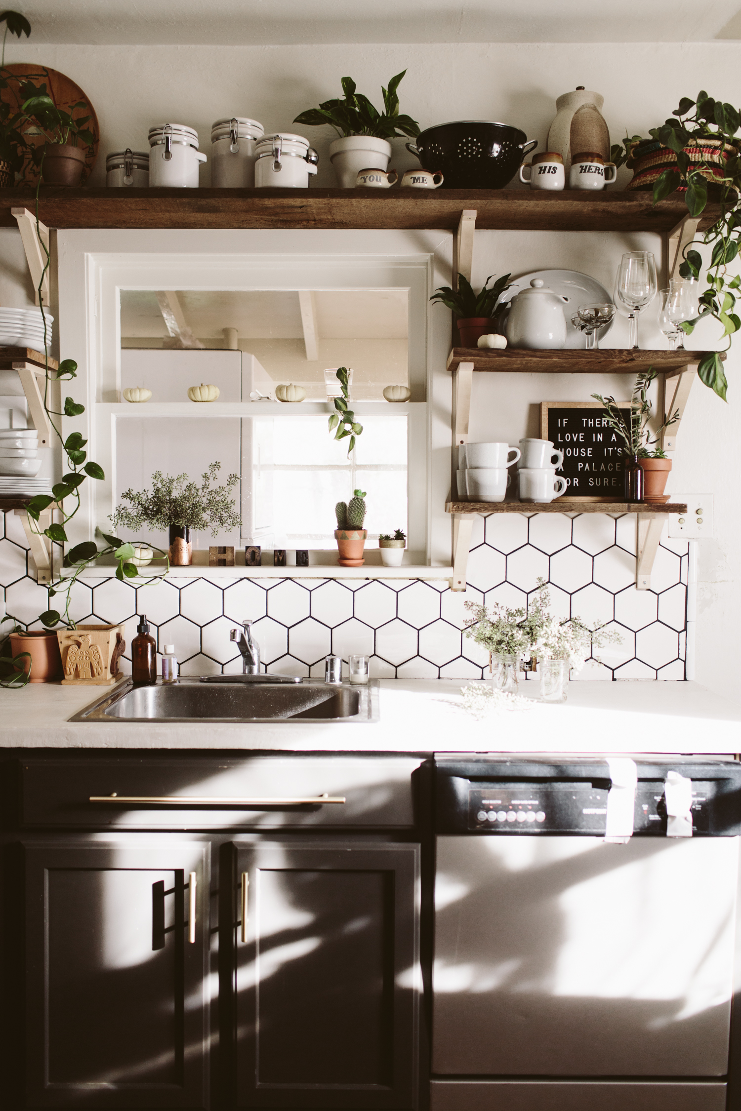
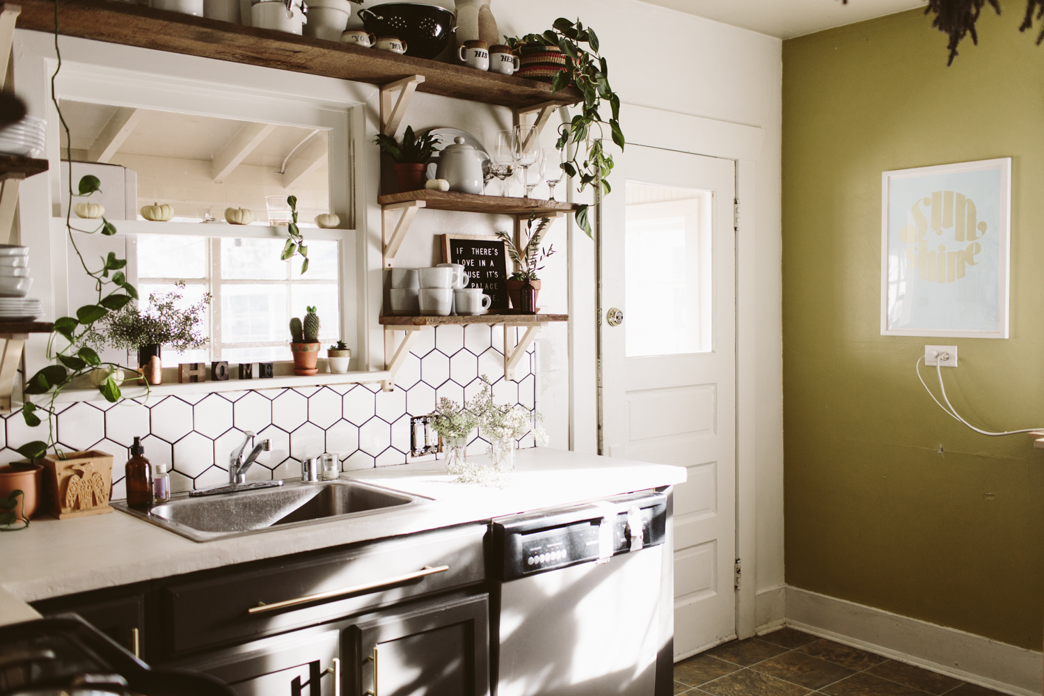
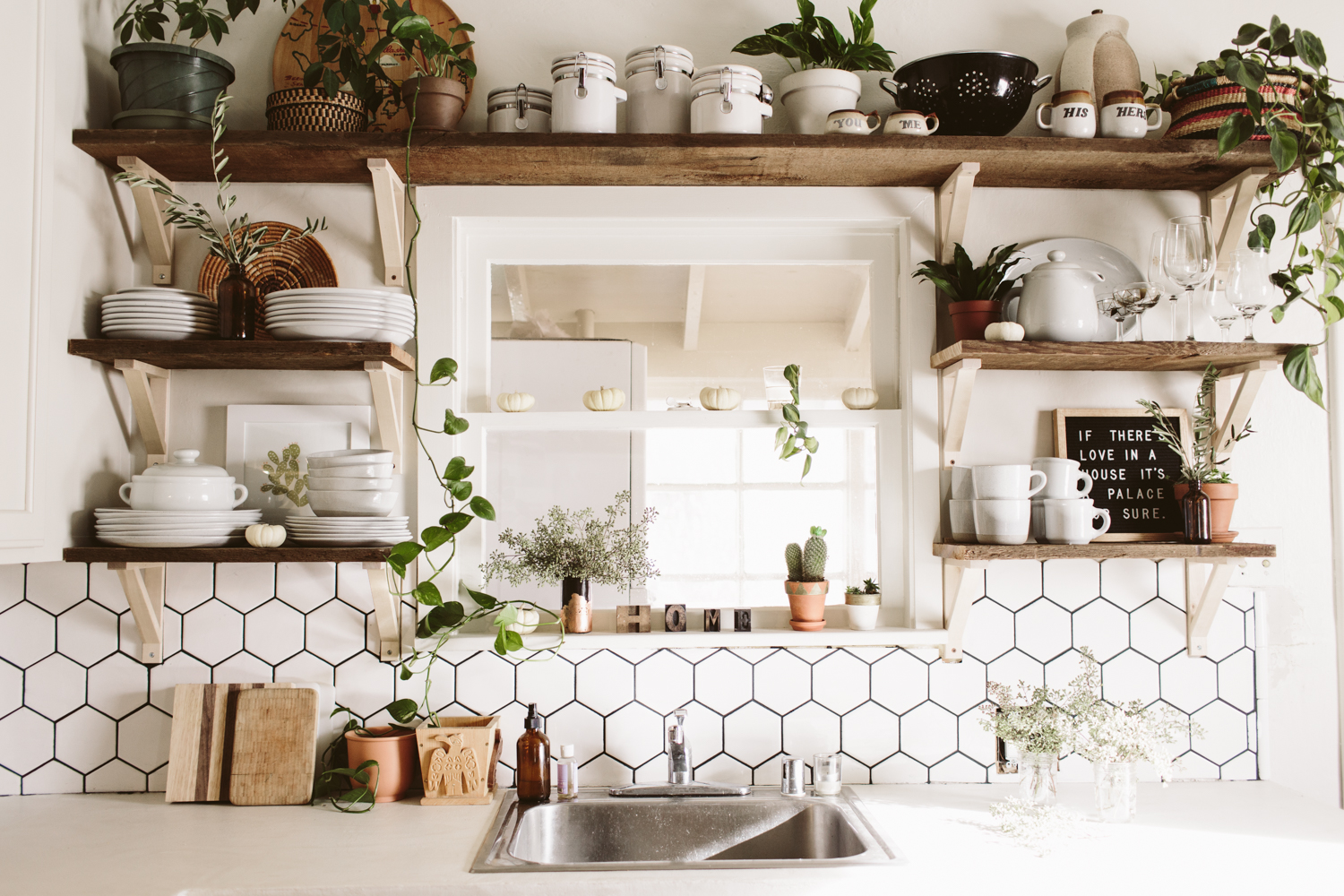
I still have a few odds and ends to button up on my kitchen remodel, but I grabbed these shots of the end result and I couldn’t resist sharing! (if you want to see my old kitchen before + after click here!)

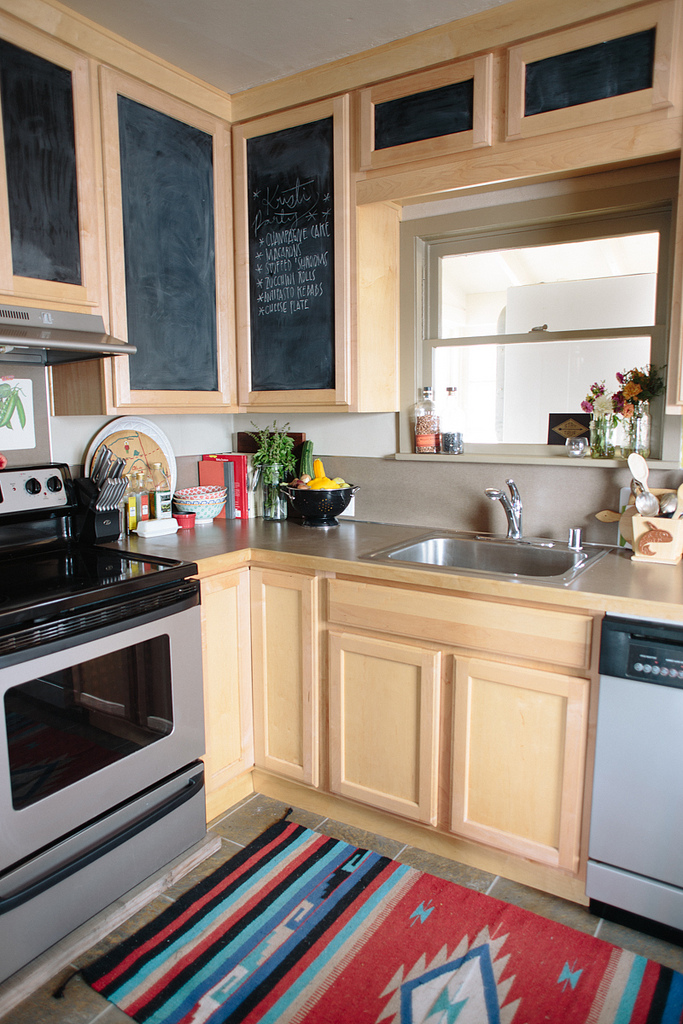
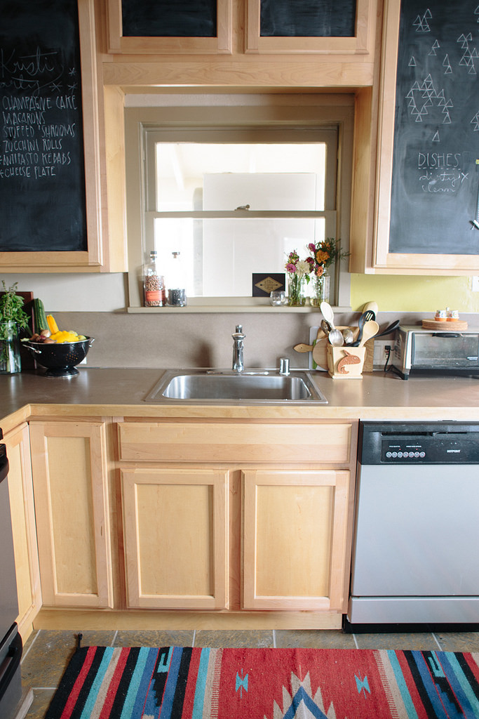
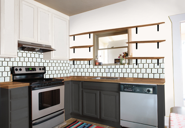
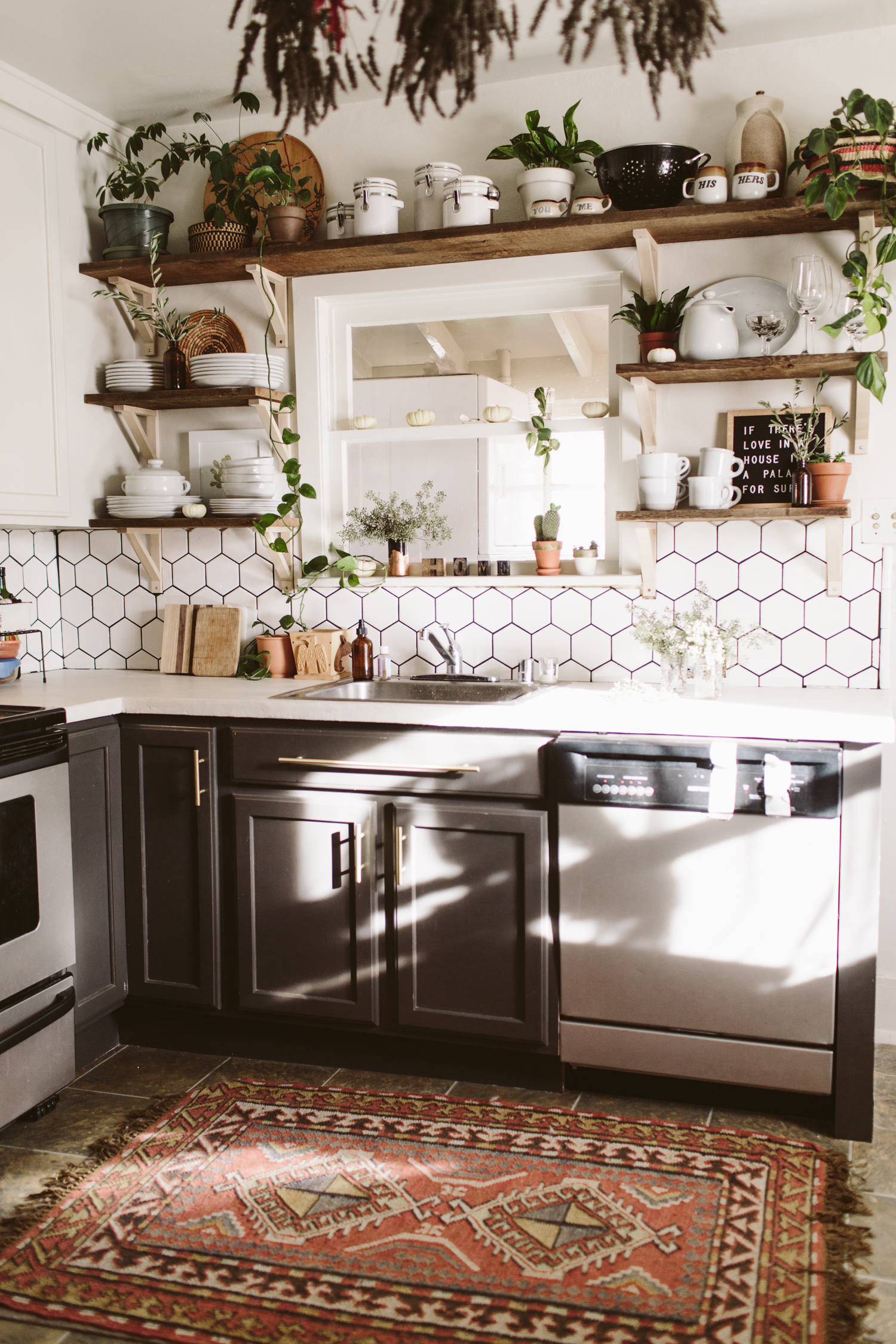
Below is the before, as well as my design plan. I ended up going with white concrete skim coat counters instead of the walnut butcher block which was my original plan. We simply skimcoated our existing formica counters with white concrete, which ended up being way more affordable, plus we wanted something durable and low maintenance, as we’re potentially going to turn this house into a rental in the near future. While I love me some butcher block counters, having something that needed regular upkeep and could get ruined by someone putting a hot pan on the counter seemed like not the best idea for a rental.

I took out the east wall upper cabinets and had to do quite a bit of wall repair, but it looks lovely now and I like how much more bright and open it is in here! The remaining upper cabinets I painted white (Glidden Cappuccino white, which is the white in my whole house), and the lowers were painted Behr Iron Mountain. None of the cabinets had pulls, so I added brass pulls from Target.

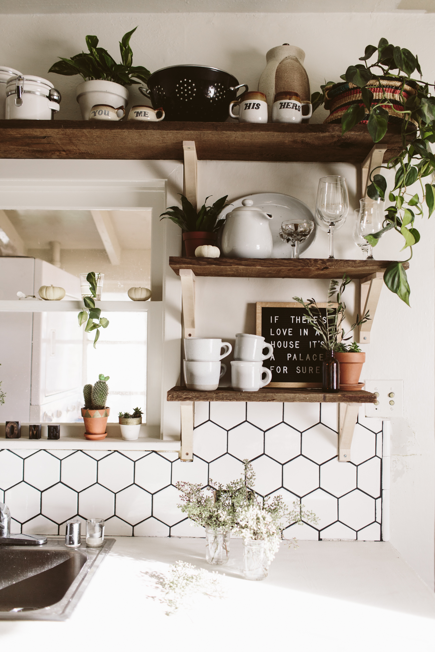
My original plan was to do white square 4x4 tiles in an offset subway tile pattern but I ended up going with hexagonal white tiles and I’m really glad I did, I love that they are white and neutral, but have a more interesting pattern than the standard subway look.

Anyway, scroll down to see the transformation and I’ll put links to the products I used at the bottom!

Dying to transform your own kitchen, but aren’t sure where to start, how to bring your vision to life, or need help figuring out how to make it all happen? I’ve got you covered! Head over here and let’s get started on working some design magic for you!


Want to recreate this design in your home? Get all the details and finishes on this design in my Design Kickstart! Moodboard, Budget Breakdown, and Source Links are all included so you can hit the ground running on transforming your own kitchen in to a bright + fresh space.


You may also like: