Thank you to Blueprint Lighting for sponsoring this post and providing the light fixture for this space.
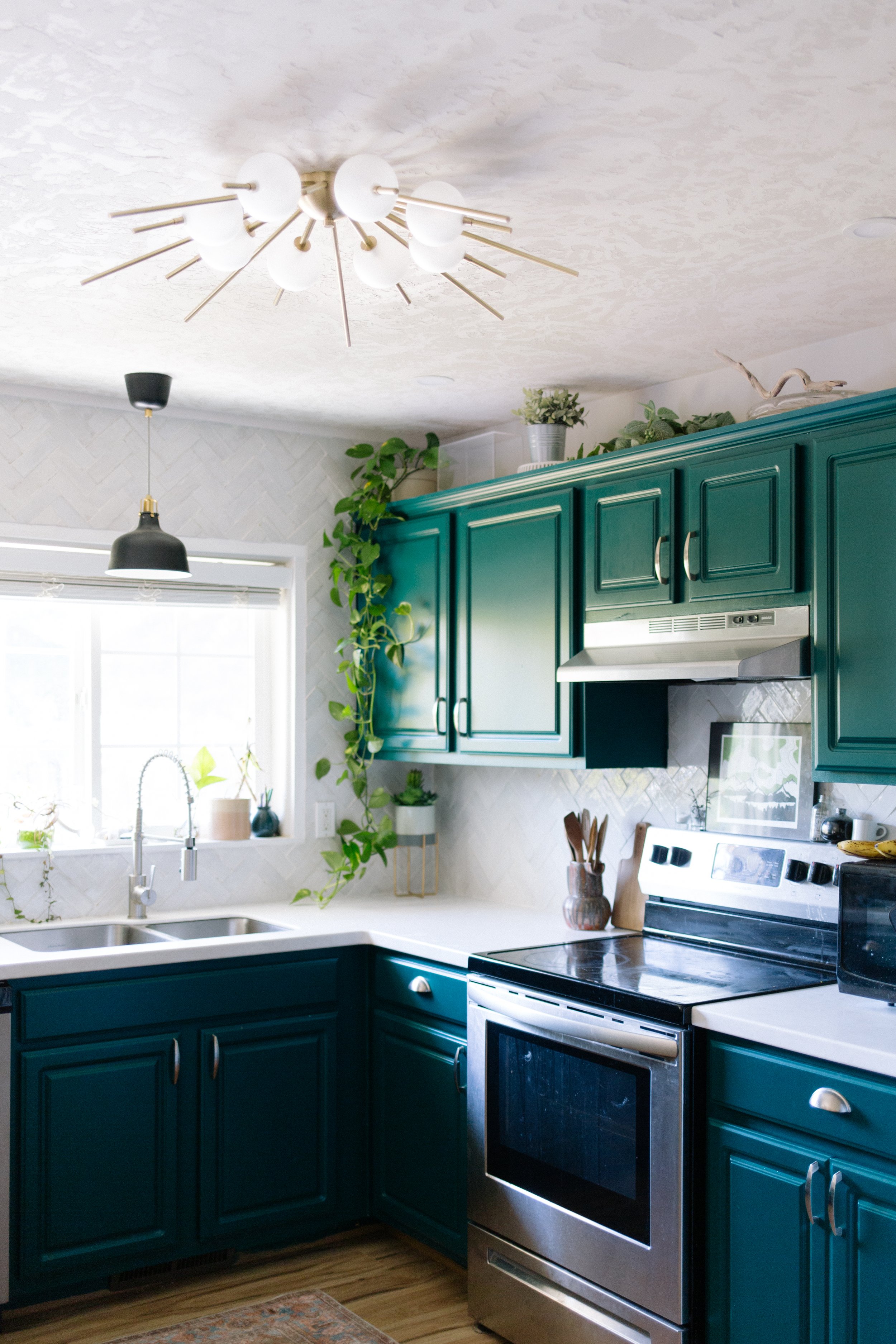
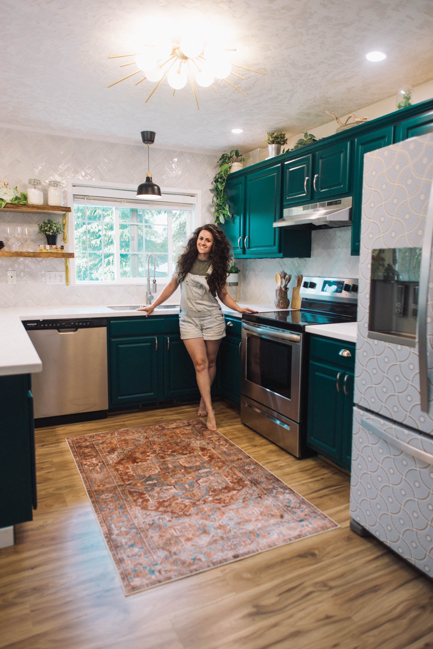
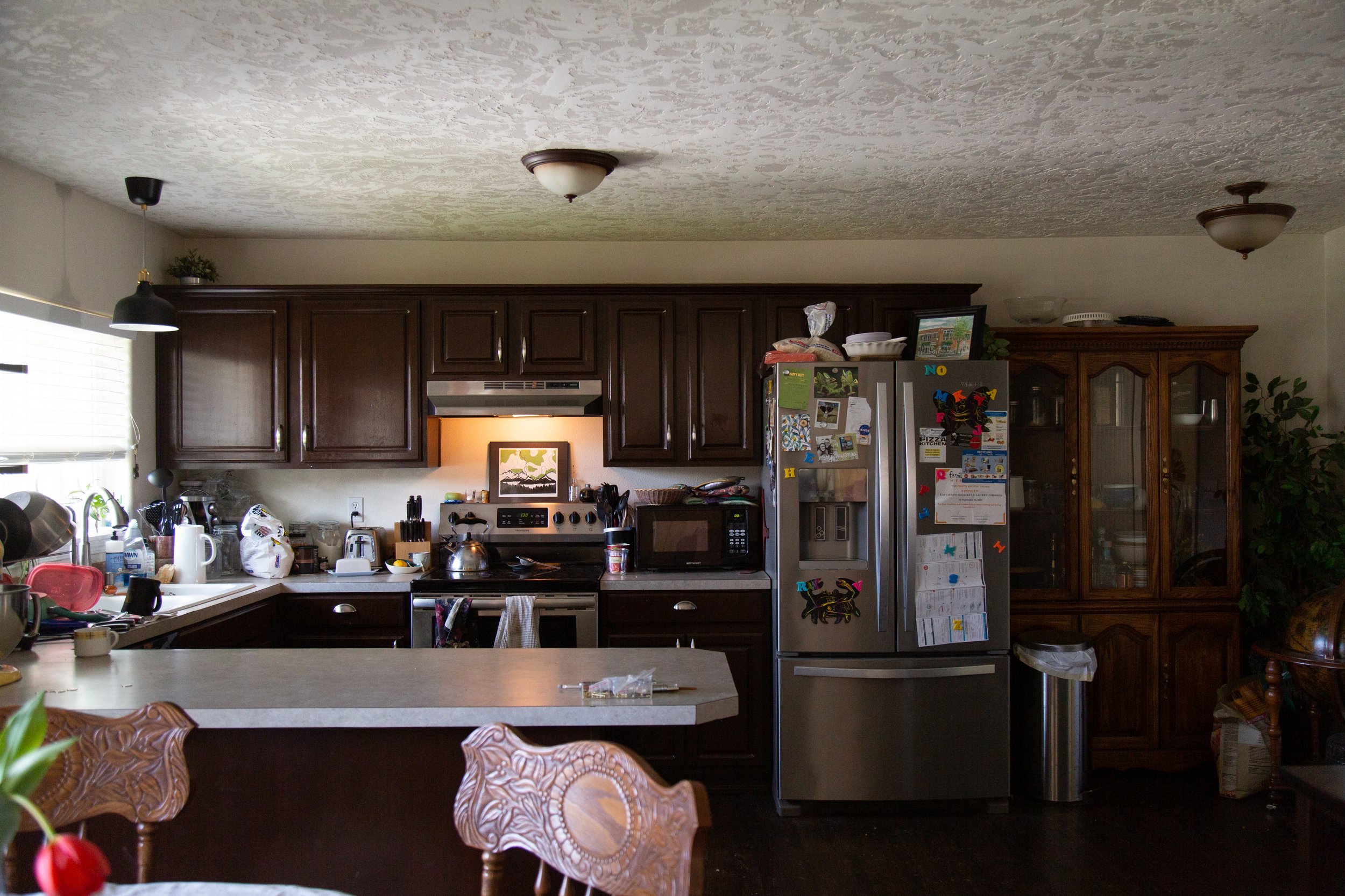
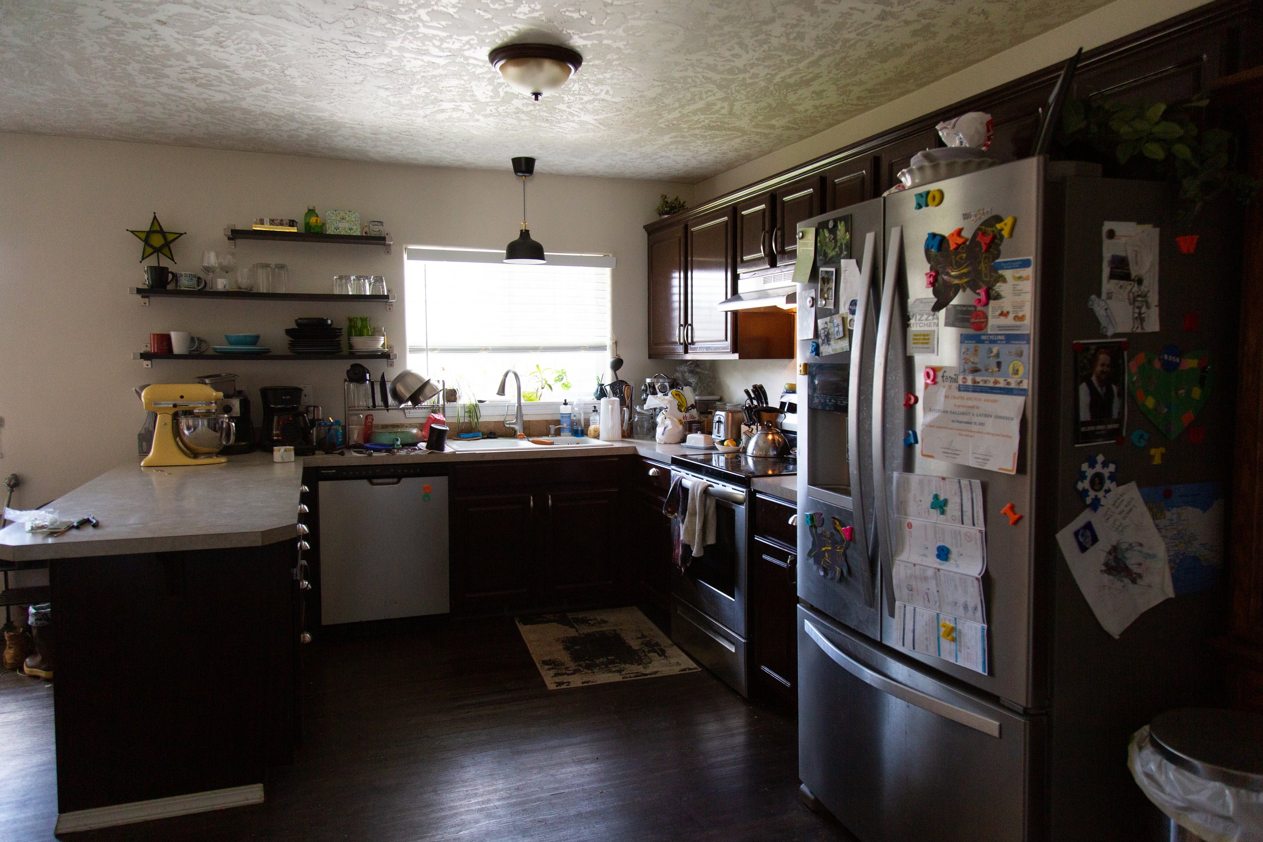
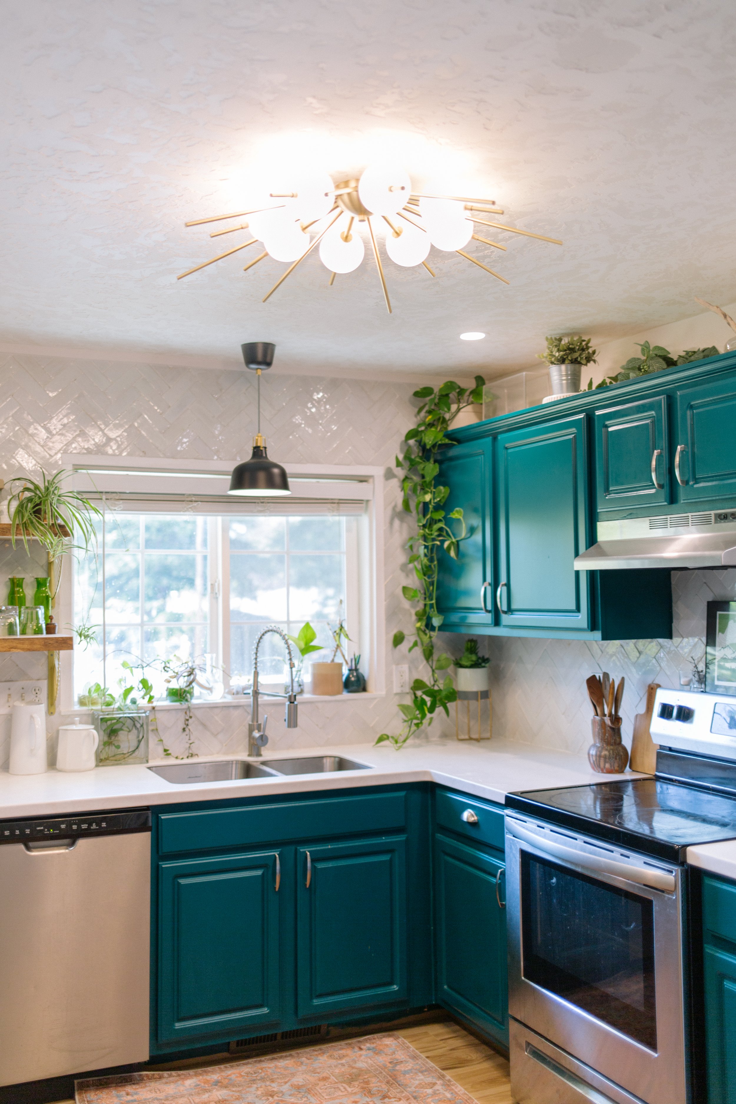
It’s truly hard to say what the biggest transformation in this space was since every single element made such an impact, but updating light fixtures not only replaced an ugly element with something stunning, but also vastly improved the brightness in a room that was previously pretty dark.
The original “boob light” flushmount fixture was ugly, sure, but it also did not do enough in terms of lighting the kitchen. This kitchen only has a north facing window, which means in the overcast winter days, it was not lighting the space adequately.
The ceilings in this room aren’t high enough for much more than a flushmount, so I knew I’d have to replace it with something at least semi-flushmount at most, and when I found Blueprint Lighting’s Lucienne flushmount I immediately knew it’d be perfect!
They sent over a whole set of finish samples, which made it even harder to pick because there are so many color and finish options! I almost went with the Malachite or Denmark colors to match the cabinet color, but ultimately I decided to go with the brushed brass to match the other brass elements in the room.
It’s legitimately one of the most beautiful light fixtures I’ve ever installed and now I’m jealous that it’s in my brother’s kitchen, not my own, thought to be honest, I do have my eye on some of their chandeliers for my kitchen. Now that my ceiling is painted black, a light fixture would really pop against the dark ceiling!



![This print feels even more relevant today. We all joke about the dumpster fire of [insert year here], but the important message of this image to me is that *we persist* through the horrors. We stand, we fight— maybe for ourselves, maybe for oth](https://images.squarespace-cdn.com/content/v1/574dddd6d51cd4bc35c1609a/1730935170369-03GPKQ5NF73VAE65RHO6/image-asset.jpeg)


