decor inspiration

Season of the Witch

IMG_2263.jpg

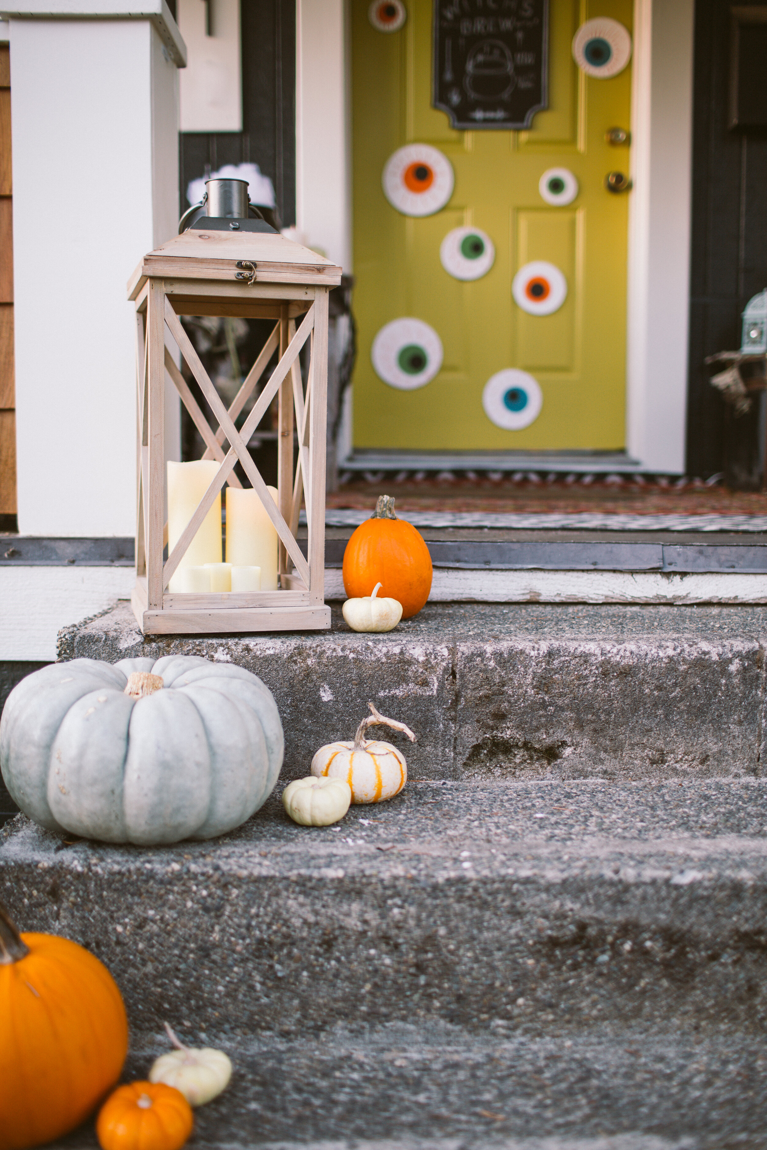
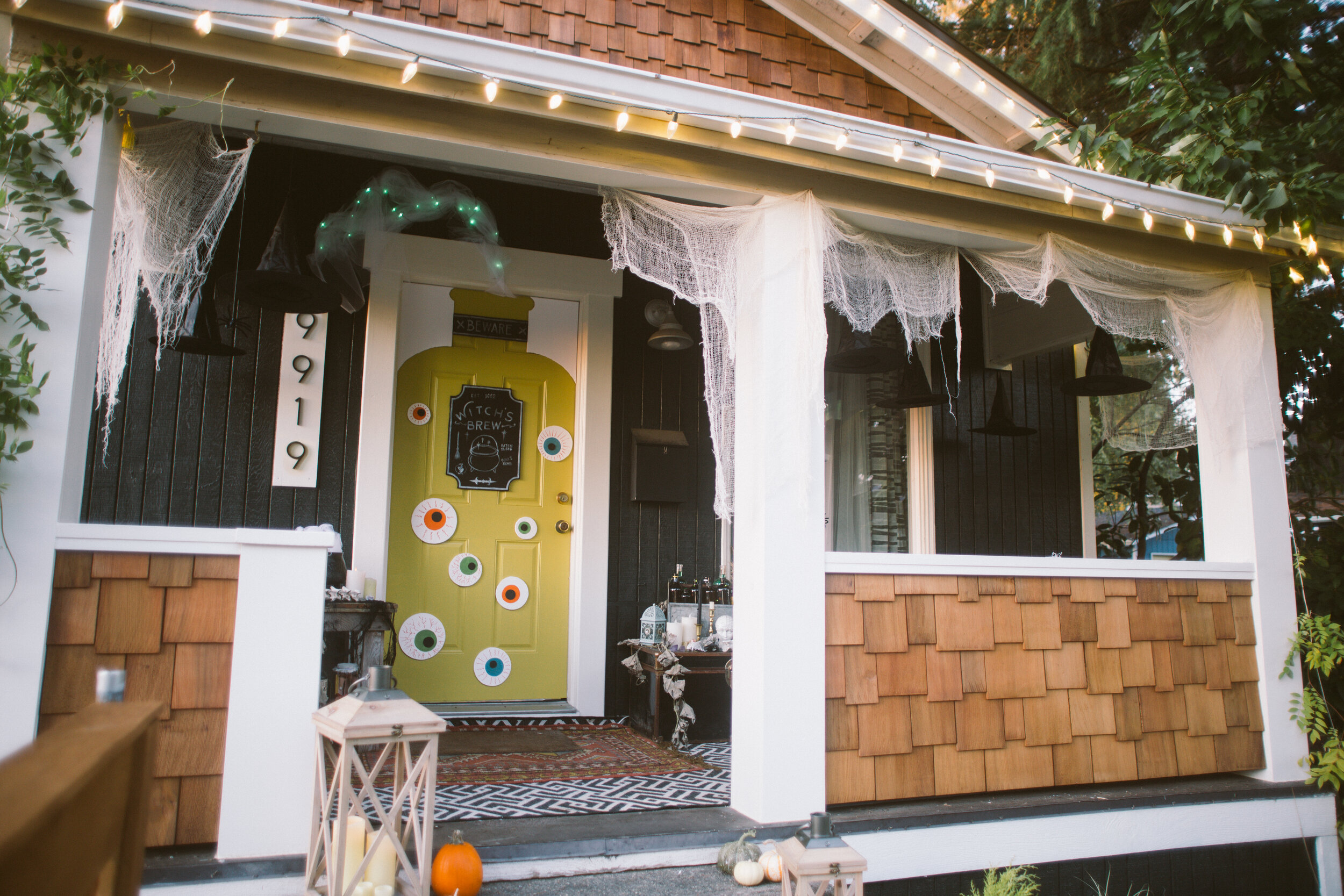
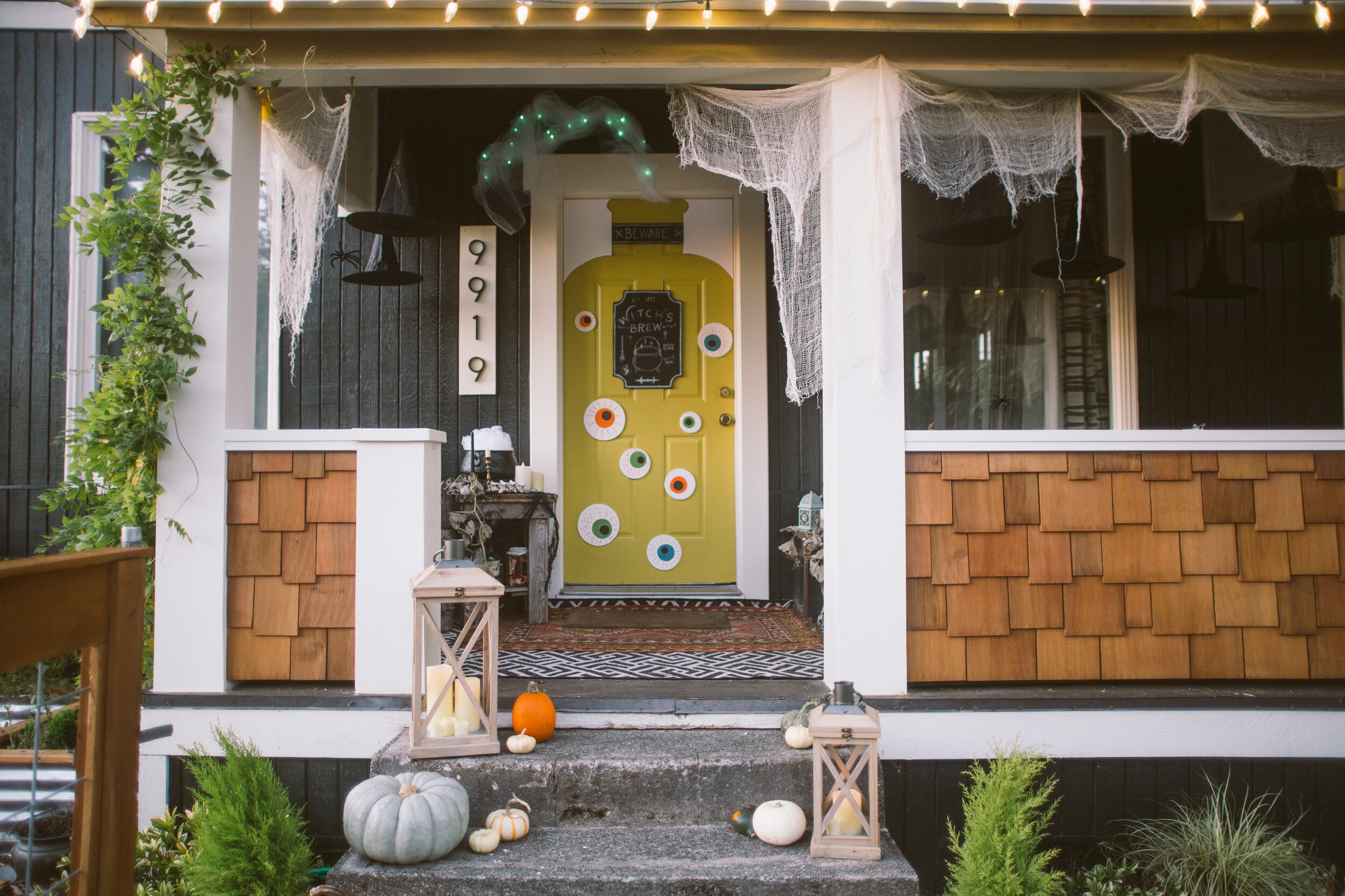
Y’all, I’m unreasonably proud of this little halloween porch. Gah! I don’t usually go full out on Halloween decor, I typically stick to more fall themed stuff— pumpkins and the like. But for some reason this year I felt like getting SPOOKY.

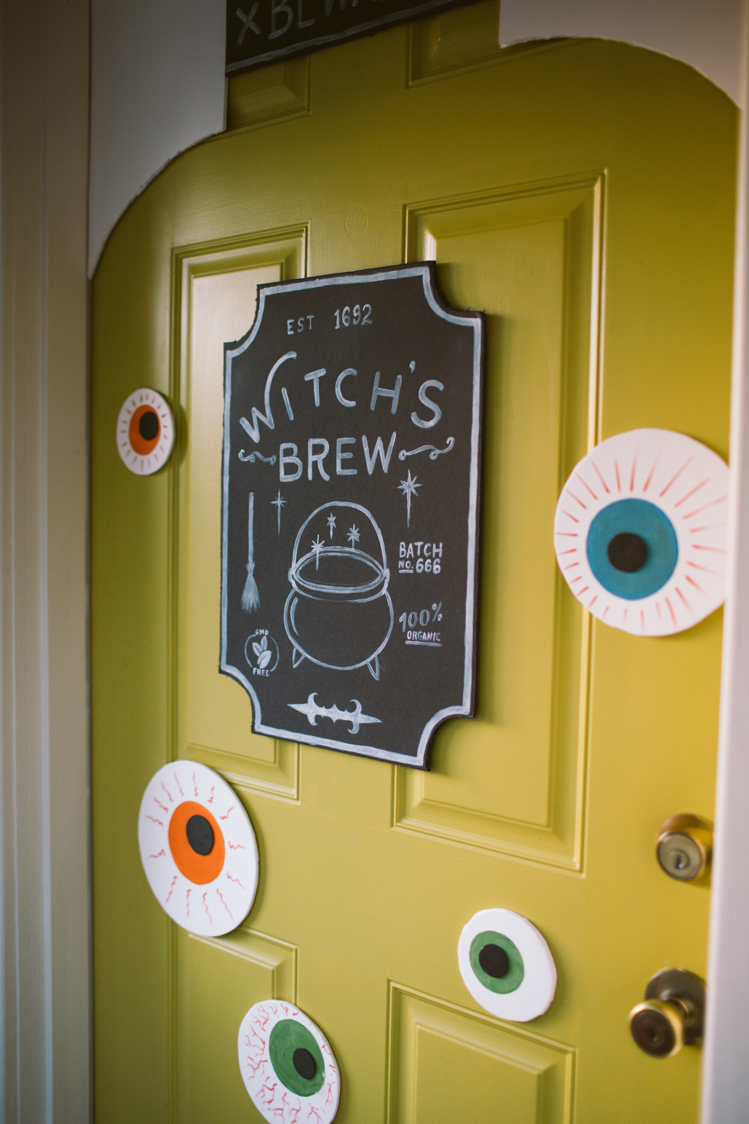
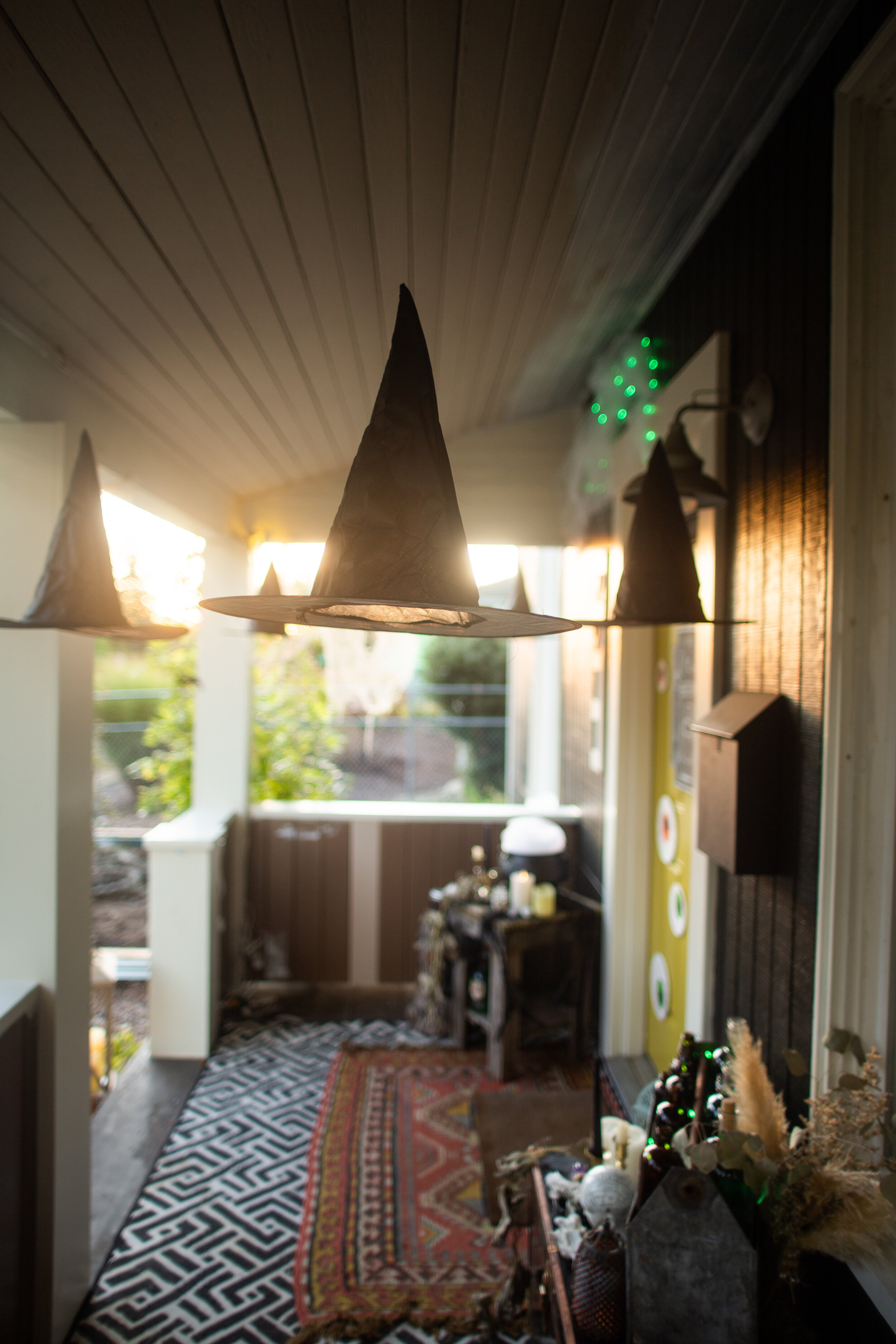
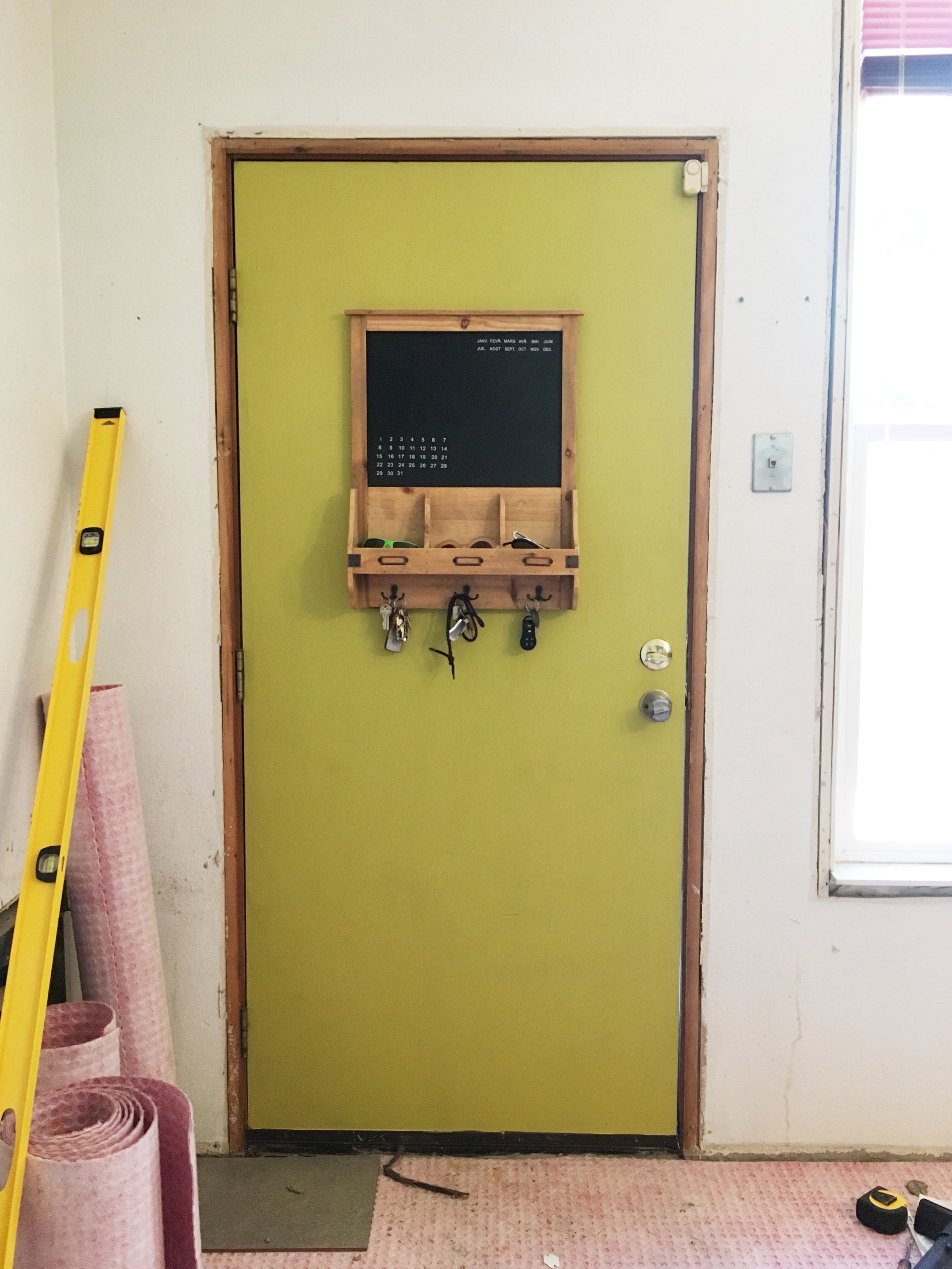
Last year’s monster door was super fun, especially with the door being pink, but after painting it chartreusey yellow, it felt like it wanted to be a spooky witch potion this year! With the door being a potion bottle, I kind of took that idea and ran with it for the rest of the porch, leaning heavy into the witch theme. So we hung some witch hats from the ceiling of the porch, made a witchy cauldron, and then a bunch of bottles filled with “potion” to finish things off.

The door was made with sheets of craft foam and foam core poster board. The eyes are cut out of white craft foam, then painted with the iris and the blood vessels, then I hot glued the pupils on, which are made of black craft foam. I used about five sheets of the white 6mm craft foam, one sheet of the 2mm black craft foam, one 20x30 white foam core board, and one 20x30 black foam core board.

The top where the bottle top shape is, was made out of foam core poster board, cut to form the negative space that make the door look like a bottle. Then I added the “witches brew” labels and attached everything with Command Strips.

I decided I wanted some witchy steam billowing out of the top of the bottle so I bought a few yards of white tulle, stapled half of it to the wall above the door, and then threaded some battery powered green twinkly lights through the tulle!

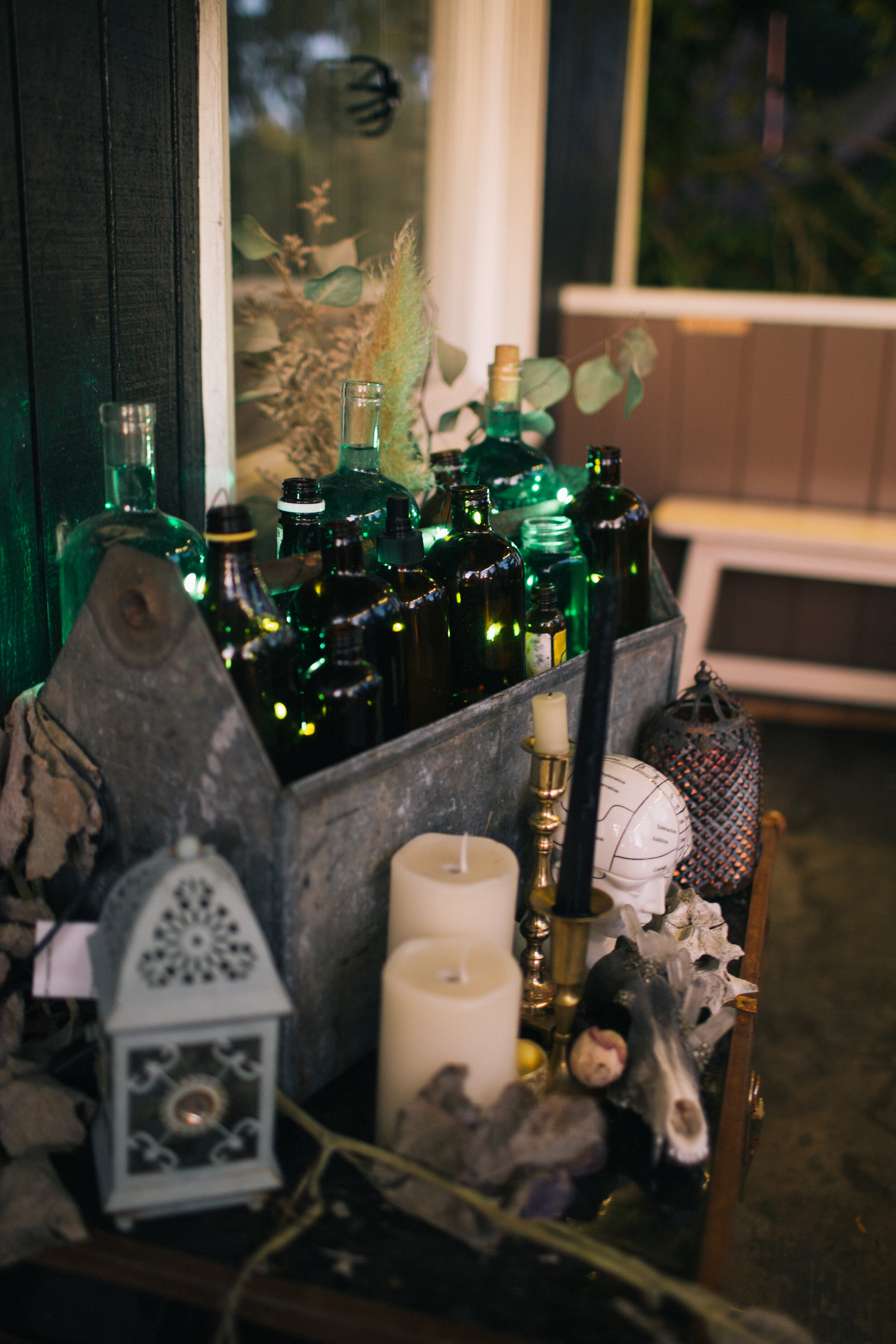
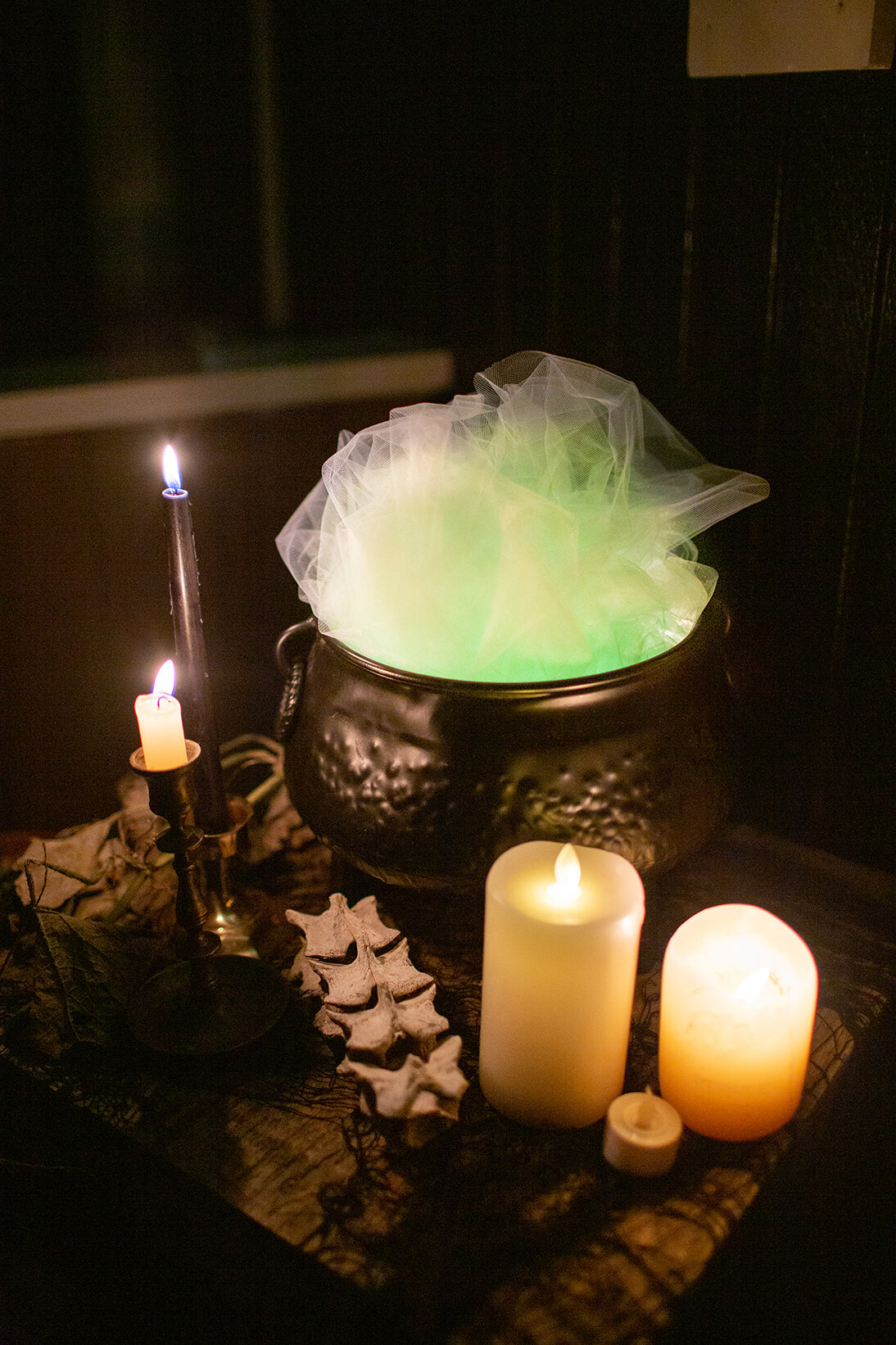
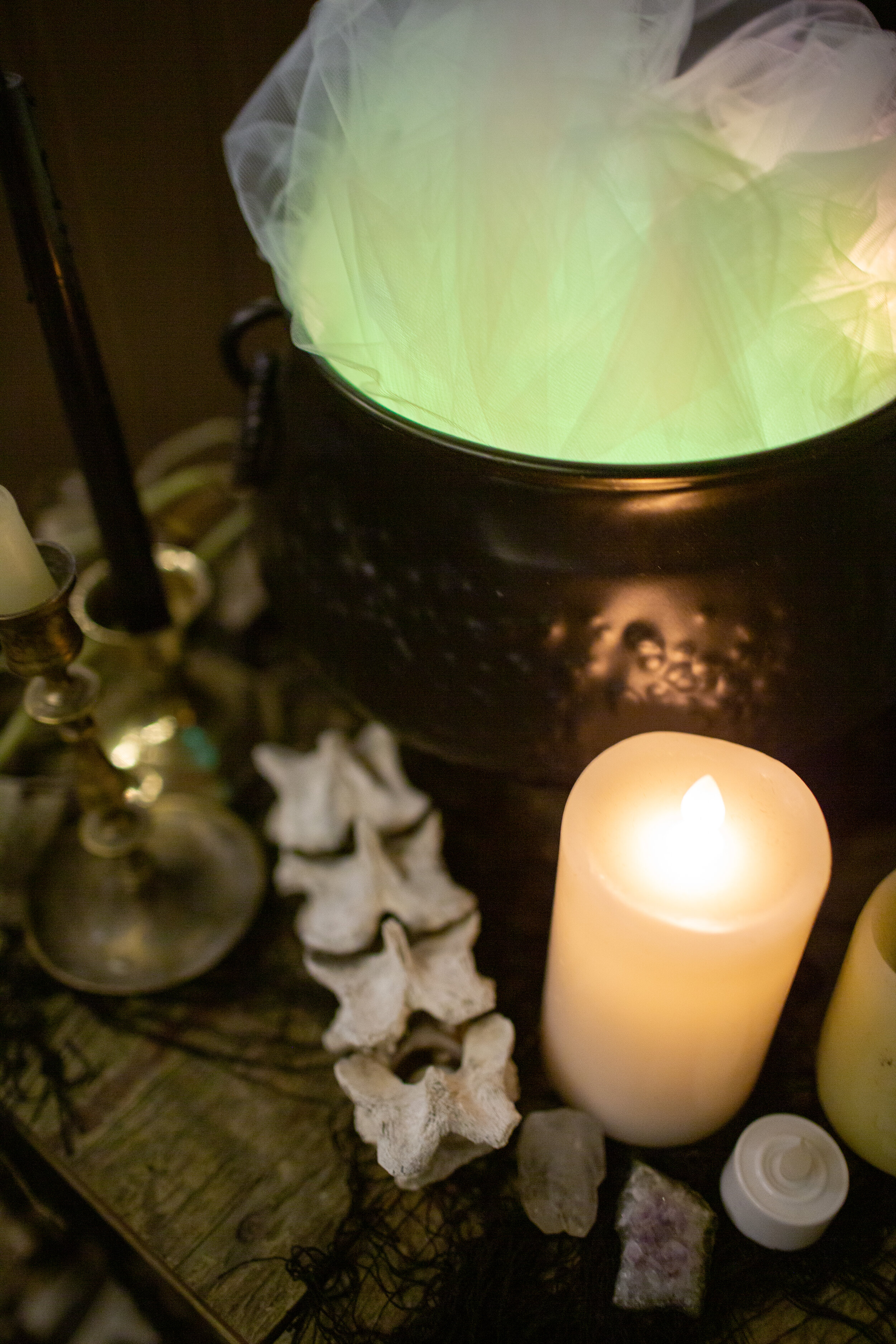
With the other half of the tulle, I put green Christmas lights in the bottom of the cauldron, then stuffed the tulle on top of it so it illuminates and looks like a frothing witch cauldron. On the opposite side of the door I salvaged some potion-y looking bottles from our recycling bin, and filled the clear ones with water mixed with green food coloring. Then I grabbed some of the crusty old squash vines that were left in our garden and wove them around everything.

Witch Hats | White Craft Foam | Black Craft Foam | White Foam Core Board | Black Foam Core Board | Witch Cauldron | Brown Bottles | Spooky fabric
Wood Lanterns | Green Christmas Lights | Battery Powered Green Fairy Lights
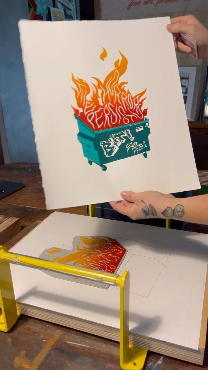
Botanical Kitchen Revival: A Rental Kitchen Makeover on a Budget

IMG_0133.jpg

Transforming any space is fun, but transforming your lifelong BFF’s space is a special kind of fun. When Frogtape reached out to me to see if I’d be interested in being a designer for their annual Paintover Challenge, it came at the perfect time. My friend, Kristina, had been talking about wanting to update her kitchen in the rental home where she lives with her husband and son, and I instantly pitched her the idea of doing the paintover challenge in HER kitchen. We talked to her landlord, who gave us the greenlight for the proposed changes and we got to work!

This makeover was primarily achieved with paint, with some honorable mentions from a few other design elements. I traded out the old overhead track lighting for a pretty new light that not only looked gorgeous, but offered way more illumination (which is a godsend come those dim PNW winter months). In lieu of taking out the meager tile backsplash and doing new tile (which probably would’ve required some drywall repairs, and a significant budget bump) I opted to keep the existing strip of tile, and add beadboard on top to fill the blank space between there and the bottom of the wall cabinets. Then, we painted it the same color as the cabinets and the walls, for a delicious tone-on-tone vibe. This basil color is super pretty, it feels lush and sophisticated.

2before.jpg
2after.jpg

The big, unexpected showstopper ended up being her basic old fridge, transformed with a bit of removable stick-on wallpaper! Since we kept the existing cabinet hardware and painted it brass to match the light fixture, we did the same with the fridge handle to tie everything together. I used Rustoleum Vintage Gold spraypaint to paint both the cabinet door pulls and the fridge handle.

Another thing we did was add a whole wall of open shelving to give her a ton more storage. We painted those shelves the same green as the rest of the kitchen, but kept that wall white to give some contrast. Now she has a bunch of space to store all her pretty jars of dry goods, cute mugs and, of course, more plants.

And one more fun little detail: we put a chalkboard area in for her toddler to use! That panel is access for the water heater, so it was just an unfinished wood panel before, so we framed it out to match the shaker style of the cabinets and did the center panel in chalkboard paint so he could draw and have fun!

Projects like this have all the elements of what makes me most excited about design and remodels. Making a huge impact for not a huge amount of money, coming up with creative solutions, and doing really fun and out of the box elements (I’ll never get over that fridge).

I’m so thrilled that Frogtape brought me in on their Paintover Challenge this year so I could do this amazing project!

YOU MAY ALSO LIKE:

Elevating interiors using the senses

Thank you WoodWick Candles for sponsoring this post.

IMG_1031-Edit.jpg

Finding inspiration for the design of a space is all about creating a mood.

Taking your design to the next level means creating a space that makes you feel a certain way when you enter that space, not just putting together pretty things. It's that design je ne sais quoi, you know?

Including WoodWick Candles in my home has elevated the spaces I've worked hard to build and style, it's like the cherry on top of all the other design elements. I love the scents, but also the soothing crackle of the wooden wick. It's such a lovely added ambiance that helps my house feel like a home.

Something that I like to think about when I'm designing is focusing on the senses. How does the space look, yes, but also: how does is sound? How does it smell? What do the materials feel like when I touch them? What quality of light is there?

When you design from that perspective it informs how you choose your materials, your finishes, your styling. You don't put fluorescent lighting in a cozy bedroom. You don't buy a firm couch for a room where you're going to curl up and read a book for a couple hours.

One of the things that helps me create a solid vision for a space’s design, whether I’m doing a remodel or simply the decor, is creating a mood board. You can do this digitally, or IRL by gathering swatches and elements of your design. This way you can see how all the different elements interact with one another before you commit to them. How does that tile look against the cabinet finish? How do the paint colors compliment the textiles? Does anything clash? Is there too much of one texture that it’s feeling unbalanced? Mood boards are a great way to give you the confidence to fully realize a design.

IMG_1259.jpg
IMG_0985.jpg

Great interior design incorporates all the senses, and scent is a particularly strong element for us psychologically so I try to incorporate some element of fragrance into each room I create. These WoodWick Candles not only have amazing scents, but they have a wooden wick, which crackles softly as it burns, creating an added element of ambiance, which I love.


I chose the Seaside Neroli candle for our bathroom, which elevates the space so beautifully and gives it a subtle spa-like vibe which is exactly the feeling a bathroom should have, and the Melon Blossom candle has such a bright, fruity scent that has been perfect for the kitchen in these spring months.

For this WoodWick Shoreline Trilogy Candle, I wanted to create a mood board based on the candle, taking inspiration from each of the three scents. This mood board is definitely very organic and natural, with a bright and fresh feel. It’s got the pink and peachy colors inspired by the Melon Blossom scent. Then, there are some more beachy vibes, like the wood tones, shaker cabinet door, and textiles, inspired by the Coastal Sunset scent. Then I brought in some bohemian elements inspired by the Palo Santo scent, with the rose quartz and macrame elements.

Having a mood board like this lets me have an anchor when I’m choosing things like tile, throw pillows, rugs, linens, etc. It’s kind of like a design litmus test: does this element fit in with my mood board? If yes? Go for it!

Adventures in DIY tiling

DIY kitchen floor tile

There’s not much I won’t DIY, and I’m usually pretty spot on in my assessment of how difficult a project will be but this kitchen floor has turned into a huge pain. And to be fair, I’m not feeling the pain of how annoying the install process is— Dan is the one doing the mortar and laying the tiles. But what we planned on being a weekend project has now entered the second week of having no functional kitchen, and I’ll tell you what: not having a range is a lot harder than I thought. I finally broke down and bought a microwave yesterday so we could at least have some home cooked food.

We’re probably about halfway done with the kitchen and the same tile will continue into the bathroom and in the laundry closet, so I’m thinking we probably have at least another week of doing tile, though we thankfully have laid the tile where the range goes, which means it will be able to return to it’s home and functional status in the next day or two.

Next up, I’ll be grouting the tile, which is perfect because it’s a great project for me to do while Jack naps. Even though I hate working with it, I decided to go with the Fusion Pro grout again, just because I don’t have to seal it or anything. And I think it’ll be less annoying to work with this time simply because I’m not doing a contrasting grout (last time I did black grout with white hex tiles). Since I wanted a concrete floor, I’m doing the grout in as close to the same color as the tile to give it more of a seamless look. But you know I couldn’t make things easy, so we’re doing a herringbone pattern. It’ll be more subtle since the grout won’t be contrasting, but I still think it’ll add interest.

Photo Jun 30, 5 19 40 PM.jpg

Ooooh, and peep that new light fixture too! In the meantime, you know I couldn’t wait any longer to paint something chartreuse in this house. This color is Lemongrass by Behr and It feels so happy! Even with no trim.

Chartreuse door

Living Room Inspiration

Our new kitchen is a pretty big project that will be a little more intensive, so in the meantime I'm focusing on breathing new life into our living room.  It's already changed a ton since the image below was taken (what it looked like when we moved in), mostly just because our furniture and artwork is in there now, but I really want to give it a fresh coat of white paint (especially on the dark, heavy fireplace), some pops of color and pattern, and lots of plants!

We've got a door with a window similar to the one second to last in this post, and I've already got yellow paint to brighten it up.  I think the other walls will end up with white, but I might do a fun statement wall on one of the smaller walls.  Since we don't live here permanently I can't do super crazy stuff, so I may end up using removable wallpaper from Walls Need Love like I did in our last house, which was a really great way to update without the pressure of committing to a crazy paint job (or committing to a crazy paint job that takes months to finish.  Walls Need Love actually made that pattern into a wallpaper so you don't have to become a crazy person like me).

Images sources (except before image below): 1 | 2 | 3 | 4 | 5 | 6 | 7 | 89 | 10

Mostly I just want the space to feel inspiring, bright, and happy.  I want lots more plants (I need a snake plant and super tall cactus, like, yesterday), and I have a couple of vintage chairs that my parents got at a garage sale that I really would love to reupholster to bring them into the vibes of the space I have envisioned.  Luckily their upholstery is super simple (basically just 4 rectangular pads), so I think I can DIY that!  

A super big project that will probably be down the line is putting built-in cabinets/shelving on either side of the fireplace.  As you can see, that whole side of the room has a sort of weird step up that makes it virtually non-functional for furniture, so building in some shelving (much like Elsie's white shelving) would make that space much more useful and I would even love to put some upholstered pads in front of the shelving next to the fireplace for reading nook seating!  Like I said, that's a huge project that probably won't happen in the next few months, but who knows, maybe I'll get a huge burst of nesting energy and go for it before the baby comes!  Now to convince my dad to help me build this cabinetry...