Interior Design

Transform your kitchen with DIY painted cabinets

DIY Painted Kitchen Cabinets

Painting kitchen cabinets can feel intimidating, or even sacreligious, but I believe that it’s one of the easiest, most affordable ways to completely transform your kitchen. I lived in our kitchen for years wanting to paint the cabinets, but felt bad painting them because they looked relatively new and were perfectly fine. But here’s the thing, I LOVE our kitchen after painting the cabinets. It feels so much more “us,” it feels modernized, and custom (vs. basic builder grade).

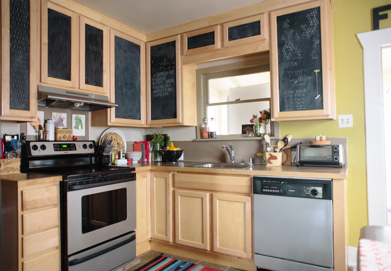
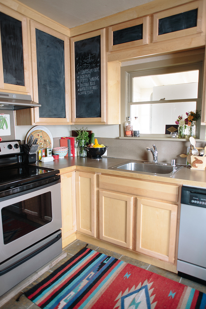
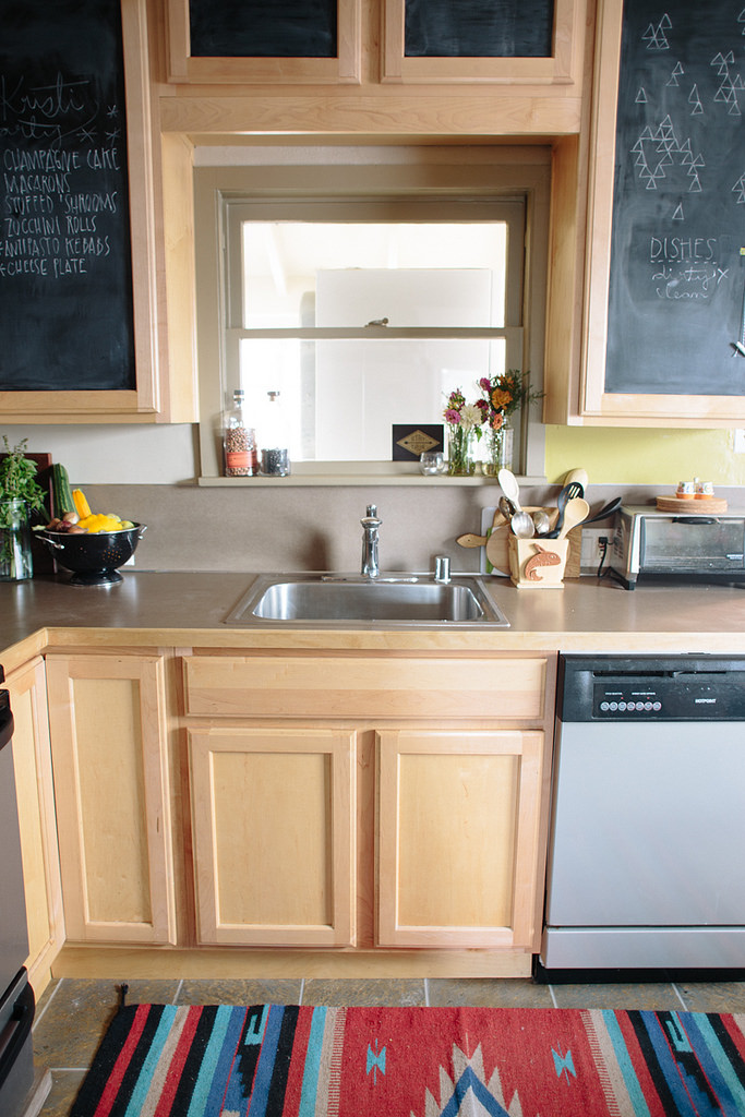
I’ve painted cabinets in three different kitchens now and I love each transformation. In some, I’ve replaced the upper cabinets with new ones, to freshen up the look (like in the before/after below), or put in open shelving, and in others I’ve painted both the lower and upper cabinets.

DIY%2BPainted%2BKitchen%2BCabinets%2Bbefore
DIY Painted kitchen cabinets after

01/ Remove doors and hardware

This one is kind of optional. Removing drawer pulls and knobs is not: you’re definitely gonna want to remove those, it only takes a couple minutes and a screwdriver. But removing doors is up to you. It’s definitely easier to prep and paint them separately, but I have painted cabinets with the doors on and it works too! If you don’t have a garage or somewhere that you can set up a painting area, leaving the doors on is workable!

02/ Clean + degrease your cabinets

You’ll want to make sure you have a clean surface to paint, free from kitchen gunk and grease. Lower cabinets that aren’t near the oven don’t tend to have as much grease, but cabinets over the stove can have grease build-up that will definitely need to be removed in order for the paint to stick well. Use TSP or a similar cleaner to clean your cabinets first. Do all the surfaces you plan on painting. I have never painted the interior of cabinets, mostly because it seems like a pain and I don’t mind the insides having the original wood, but you’d follow the same steps laid out here.

03/ Sand and/or degloss your cabinets

Next, you’ll want to remove some of the glossiness on the cabinets so the paint will stick well. I use Liquid Sandpaper first, and then if I feel like I still need to rough up the surface a bit more, I’ll hit it with a fine grit sandpaper like 220 grit.

04/ Prime!

There are tons of primers out there, some specially designed for furniture and some that say they’ll stick to basically anything. I use Kilz for basically everything, so that’s what I’ve used on all my cabinet painting jobs, as well as to paint metal file cabinets and it seems to work really well.

With primer and paint, you have a couple options. I’d say the best option for a smooth surface is using a paint sprayer. We have a pretty heavy duty sprayer because we bought it to do the exterior of our house, but there are smaller, more affordable ones available that would work for painting cabinets. For spraying, I would recommend just doing the doors and setting up a spray booth in a garage or other workspace with plastic sheeting and drop cloth, unless you feel like masking off your entire kitchen and spraying the whole cabinet. We sprayed the doors, then used brushes and 4-in smooth rollers for the cabinets themselves. One coat of primer should do the trick.

kitchen before.jpg
DIY Painted Kitchen Cabinets tutorial

05/ Paint!

Now the fun part! You’re gonna want to get a nice paint. I’ve used Behr Marquee for all my cabinets because it does a nice job of self leveling and the coverage is amazing. Behr also makes an Alkyd paint that is designed for cabinetry and was recommended, however they have limited paint colors available for that paint and I’m too picky with my colors. I’ve never had a problem with using the Marquee.

When it comes to picking a sheen, I’ve discovered that I prefer eggshell. I’ve used semi-gloss in the past thinking that the glossiness would be easier to wipe down, but I’ve found that semi-gloss and gloss paints tend to, like, not stick as well? I don’t know, they seem like they can be scratched easier, and for cabinets when there are fingernails scratching when you grab for drawer pulls, I’ve had the semi-gloss paint scratch off, but the eggshell doesn’t.

I’d recommend at least two coats, possibly three, depending on how it looks after two. Again, if you’re spraying, spray the doors and then roll + brush the cabinets. Allow the right dry time between coats based on what your paint recommends.

Also, I should note that I have not used a sealer or top coat on my painted cabinets yet, but with my most recent cabinet painting project I’m thinking of finding one so I can see if it’s something I recommend. For some reason I just never thought to put a top coat on, so I’m going to do some research and testing to see if there’s something I like and I’ll update this accordingly!

Thrifted Dresser Revival

Modern Dresser Revival

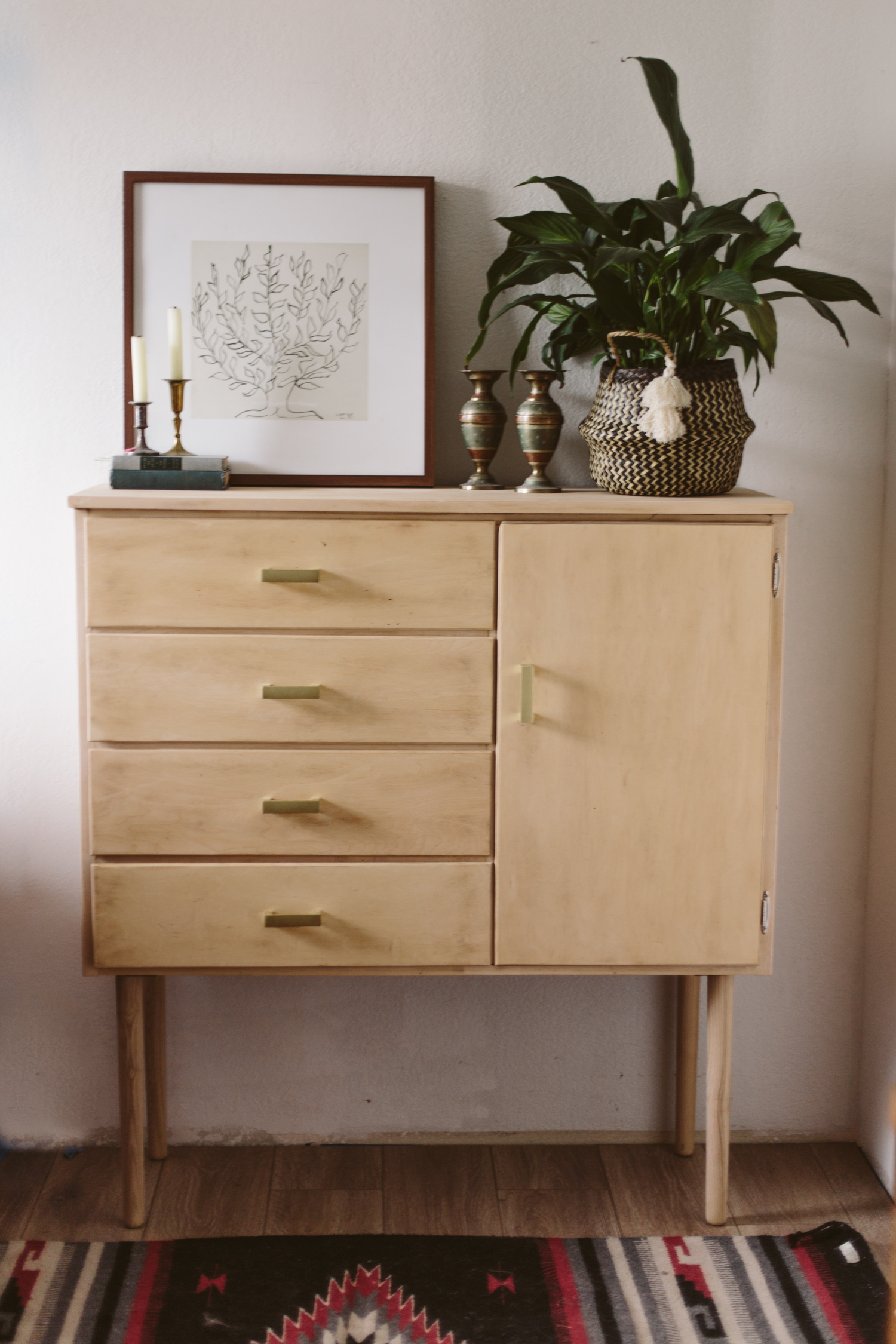
After we moved into the new house I was looking for a dresser for Dan because the closet space isn’t huge. I knew I wanted something kind of modern, kind of scandinavian, but also affordable. Buying anything new that fit those descriptions seemed nearly impossible. I could get the first two, but nothing that fit my (real low) budget. So I decided to hit the thrift stores and see what I could find. I ended up getting this old dresser for $25 and promptly started refinishing it!

In the Before image I’ve already removed the old hardware that was just plain and dated, and I’d removed some of the drawers to start sanding. The door’s hinges broke off when the gal was wheeling the cabinet out to my car and she hit a pot hole, so that’s why the door is sitting on the ground, but replacement hinges were easy enough to find at the hardware store!

BEFORE

BEFORE

AFTER

AFTER

I had some long legs from Pretty Pegs for a bench project that I never ended up doing, but I loved the idea of adding a bit of quirkiness to a dresser with the long legs. I used a skill saw to cut off the bottom on the two sides that served as the old legs in order to give it a straight bottom to attach the legs to, but other than that, the only power tool I really needed was a sander and a drill. And man did I do some sanding. So. Much. Sanding. I used a belt sander for most of it, then used an orbital sander for some parts, and had to do hand sanding in all the crevasses.

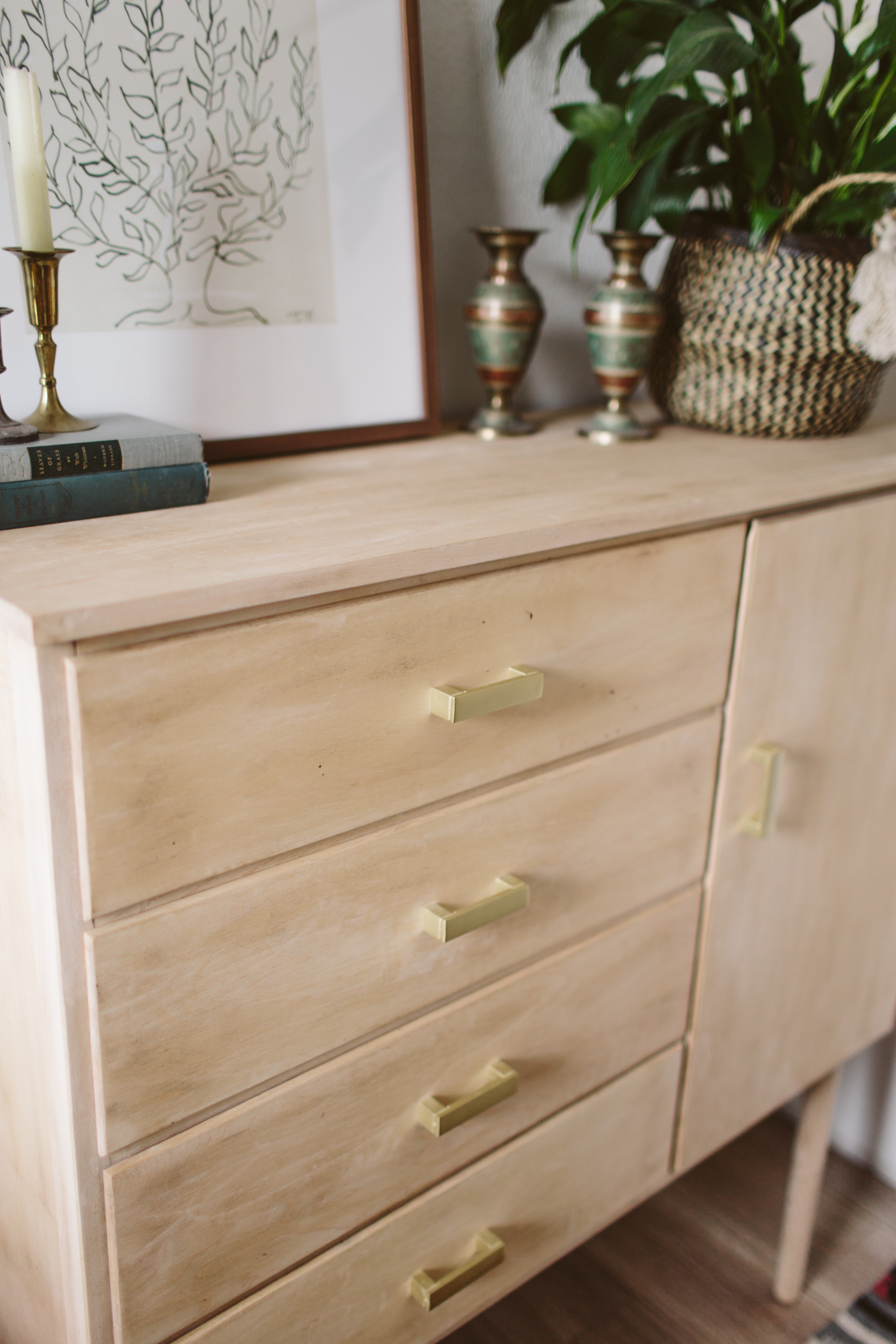
I decided to keep it unfinished because I liked the light, naked wood. I replaced the old dated drawer pulls with new ones, and then I added some shelves in the door space on the right because it previously held an odd slide-out hanging rod that didn’t seem practical for our purposes.

I picked up the drawer pulls from Home Depot and just made sure that they had the holes the same distance apart as the original ones so all I had to do was screw them right on, super easy update! And the Pretty Pegs legs came with brackets to attach the legs, so that was also a pretty easy update!

Since it’s relatively top heavy with the longer legs, I’m planning on attaching it to the wall with brackets, just so it doesn’t fall over with the drawers pulled out (or some crazy toddler decides it’s a good idea to climb up it).

Modern Dresser Revival

All in all, the project took 2, maybe 2.5 days from start to finish and here’s the breakdown on the cost:
Thrifted Dresser: $24.99
Drawer Pulls: $32.40
Hinges: $2.78
Legs: (c/o Pretty Pegs) $75

Adventures in DIY tiling

DIY kitchen floor tile

There’s not much I won’t DIY, and I’m usually pretty spot on in my assessment of how difficult a project will be but this kitchen floor has turned into a huge pain. And to be fair, I’m not feeling the pain of how annoying the install process is— Dan is the one doing the mortar and laying the tiles. But what we planned on being a weekend project has now entered the second week of having no functional kitchen, and I’ll tell you what: not having a range is a lot harder than I thought. I finally broke down and bought a microwave yesterday so we could at least have some home cooked food.

We’re probably about halfway done with the kitchen and the same tile will continue into the bathroom and in the laundry closet, so I’m thinking we probably have at least another week of doing tile, though we thankfully have laid the tile where the range goes, which means it will be able to return to it’s home and functional status in the next day or two.

Next up, I’ll be grouting the tile, which is perfect because it’s a great project for me to do while Jack naps. Even though I hate working with it, I decided to go with the Fusion Pro grout again, just because I don’t have to seal it or anything. And I think it’ll be less annoying to work with this time simply because I’m not doing a contrasting grout (last time I did black grout with white hex tiles). Since I wanted a concrete floor, I’m doing the grout in as close to the same color as the tile to give it more of a seamless look. But you know I couldn’t make things easy, so we’re doing a herringbone pattern. It’ll be more subtle since the grout won’t be contrasting, but I still think it’ll add interest.

Photo Jun 30, 5 19 40 PM.jpg

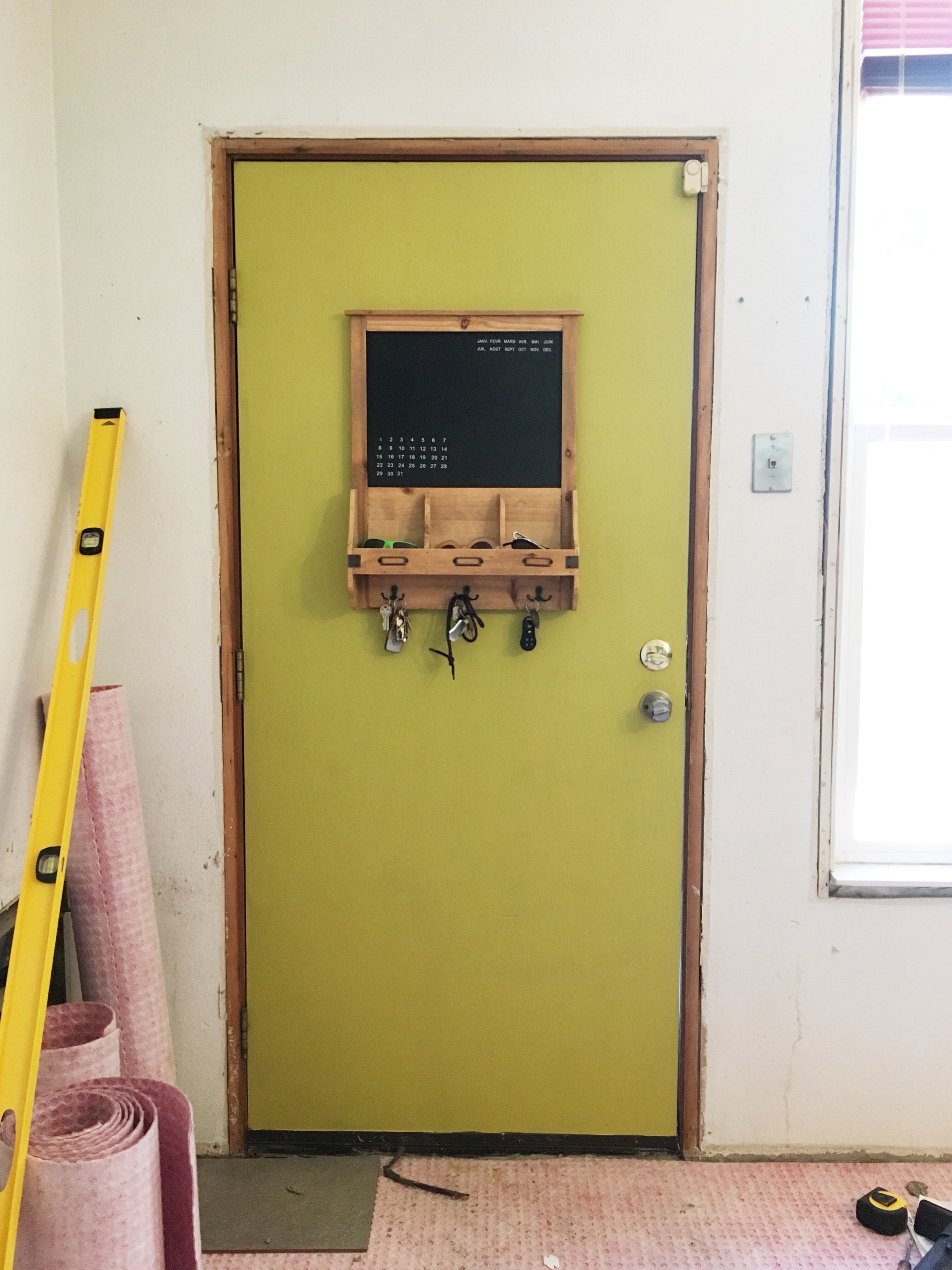
Ooooh, and peep that new light fixture too! In the meantime, you know I couldn’t wait any longer to paint something chartreuse in this house. This color is Lemongrass by Behr and It feels so happy! Even with no trim.

Chartreuse door

Project House Update No.1

IMG_0065.jpg

It’s been a LONG time since I did an update, and I could’ve posted some more over here in the prior months, most of it was just gutting the house, putting in new subfloors, and revising my design plan like 100 times. We ditched our original plan to add a bedroom and move the kitchen because it turned out to be out of our budget, so we’re doing a plain ol’ “lipstick flip” (as they say in the biz). So basically, keeping the original floor plan and just updating all the surfaces to be new and prettier. The original floorplan was not bad (minus the odd pony wall that separated the dining room and living room and broke up the whole flow of the space), so I’m not disappointed about the floorplan. The whole idea with adding a bedroom was just to add value to the home (3 bedrooms can fetch a higher sale price than 2), but you can’t add any value if you go over budget, so we scrapped my grand plans and went back to basics.

The other change in plans: we are now living in the house! I’ve mentioned it before in my post about #thebravehouse becoming an Airbnb, but we decided since we have two houses, it makes the most financial sense for one of them to be generating cashflow or at least paying for it’s mortgage and utilities. So even though we’re living in an unfinished house and all my socks have sawdust stuck to the bottoms, I’m very happy to a.) be spending SO much more time with Dan (he used to go straight from work to the house to work on it, then come home, go to bed and repeat. Needless to say, this girl whose love language is quality time was feeling a bit starved for our marriage to have time together), b.) be able to put in work on the house myself while Jack is either playing outside or in his room and during his naps, and c.) be generating an income with the other home I spent years crafting and curating!

IMG_3337.jpg

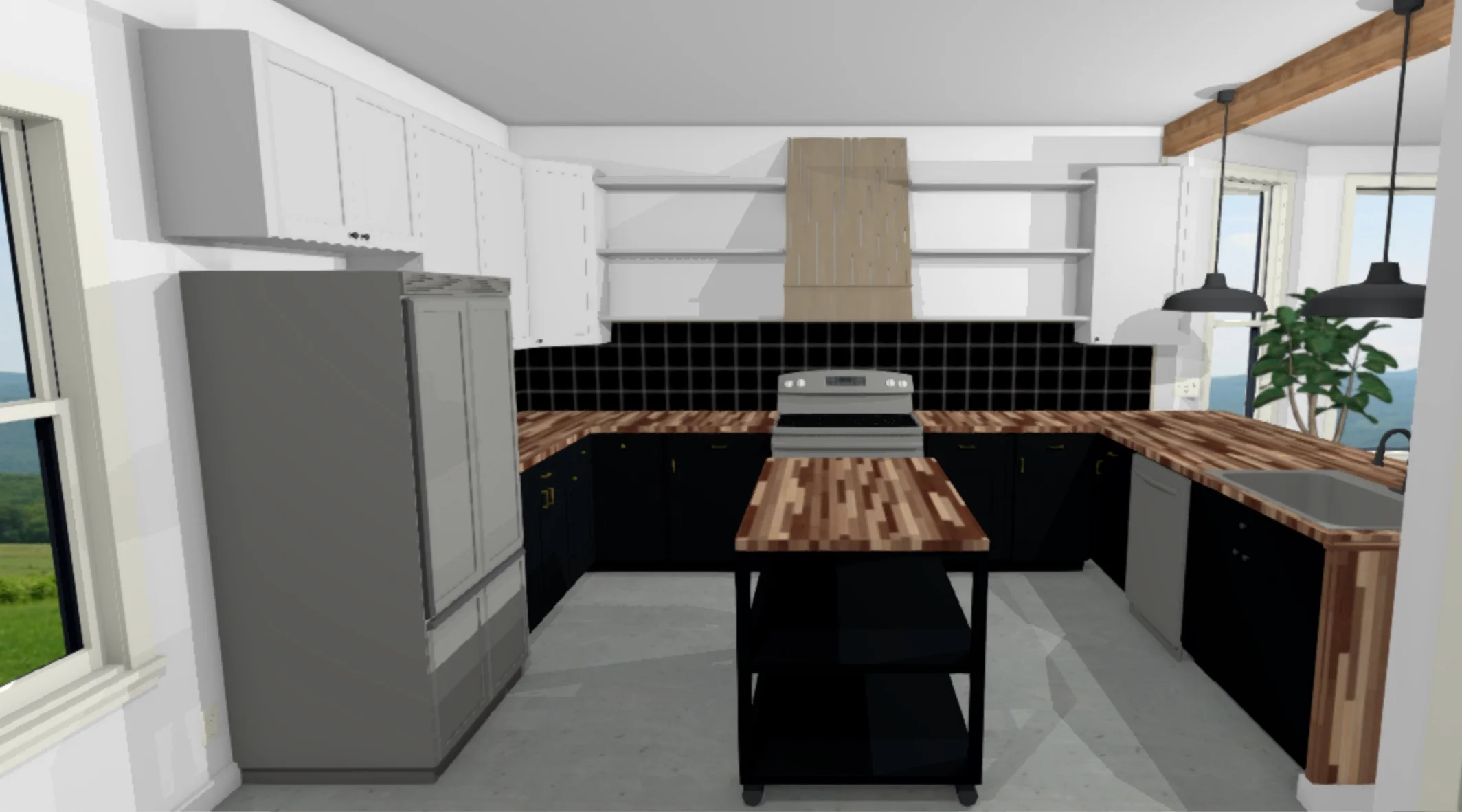
So as a little reminder: here is the original kitchen. This photo was taken the day we got the keys. The lower cabinets are the same, we just painted them black (Behr Broadway, the same color we have on the exterior, just in an eggshell sheen. Exterior is a semi gloss). We decided to get new uppers because I wanted them to be taller. The old cabinets felt too short and I wanted something that drew your eye upward and made the room feel taller. I have a couple more to put up, one over the fridge and one on the right side by that window, and then we’ll do a hood over the range and open shelving on either side of that, butting into the cabinets, like so:

melrose mockup.jpeg

We’re gonna pop an island in there because this kitchen is HUGE. The floor is going to be a concrete-look 12x24 tiles, and then I’m thinking of doing a black tile backsplash, which would definitely be a bold move, considering the cabinets are also black, but I definitely don’t want to do a basic white tile. After all the basic stuff is taken care of we can move on to more fun stuff like putting in pendant lighting over the bar/peninsula and replacing the gross fluorescent light in the center of the kitchen, maybe putting in some can lights for optimal light in the space, and wrapping the odd little beam above the peninsula so it looks more intentional and not just a weird bump on the ceiling. Oh and giving everything a fresh coat of white paint.

IMG_0066.jpg

We’ve got a lot of work to do. We definitely didn’t do this whole thing in the most efficient way and it’s been a huge learning experience, but we’re trucking along and chipping away at each project on our very long to do list.

Fresh & light-filled Kitchen Before + After

White natural kitchen remodel

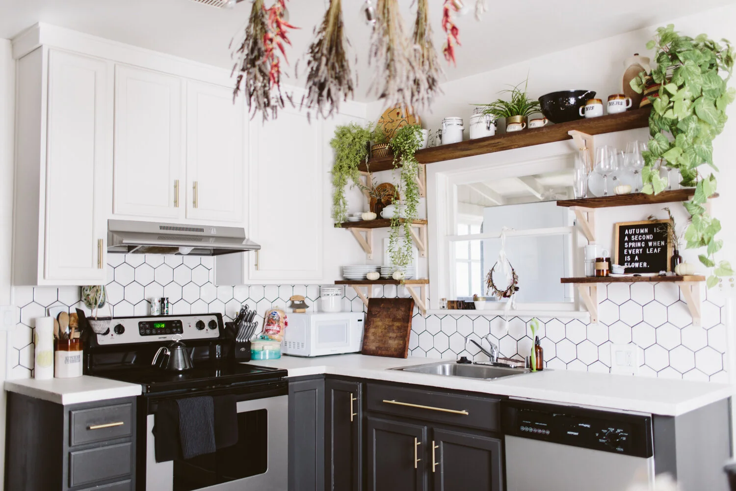
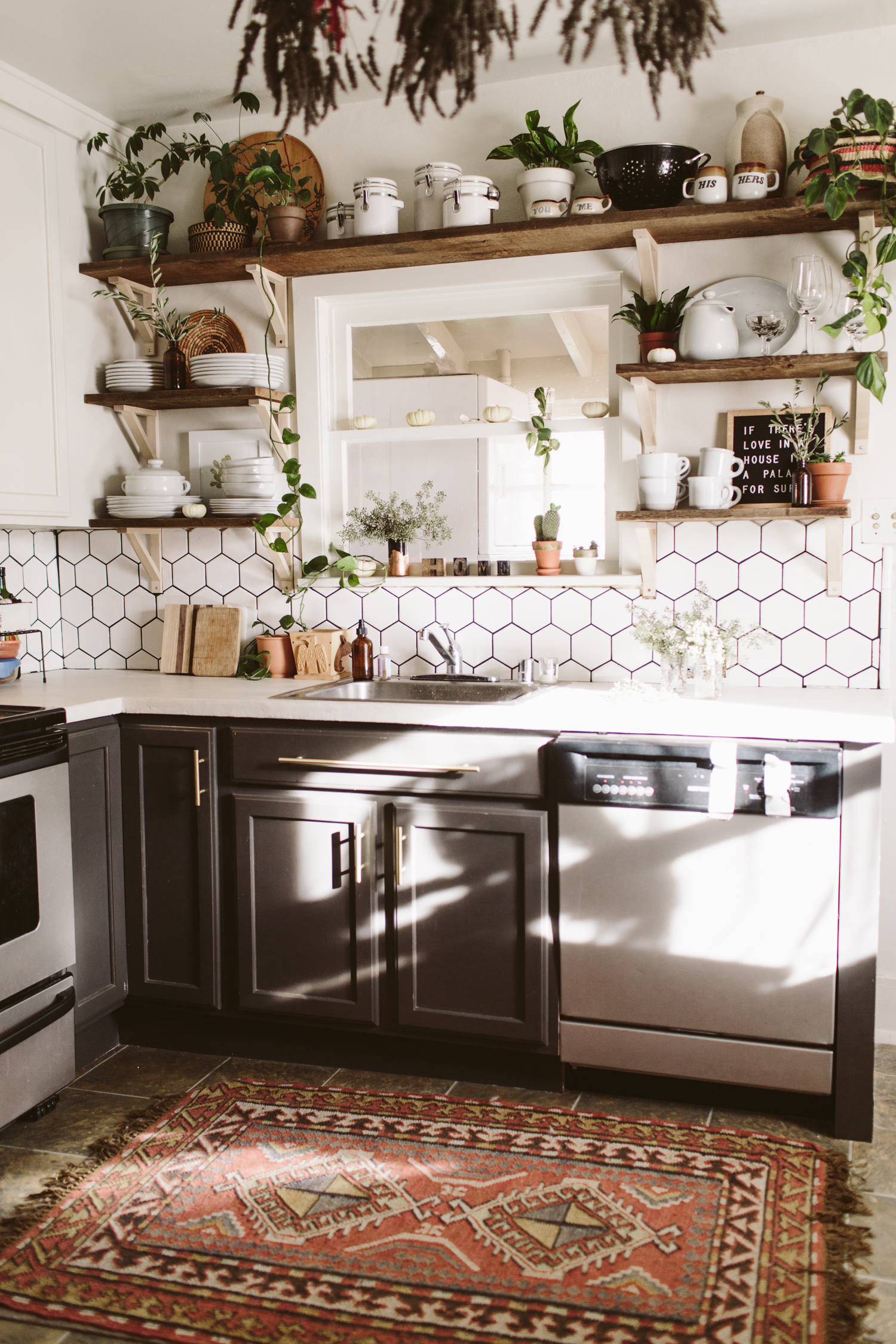
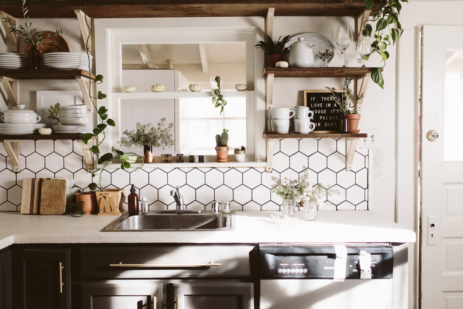
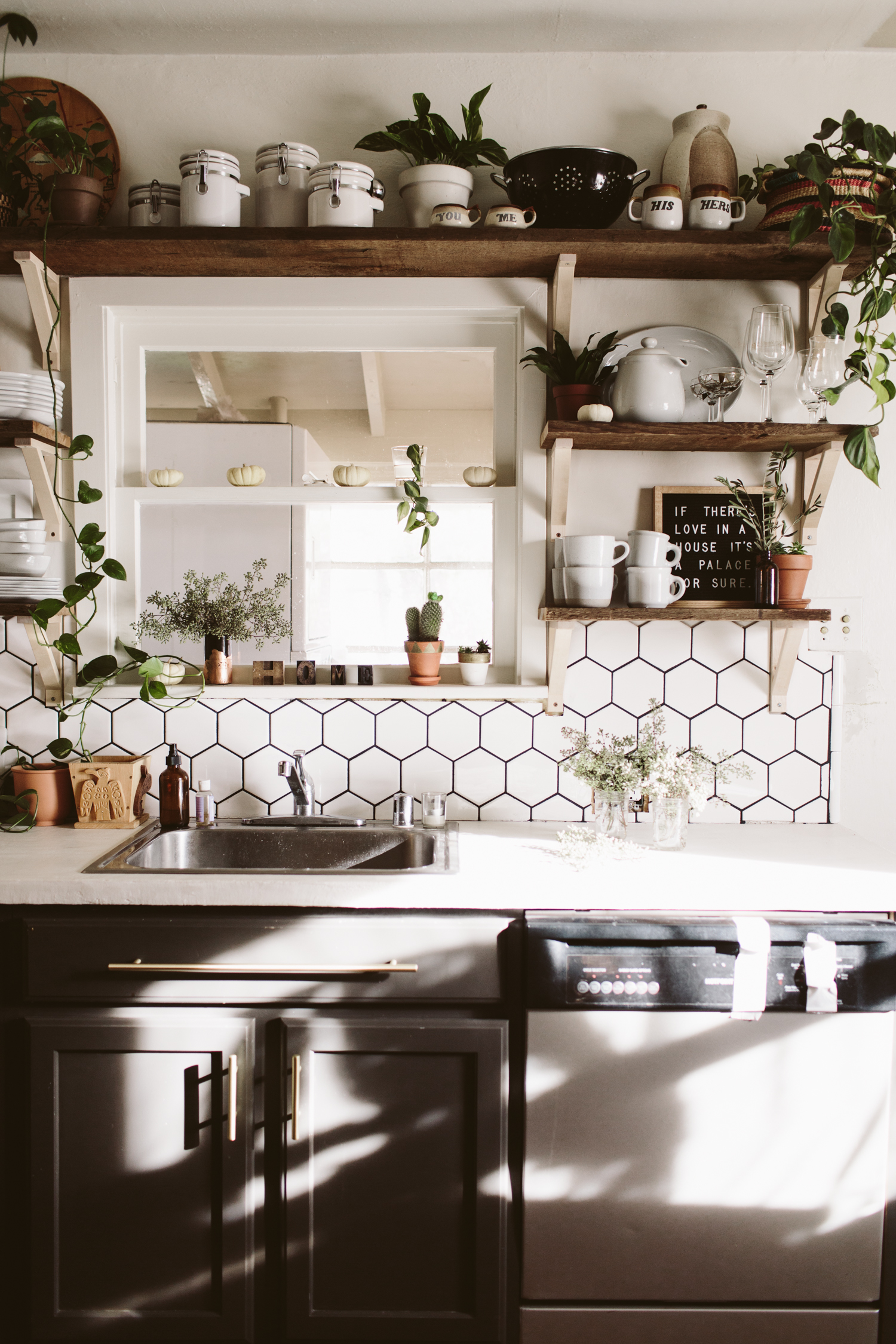
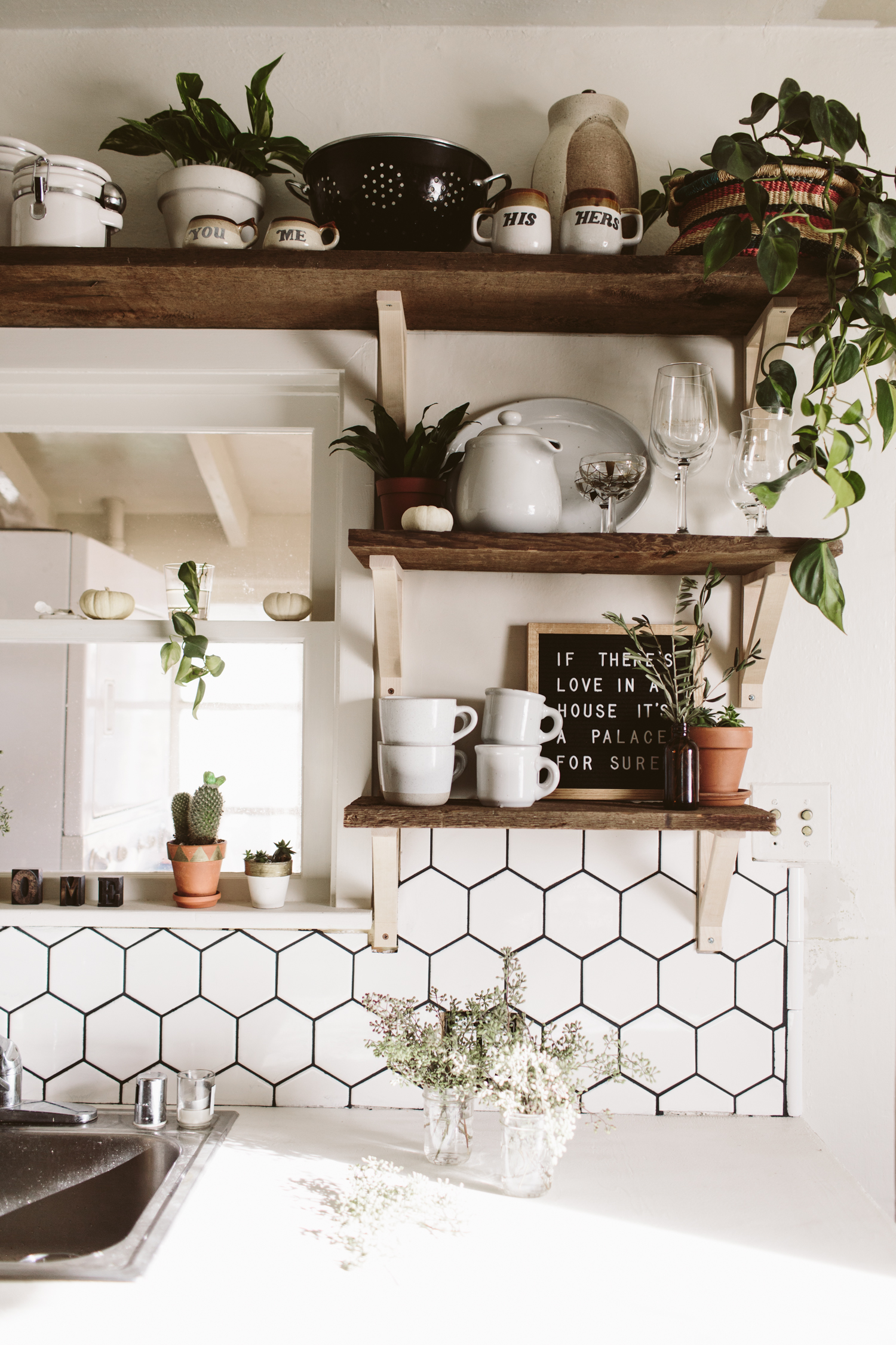
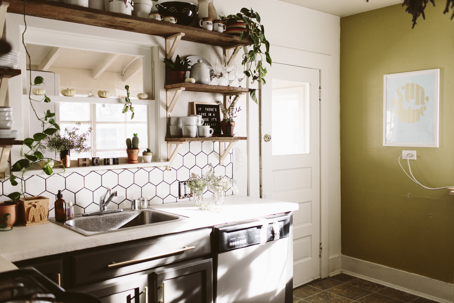
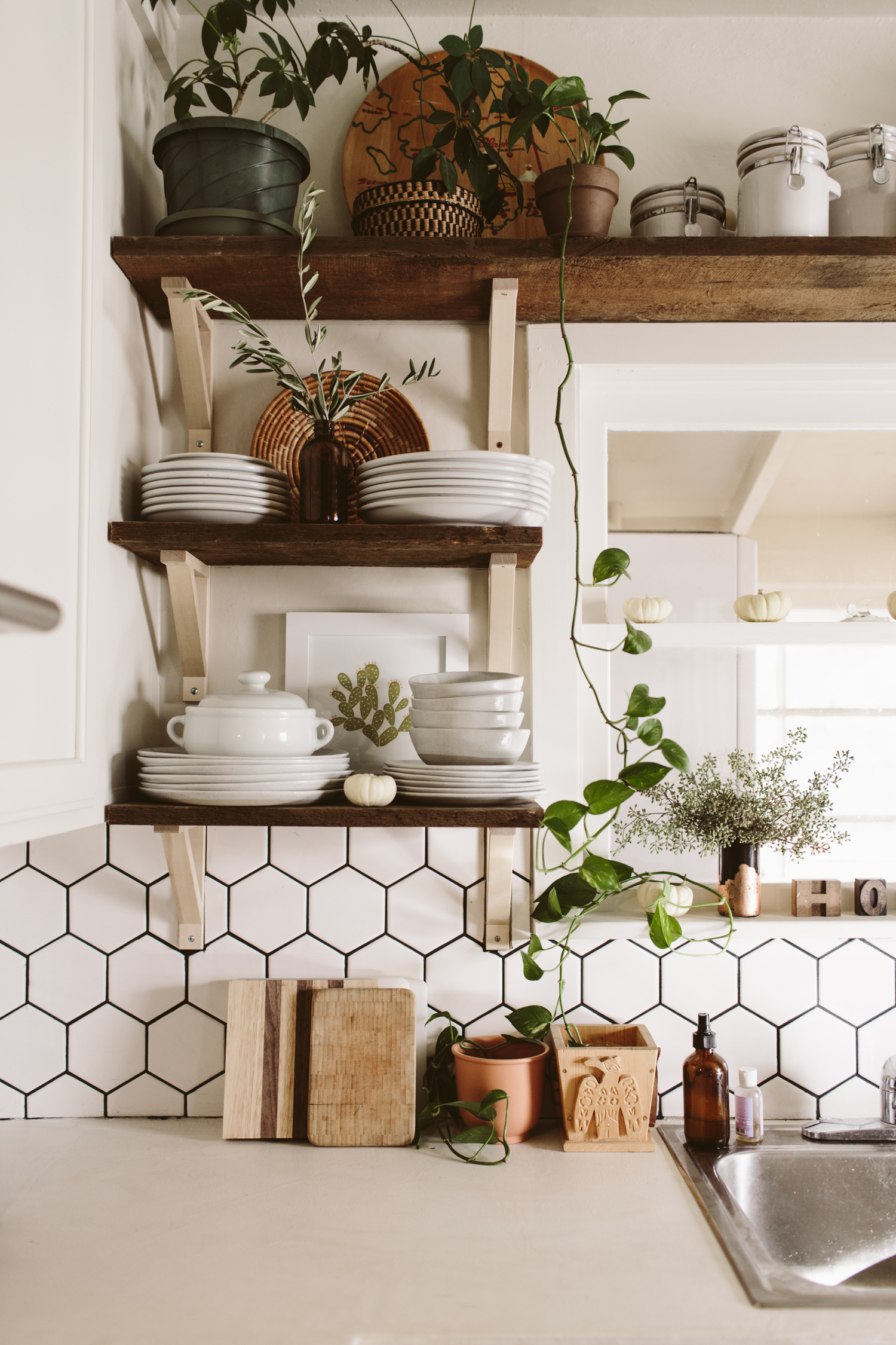
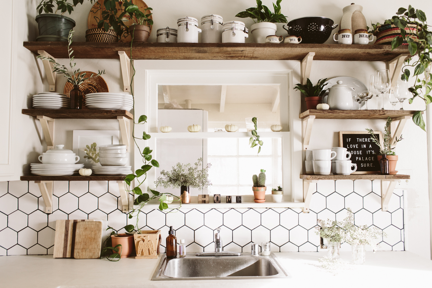
I still have a few odds and ends to button up on my kitchen remodel, but I grabbed these shots of the end result and I couldn’t resist sharing! (if you want to see my old kitchen before + after click here!)

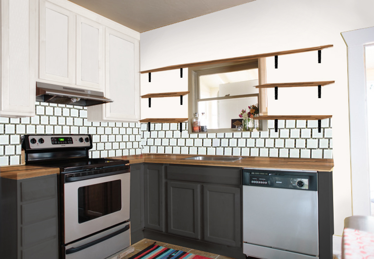
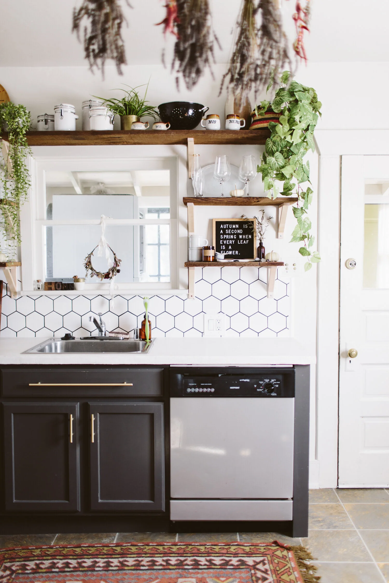
Below is the before, as well as my design plan. I ended up going with white concrete skim coat counters instead of the walnut butcher block which was my original plan. We simply skimcoated our existing formica counters with white concrete, which ended up being way more affordable, plus we wanted something durable and low maintenance, as we’re potentially going to turn this house into a rental in the near future. While I love me some butcher block counters, having something that needed regular upkeep and could get ruined by someone putting a hot pan on the counter seemed like not the best idea for a rental.

I took out the east wall upper cabinets and had to do quite a bit of wall repair, but it looks lovely now and I like how much more bright and open it is in here! The remaining upper cabinets I painted white (Glidden Cappuccino white, which is the white in my whole house), and the lowers were painted Behr Iron Mountain. None of the cabinets had pulls, so I added brass pulls from Target.

My original plan was to do white square 4x4 tiles in an offset subway tile pattern but I ended up going with hexagonal white tiles and I’m really glad I did, I love that they are white and neutral, but have a more interesting pattern than the standard subway look.

Anyway, scroll down to see the transformation and I’ll put links to the products I used at the bottom!

Dying to transform your own kitchen, but aren’t sure where to start, how to bring your vision to life, or need help figuring out how to make it all happen? I’ve got you covered! Head over here and let’s get started on working some design magic for you!


Want to recreate this design in your home? Get all the details and finishes on this design in my Design Kickstart! Moodboard, Budget Breakdown, and Source Links are all included so you can hit the ground running on transforming your own kitchen in to a bright + fresh space.


You may also like: