Interior Design

Kitchen Mural Reveal

IMG_1495-Edit.jpg

After I built out this laundry room in the awkward corner of our kitchen, I knew the wall wanted to have some kind of statement on it. But dang did it take forever to figure out what that statement was going to be. This design was actually inspired by a tile design where each square tile had a quarter circle on it, when meant you could completely customize the design. So I pulled a pic of this spot into photoshop and played around with quarter circles until I landed on something that felt good.

But my favorite element came later. I had been seeing this orange color around and I knew I wanted to incorporate it into the house. My original plan was for the french doors to be painted black, but then a bell went off in my head and I knew they had to be orange. I grabbed a paint chip (which ended up being the exact same color as Home Depot’s signature orange, haha) and bought a little paint sample (a paint sample size is usually enough to paint a door— and they’re only a couple bucks!). A few hours later the doors were orange and it MADE the space.

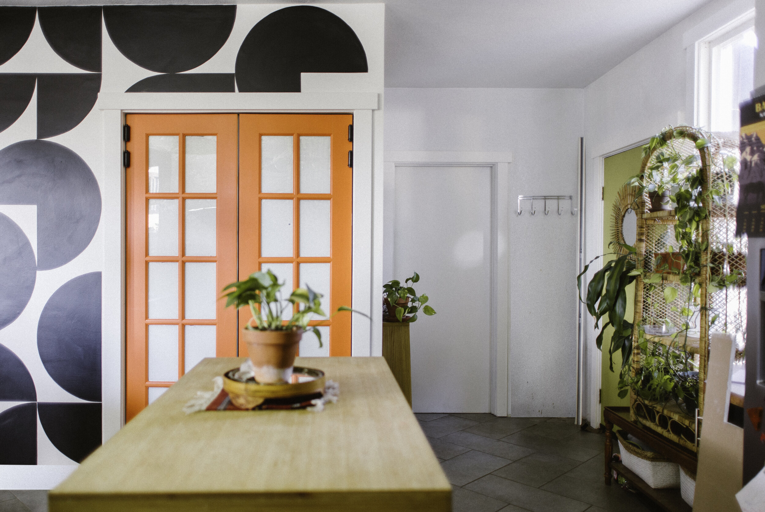
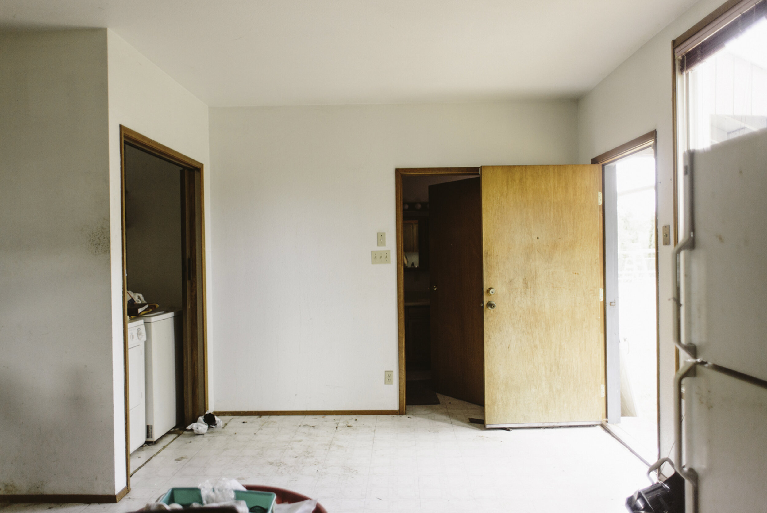
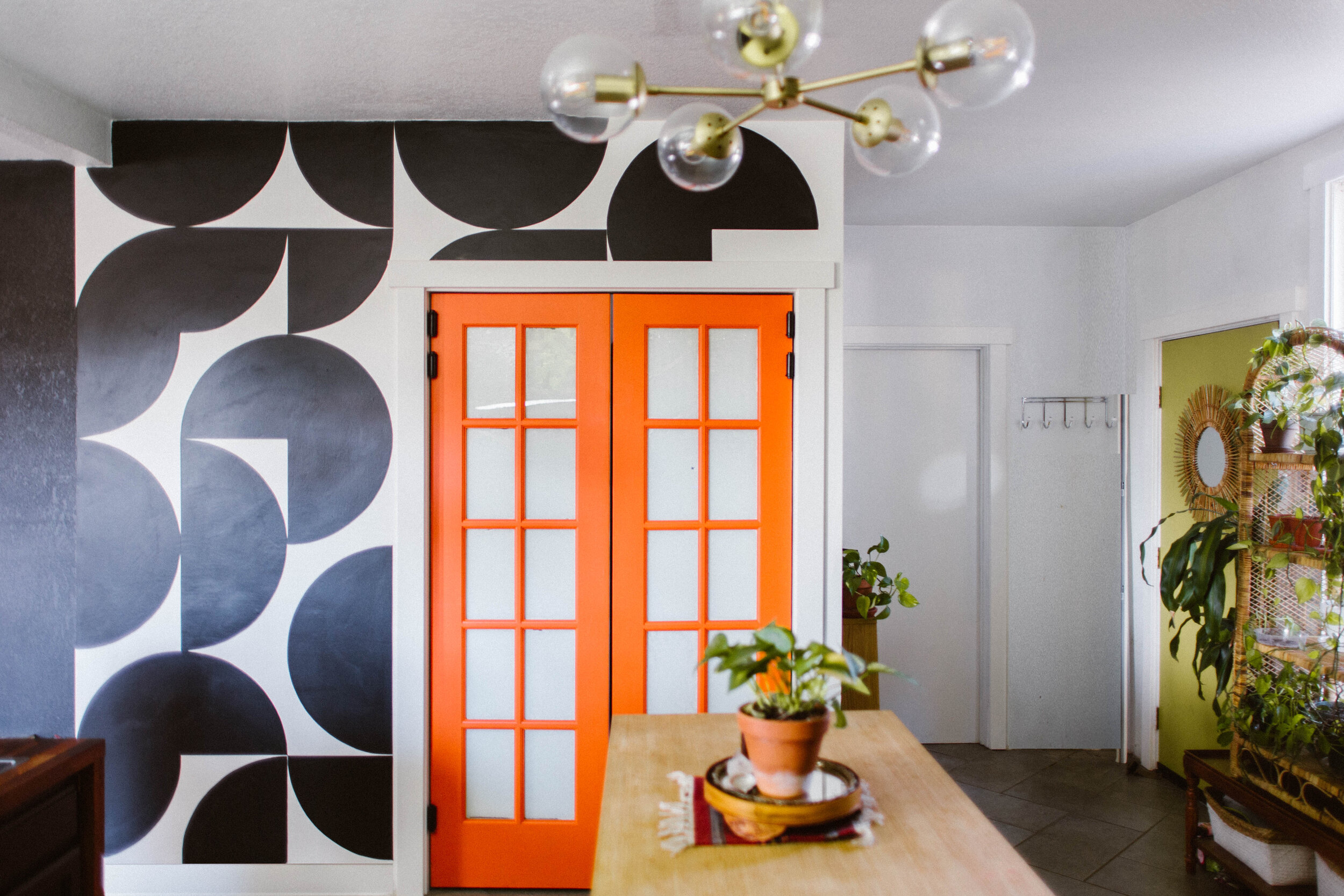
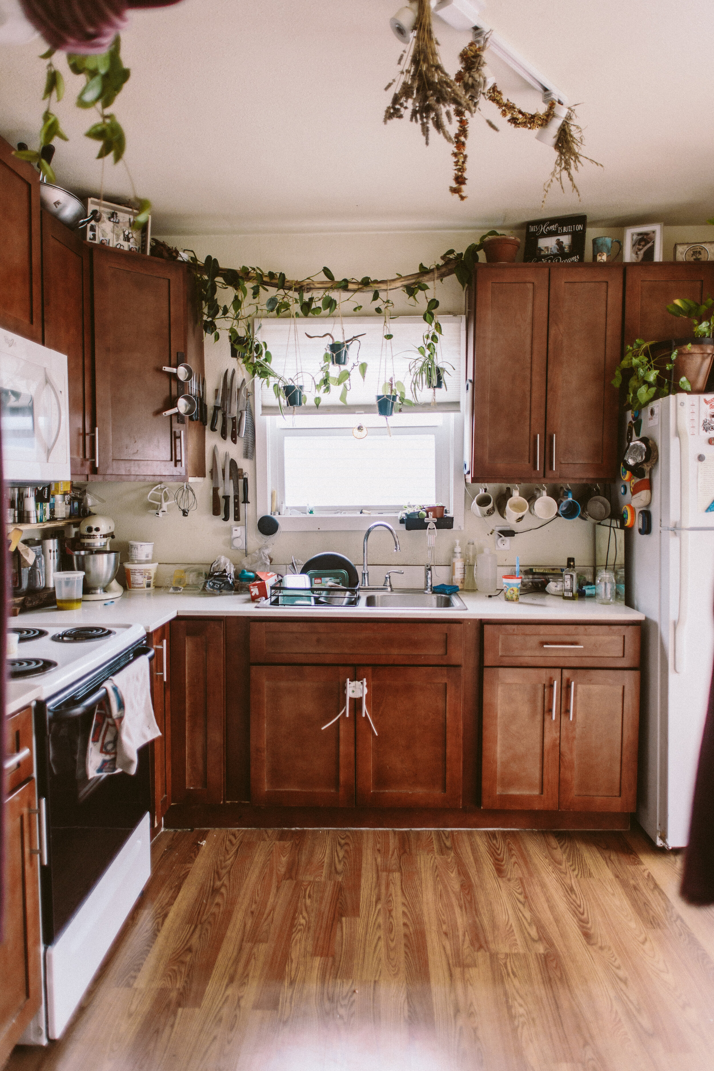
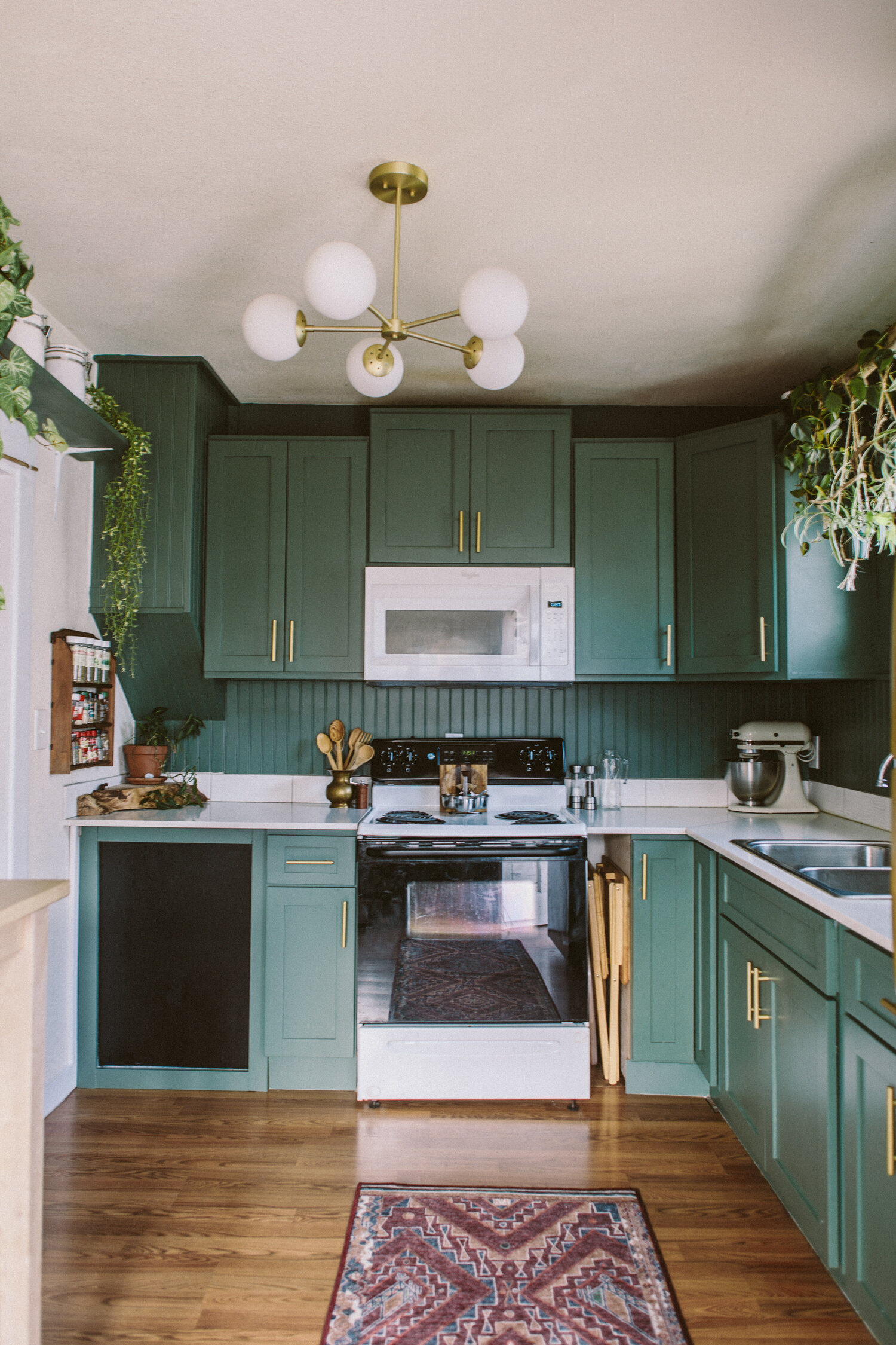
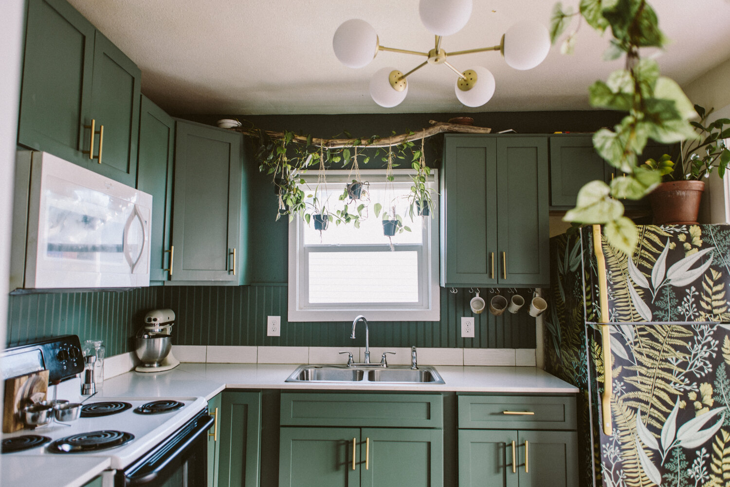
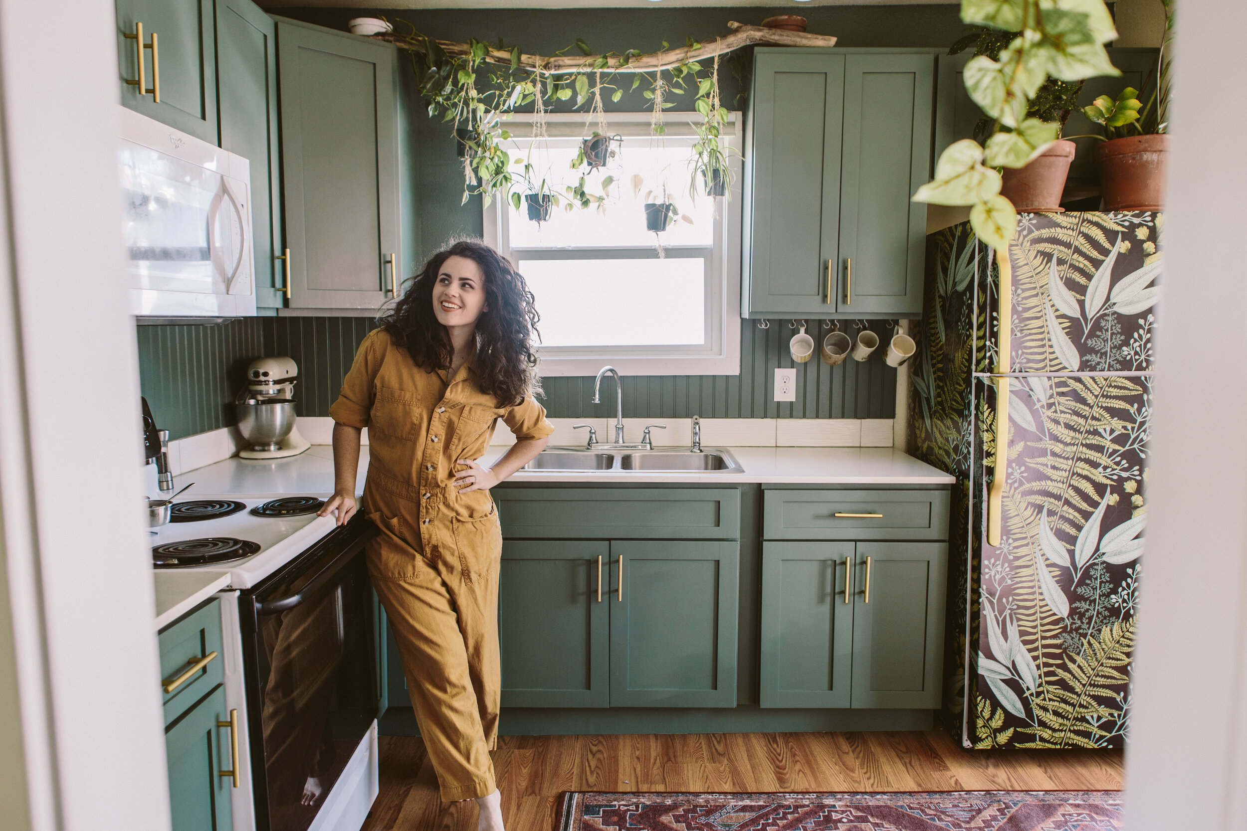
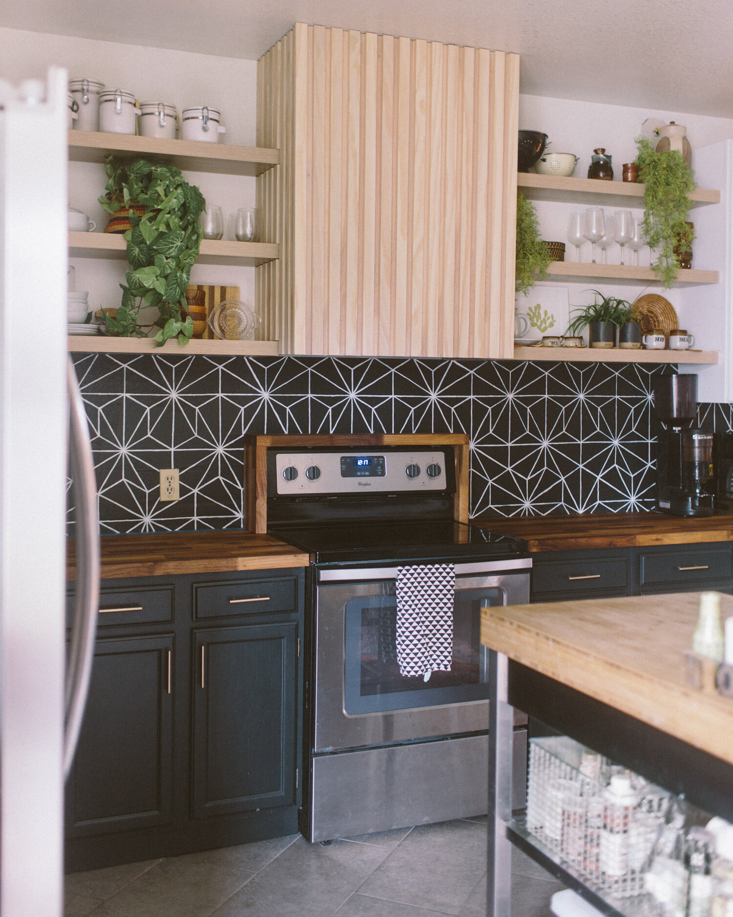
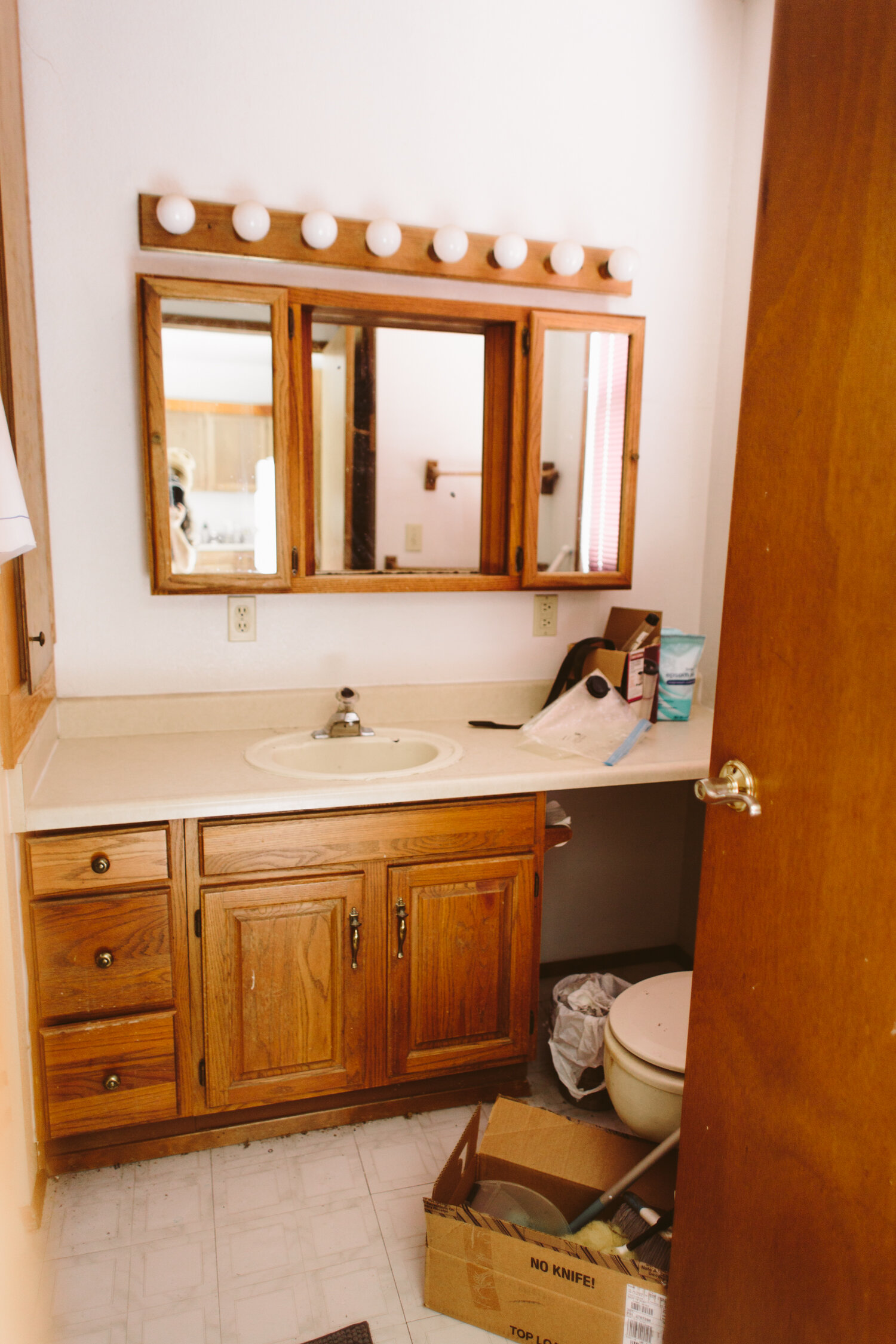
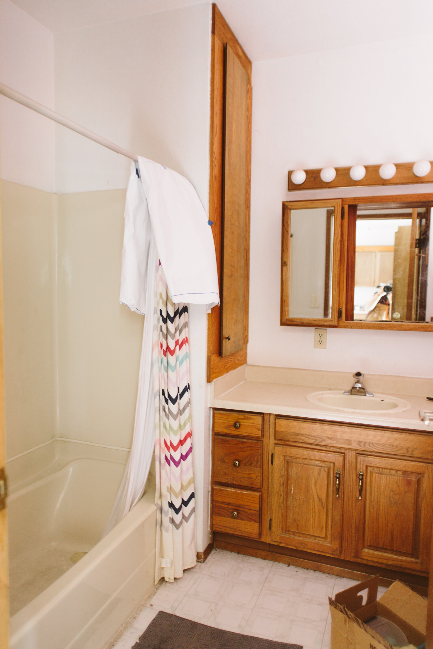
It’s so wild to look at the before pic and see that sad corner with the laundry closet. The space planning in this house by whoever built it is down right bananas, folks. Like… was that supposed to be a breakfast nook? It didn’t feel big enough for a table there, but it’s still a lot of square feet of wasted space. Now we have a laundry room with added cabinetry for storage, a more defined rear entry area for dropping keys, coats, etc, and they functionality and flow through the space isn’t impacted whatsoever.

Now… I just have to finish the final details on the inside of the laundry room…

Botanical Kitchen Revival: A Rental Kitchen Makeover on a Budget

IMG_0133.jpg

Transforming any space is fun, but transforming your lifelong BFF’s space is a special kind of fun. When Frogtape reached out to me to see if I’d be interested in being a designer for their annual Paintover Challenge, it came at the perfect time. My friend, Kristina, had been talking about wanting to update her kitchen in the rental home where she lives with her husband and son, and I instantly pitched her the idea of doing the paintover challenge in HER kitchen. We talked to her landlord, who gave us the greenlight for the proposed changes and we got to work!

This makeover was primarily achieved with paint, with some honorable mentions from a few other design elements. I traded out the old overhead track lighting for a pretty new light that not only looked gorgeous, but offered way more illumination (which is a godsend come those dim PNW winter months). In lieu of taking out the meager tile backsplash and doing new tile (which probably would’ve required some drywall repairs, and a significant budget bump) I opted to keep the existing strip of tile, and add beadboard on top to fill the blank space between there and the bottom of the wall cabinets. Then, we painted it the same color as the cabinets and the walls, for a delicious tone-on-tone vibe. This basil color is super pretty, it feels lush and sophisticated.

2before.jpg
2after.jpg

The big, unexpected showstopper ended up being her basic old fridge, transformed with a bit of removable stick-on wallpaper! Since we kept the existing cabinet hardware and painted it brass to match the light fixture, we did the same with the fridge handle to tie everything together. I used Rustoleum Vintage Gold spraypaint to paint both the cabinet door pulls and the fridge handle.

Another thing we did was add a whole wall of open shelving to give her a ton more storage. We painted those shelves the same green as the rest of the kitchen, but kept that wall white to give some contrast. Now she has a bunch of space to store all her pretty jars of dry goods, cute mugs and, of course, more plants.

And one more fun little detail: we put a chalkboard area in for her toddler to use! That panel is access for the water heater, so it was just an unfinished wood panel before, so we framed it out to match the shaker style of the cabinets and did the center panel in chalkboard paint so he could draw and have fun!

Projects like this have all the elements of what makes me most excited about design and remodels. Making a huge impact for not a huge amount of money, coming up with creative solutions, and doing really fun and out of the box elements (I’ll never get over that fridge).

I’m so thrilled that Frogtape brought me in on their Paintover Challenge this year so I could do this amazing project!

YOU MAY ALSO LIKE:

DIY Painted Faux Tile Backsplash

IMG_0046.jpg

My ultimate plan for our kitchen backsplash involves a gorgeous black zellige tile, but I knew that it would be a while until we got that tile project underway. In the meantime, I decided to have fun with a hand-painted backsplash that gave the effect of a faux tile look. I absolutely love how much depth the dark backsplash adds to the space!

Hand painting isn’t for everyone and there are other affordable but less tedious and time-consuming ways to upgrade your backsplash, like stick-on tiles, removable wallpaper, and paint stencils. You can even get a stencil that mimics this hexagon design!

For my process, I used chalk to trace the hexagon shape onto the wall, then used a straightedge to draw the lines inside the hexagons with chalk. Once that template was on the wall, I used a small craft paintbrush to paint interior latex paint along those lines. Definitely tedious! But I did this in the midst of the post-election madness and a tedious project that needed a lot of focus what a pleasant distraction, haha.

IMG_0068.jpg

Eclectic Modern Bathroom Remodel

IMG_0157.jpg

This before and after still rocks my world a little bit. Truth be told it’s not a true after, there are still projects to be done in here. but, I mean, come on. Are these two rooms even the same?! It’s wild. The layout for this room is strange. I’m really not entirely sure what the person who laid out this space was thinking, but gutting it and rearranging just wasn’t in the budget.

We kept pretty much everything and just reworked it. The vanity is the same, but I put new slab doors on, sanded down the original vanity to its natural oak and then whitewashed it to keep the modern light look that the raw wood had (putting poly over the raw wood would have turned it back into the ugly orangey color of the original bathroom— no thanks!).

For whatever reason, the old vanity had a strange vacant cavity next to the cabinet under the counter. What went there? Who knows. Probably just cobwebs and grime. I added some open shelves there which are perfect for holding baskets with hair product (curly girls represent!), and the bottom shelf is the perfect spot for extra TP rolls.

The large linen closet storage on the left side of the vanity got a slatted upgrade, I just refinished the existing door and trim the same way I did the vanity cabinet, and then added oak slats.

This bathroom is not hurting for storage so the massive medicine cabinet mirror was absolutely not necessary. a streamlined simple brass mirror took it’s place, and the sorely dated vanity lighting got a midcentury modern upgrade.

Dingy white walls be gone! I did a textured wall treatment, giving the walls a plaster-y look to remove the dated orange peel texture, and then painted a moody blue-ish green-ish teal, Valspar’s Everglade Deck.

Obviously the showstopper of the space is the stunning cement hex tile from Riad Tile. I’ve eyed so many styles from Riad for years and this large wall behind the vanity basically begged for a statement wall. I’m absolutely obsessed with how this tile completely transforms the room.

And to replace the old formica counter, we did a poured concrete counter! This whole space was a DIY update, and we did everything we could to do budget friendly updates, use what existing elements we could, and worked around the layout so we could create the maximum update for minimum cost. I did pretty much everything myself, except the poured concrete counter and the floor tile, which my husband took on (though I did cut the floor tile, so we’ll call that one a joint effort).

If you want to see the before images, scroll down!

We’ve got some other big projects in the works so this space is basically on hold for now. It has an ugly ivory fiberglass tub/surround which desperately needs to be replaced, but it works fine and I can hide it behind a pretty shower curtain, so for the time being it stays. A pretty white tub and tiled surround will happen someday! In the meantime, I just bask in the glow of the tile wall.

tile c/o Riad Tile

Rustic Industrial Bathroom Design

Photo Dec 31, 8 34 49 PM.jpg

Favorite client project of 2020 goes to: this bathroom! It was a small en-suite bath off their master, which had been poorly DIYed by the previous owners and just wasn’t very functional or stylish. Since the space was small we were able to make some really bold choices and elevate the space to a rustic, eclectic modern vibe.

One of my favorite elements that really gave the room a level up was doing floor to ceiling subway tile on the walls of the bathroom in addition to the shower. It’s classic and brightened up the whole space. We grounded the room with large black hex tile, and gave depth and warmth to the space with a gorgeous wood accent wall behind the vanity and toilet.

I’m obsessed with the shower door and I almost feel like that piece is one of the biggest game changers in the space. The old shower was tiled with large, dark grey tile, and then instead of a glass door, there was a shower curtain, basically turning the small 3x3ft shower stall into a claustrophobic dark cave. With the glass shower door, we can now get the natural light from the bathroom window, as well as the bathroom lighting, to illuminate the shower and help the smaller space feel much larger.

I’m super in love with the design we came up with and couldn’t be happier with how it turned out!

completed design photos by Michelle Baldwin