Learning how to create beautiful mood boards and project mockups is a great way to not only gain clarity on your own personal projects, but offer visual proof of concept of projects for clients, if you’re a designer, or potential sponsors, if you’re a content creator. While I love to create mockups for my own projects in order to feel out colors and design ideas, they also are a perfect thing to send alongside a pitch to a brand when I’m seeking a sponsorship. I find they are a great way to test out different paint colors or wallpapers, and get a feel for how something will look IRL. I generally like using image based mockups using actual photos of the space better than doing 3D computer renderings because they feel more real to me, especially if you’re keeping the existing structure of a space and aren’t moving walls or anything that would be more difficult to adjust from a photo. Mood boards are a great starting place for putting together a general design vibe, to see how different colors and textures will look together.
There are other programs besides Adobe Photoshop you can use to create mood boards and mockups, like Canva, but I’ve been using photoshop since 2004 and have never used Canva, so this tutorial will use Photoshop, however the same principals would apply to any program you use, the tools just may be different within different photo editing applications.
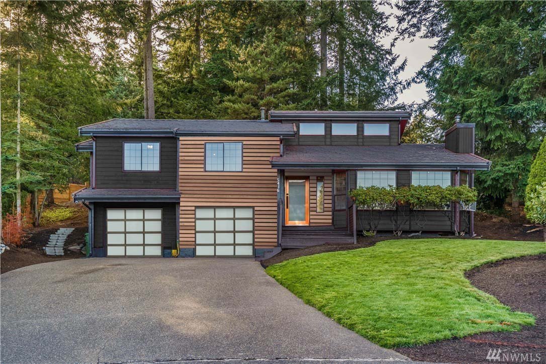
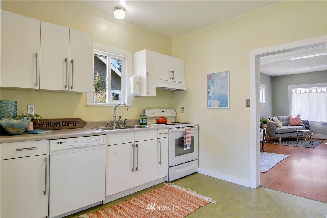
I find that, if you have access to them, the real estate photos of your space can be really nice to work with because they’re generally taken when the space is empty or very clean, so you don’t have to edit around a bunch of furniture or the clutter of daily life. But if you don’t have access to those images, you can start with images you take yourself.
The tools I use the most to create mockups are the background removal tool and the distort transform tools. The background removal tool is nice because you don’t have to remove the background of what your adding to the space. I grab a lot of product images from online to use in my mockups, and those generally have white backgrounds, which is easy to remove.
The distort transform tool is how you’ll fit that product image to your background so it matches the perspective of the space. It sometimes takes a little playing around to get things to feel cohesive, perspective-wise.
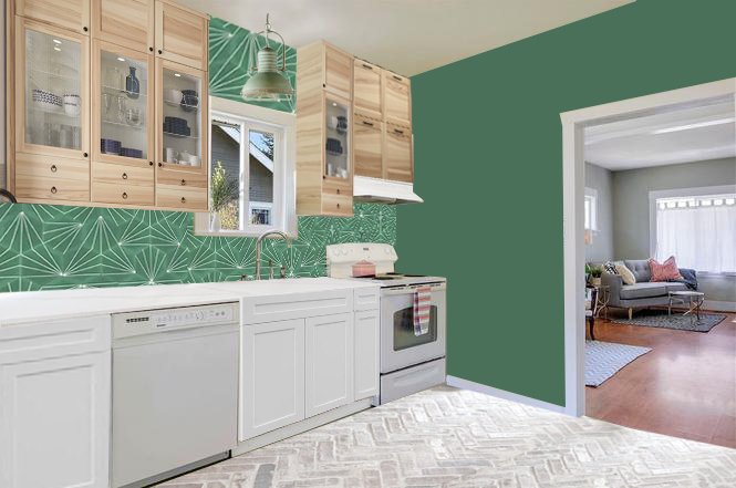
The other tools I use a lot are the clone tool, and the polygonal lasso tool. For the above image, I used the polygonal lasso tool to select that wall around the doorway and then used my paint bucket tool to fill it in with green to “paint” that wall green. When I added the tile to the backsplash, I added the tile to the whole plane of that wall, then used my polygonal lasso tool to select where the cabinets were and deleted so that the tile only showed where the tile should be.
The clone tool is nice because you can fix spots, like in the deck mockup, I fixed the dead spots in the grass, removed junk like the wheelbarrow and hose, etc.
The below image is the same image as the empty one you see here. The ceiling, bookshelves, furniture, fireplace, etc are all added in photoshop!
Mood boards are much quicker to put together, you’re really just taking images and putting them together on one “page” kind of like how you would if you cut things out from magazines and glued them all onto a pieces of paper. The main tools I use for this are the background remover tool, or the magic wand tool (if the background remover tool doesn’t do what you’re wanting you can use the magic wand tool or polygonal lasso tool to remove the background by selecting and deleting). Then you just arrange and layer things how you want. I like to include some inspiration images of spaces as well, which helps tie everything together.
If you want to start making mockups and moodboards, start simple by changing the paint color of a wall! Something like the deck mockup has a ton of layers and is more involved, but starting simple by changing a wall color or adding a tile backsplash is a great place to practice using the different tools photoshop has!






![This print feels even more relevant today. We all joke about the dumpster fire of [insert year here], but the important message of this image to me is that *we persist* through the horrors. We stand, we fight— maybe for ourselves, maybe for oth](https://images.squarespace-cdn.com/content/v1/574dddd6d51cd4bc35c1609a/1730935170369-03GPKQ5NF73VAE65RHO6/image-asset.jpeg)

