Interior Design

Kitchen Remodel Plans!

kitchen remodel mockup

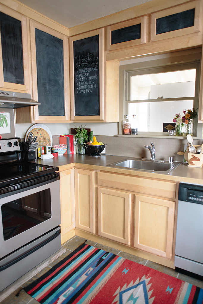
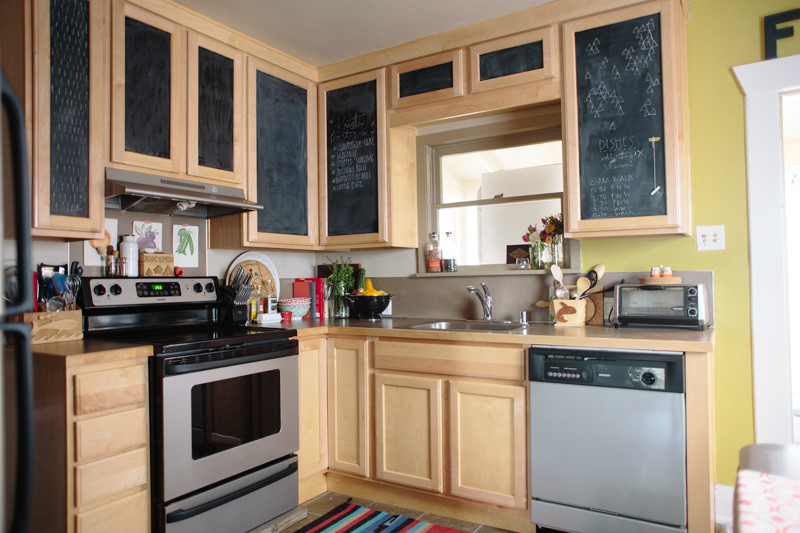
The Anchorage apartment kitchen remodel just got me even more excited about refreshing our current kitchen.  I've spent many a restless night remodeling this kitchen in my head. Ideally we'd open up the wall between our kitchen and living room to give things a bit more of an open concept feel, but we don't really feel like spending a ton of money on doing a big fancy remodel on this house's kitchen.  She's a small, modest house and dumping a ton of money into a kitchen remodel isn't' going to increase our resale value enough to offset the cost of actually doing it, so we're going to keep thing simple, i.e. not knock any walls down.

This kitchen was new-ish when we bought the house. Our best guess is that someone bought the house to flip, or was trying to renovate it and ran out of money.  The inside had new paint, refinished hardwoods, and the kitchen was new, but the exterior was horrendous (like, my insurance company refused to insure the house because of it horrendous).  So it's a quasi-cheap flip kitchen.  The surfaces are all nice enough, but with a few tweaks here and there, this kitchen could be a fresh and modern space.


The plan:

  • Take down the upper cabinets on the sink wall and replace with open shelving. Honestly, most of our upper cabinet space is just wasted space.  I'm too short to even reach 70% of the shelves, and we've got a built-in around the corner that can house the stuff that lives in them now. 
  • Paint her white.  I do love me some chartreuse, and having a bright colorful kitchen was nice, but I feel ready for a clean slate.  I'm sure some pops of bright color will find their way into my styling, but for this new look (and for resale, I hear chartreuse kitchens aren't most buyer's fave), white is gonna do the trick.
  • Tile that backsplash.  Goodbye nasty, weird, brown Formica backsplash.  I want to do square tile instead of the usual subway tile to give a little bit of a new take on a pretty played out (though still gorgeous) look. I'm sure white subway tile stock won't be dropping for some time, but I'm excited to try something a little different. For a bit of texture, I'm going to do dark grout instead of white.
  • Walnut butcher block counters. The counters are the same brown-ish Formica as the backsplash, and I'm so SO excited to get rid of them and replace them with beautiful wood counters.  I love a butcher block countertop.
  • Paint the old cabinets and give them some modern hardware. The remaining uppers on the stove wall will be painted white, and the bottom cabinets will be a dark charcoal.  None of the cabinets currently have any knobs or pulls (which is actually super annoying, but also great for keeping your baby from opening them), so I'd like to install some in a brass finish to add contrast.
  • We also might get a new sink, but that's not a must-have, but if we do, it'll probably be a white ceramic sink, second hand from a local building material re-store.

Hopefully everything will go smoothly, but this process will likely take a while, since I'll be trying to get this done with a toddler (do you start calling them toddlers when they start... toddling?  Cuz Jack is only 10 months but he's toddling like crazy, soooo baby? toddler? I digress). I think the first thing I'll start with will be painting the bottom cabinets because I don't have to do any demo to get that done. Wish me luck!  I'll keep you guys updated.

kitchen remodel before.jpg

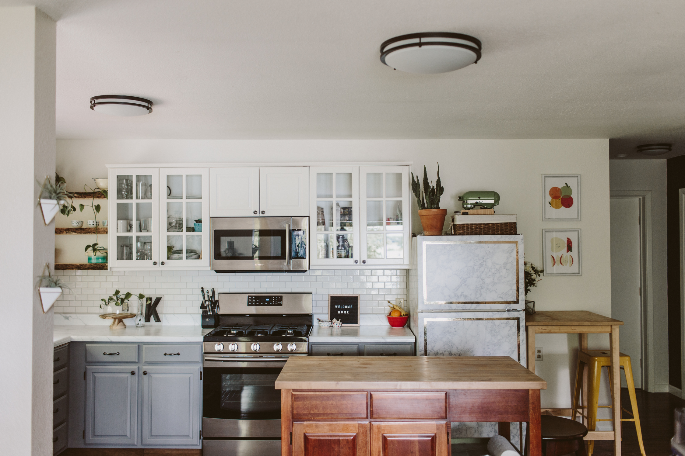
Our Apartment Kitchen Remodel

necklaces-3.jpg

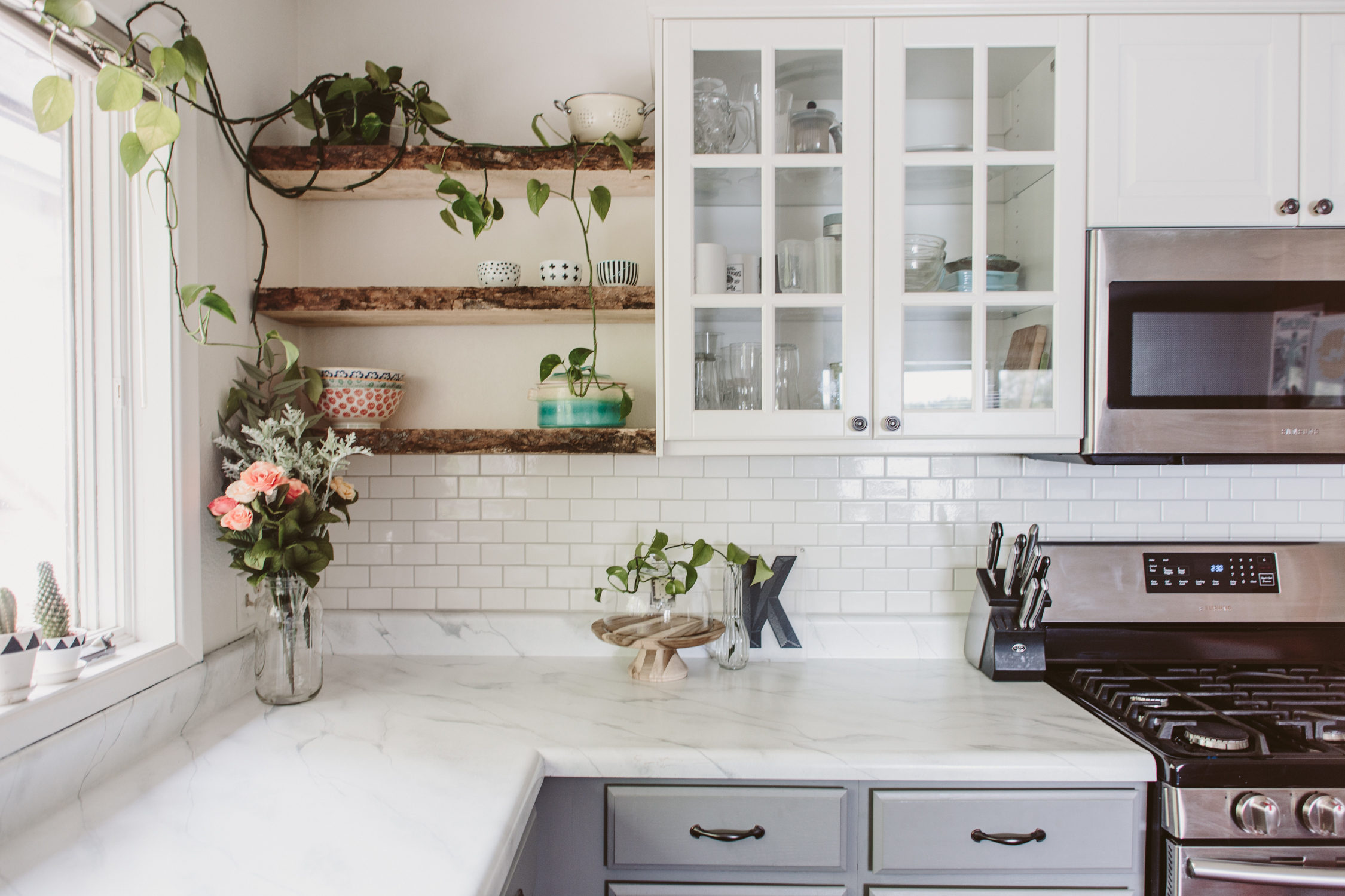
I'm gonna tell you guys something a little heartbreaking, right out of the gate.  This kitchen is now completely demolished.  We finished this remodel in June and by August,  this apartment was totally gutted by the new owners.  Moment of silence.  Okay, now lets get to it.

This apartment was above the garage of the house I grew up in, so I've been familiar with the space for many years.  It's seen a few small remodels, mostly paint, and a few years ago my parents put in new vinyl wood flooring.  Nothing about it was super special.  The cabinets were cheap, the countertop was dingy off-white formica, and the sink was designed with a sloped bottom so any time you set a glass in there it tipped over.  

We didn't want to spend a lot of money, so we didn't want to gut it and have to install new cabinets, counters, and fixtures.  We saved lots of money by DIYing a few things.

Kitchen Before 2.jpg
Kitchen Before.jpg

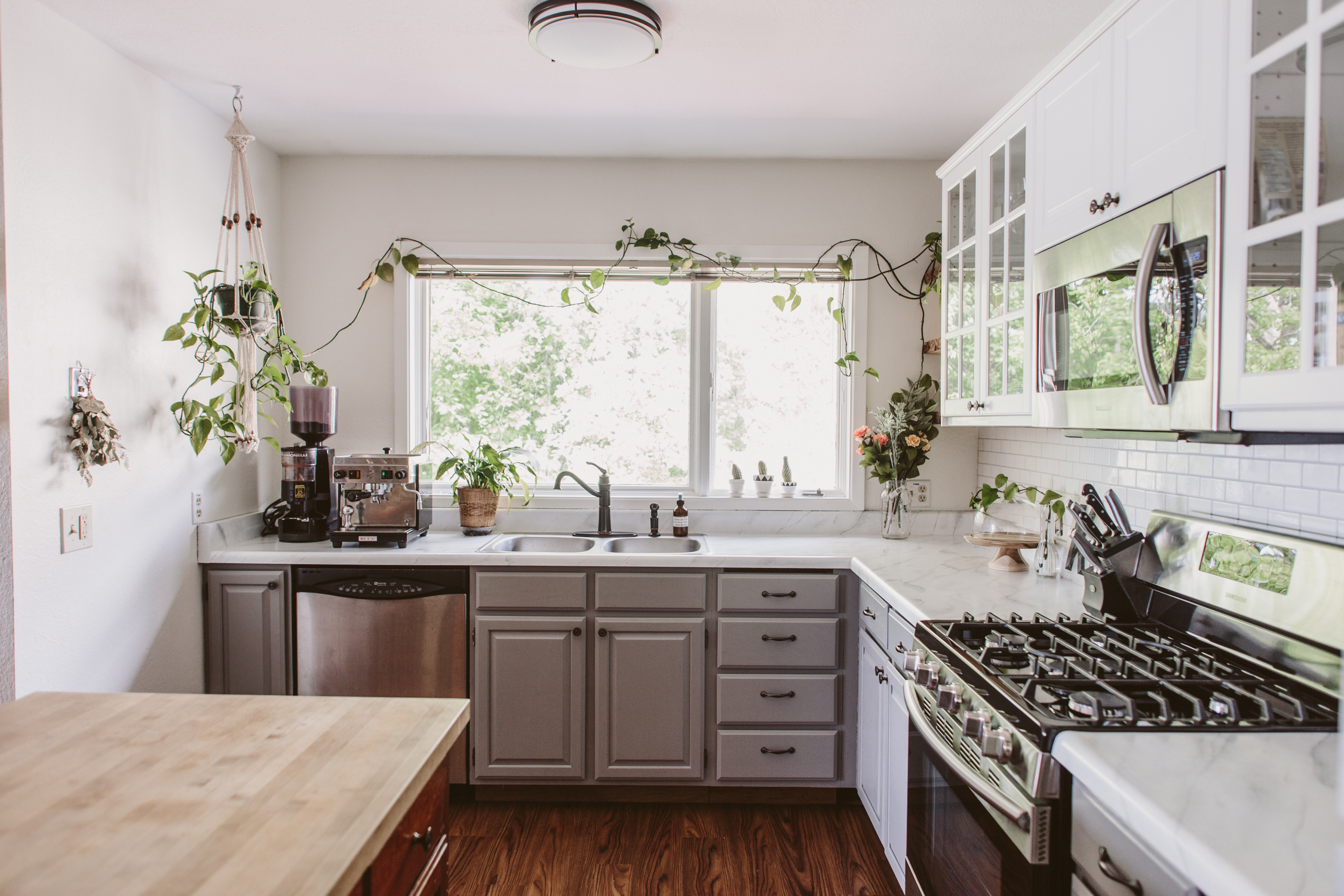
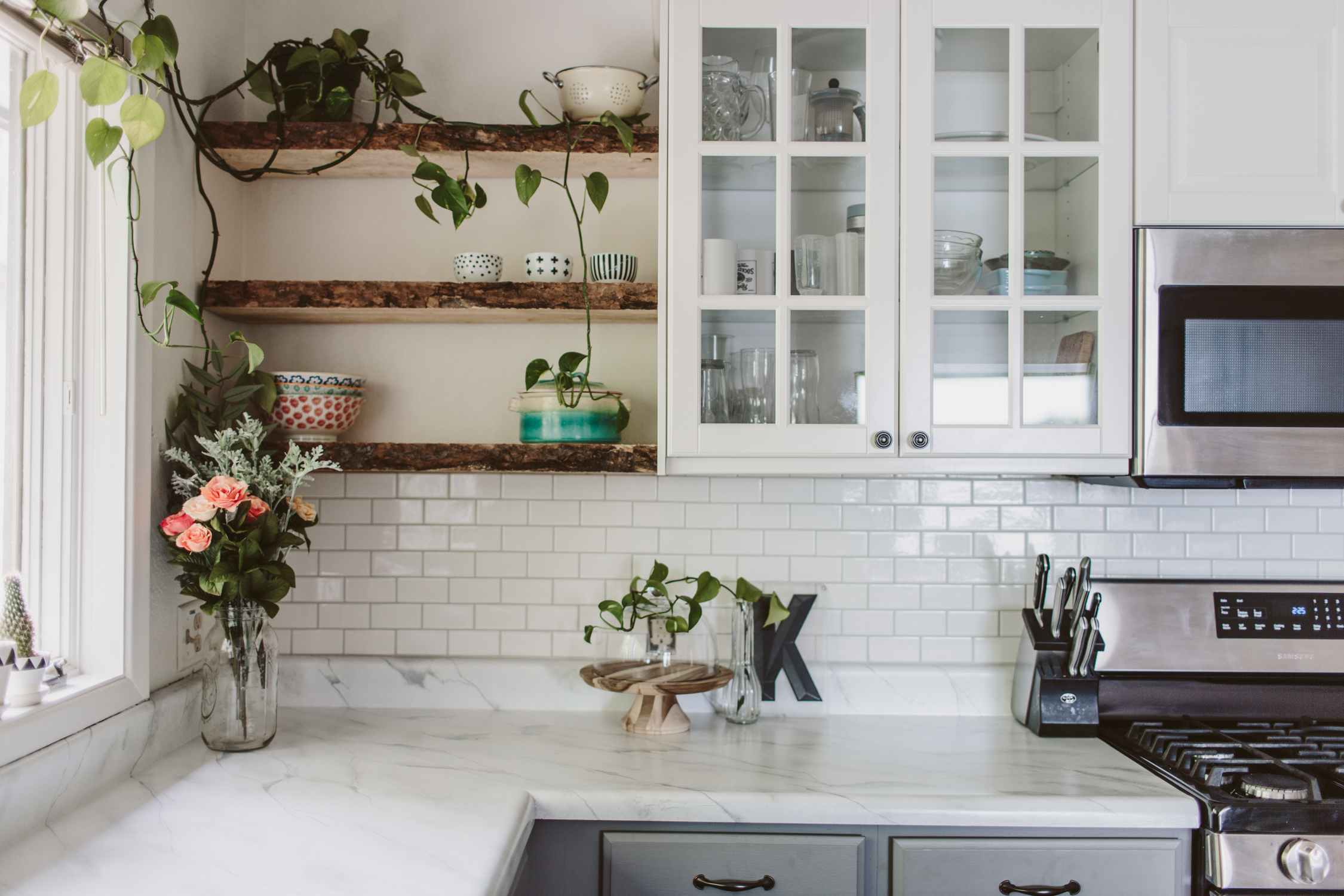
The biggest DIY was the countertop. We wanted something fresh and clean, but doing real Carerra marble was way too spendy for this space, so I decided to paint the countertop with a faux marble instead.  You can peep that DIY here.  I will say that it's a good way to get the look, but it wasn't the most durable.  It definitely would stain if you left anything like coffee or wine on the counter for too long, and if you scratched it too hard, it'd scratch the paint off.  If you're wanting something to hold you over while you save money for the real deal, it's great for that, but I'm not sure it's the best for a long-term solution, especially if you do a lot of cooking and like coffee and wine *raises hand*.

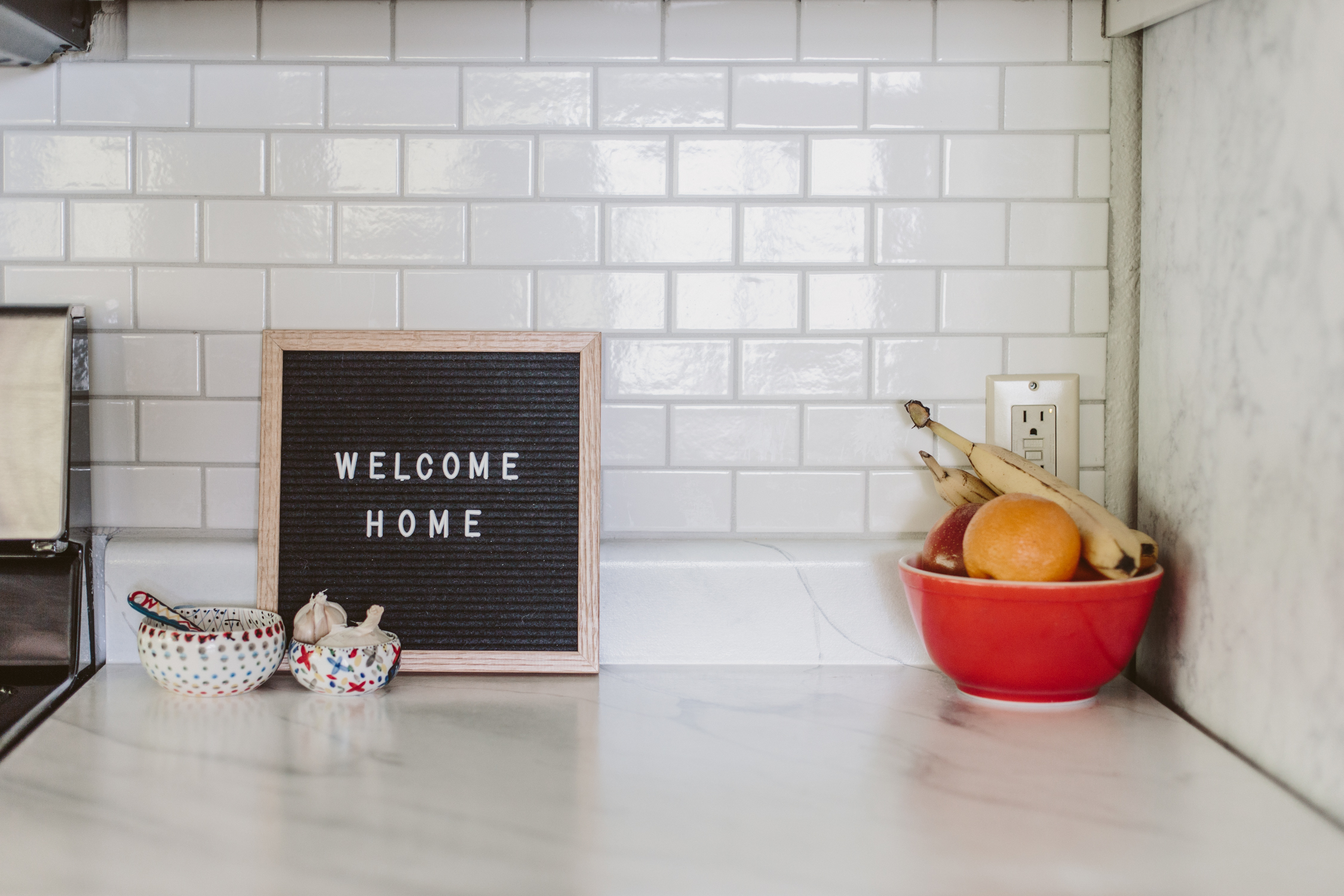
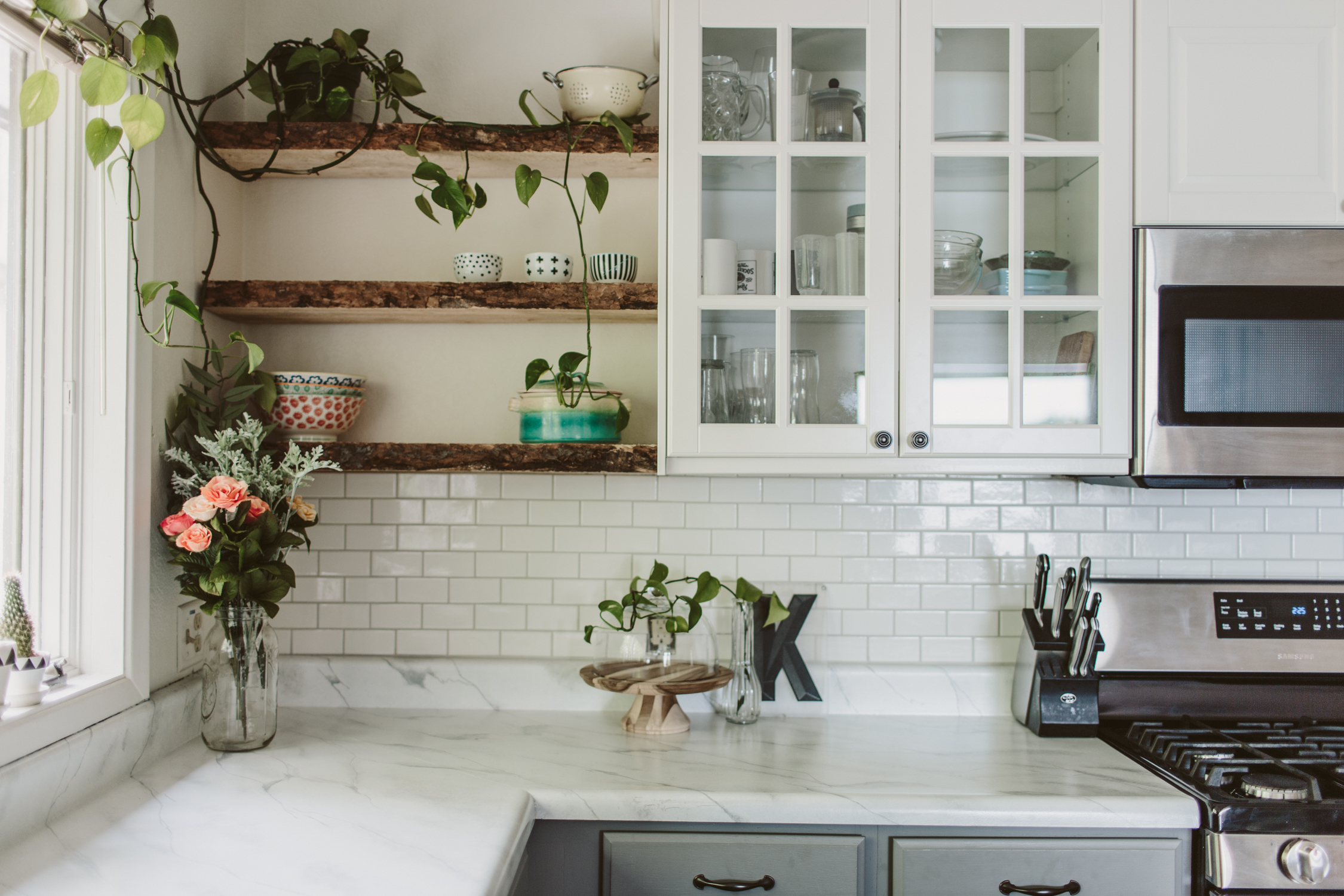
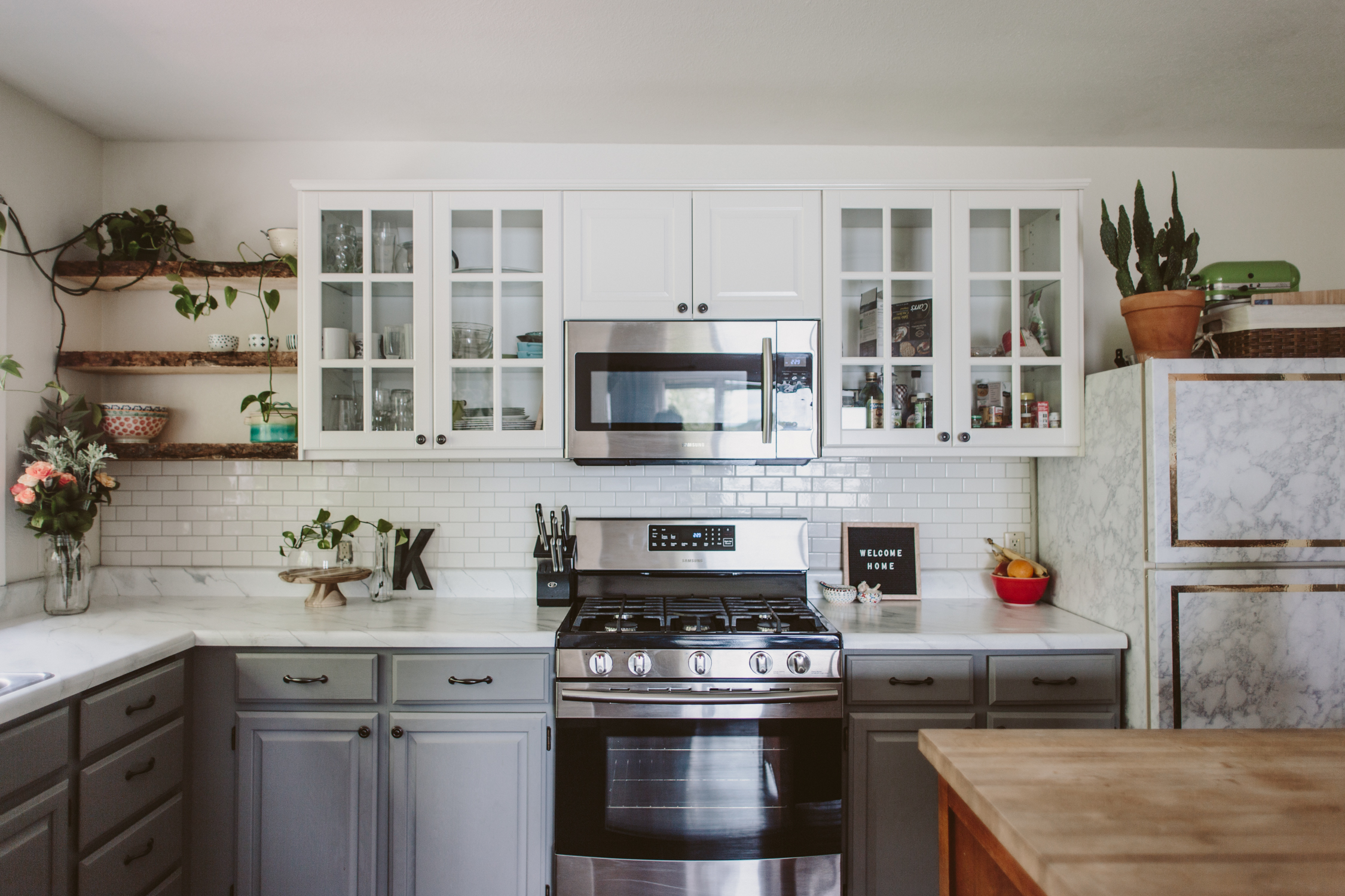
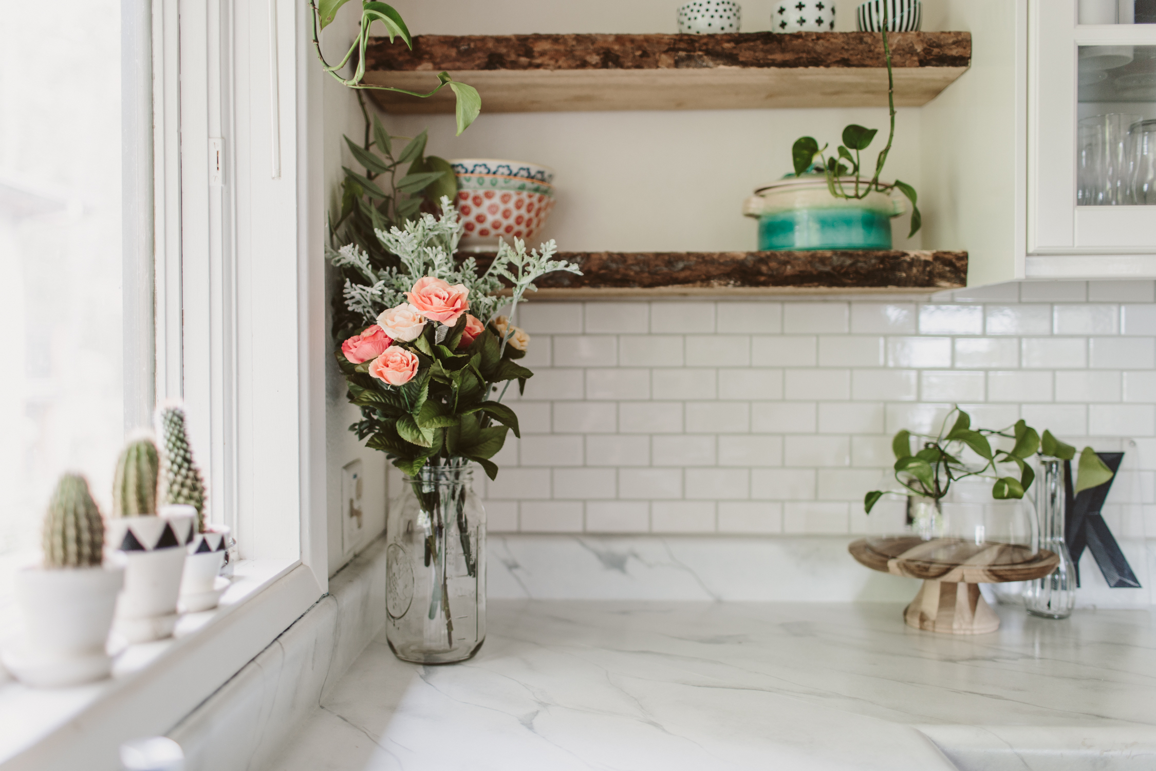
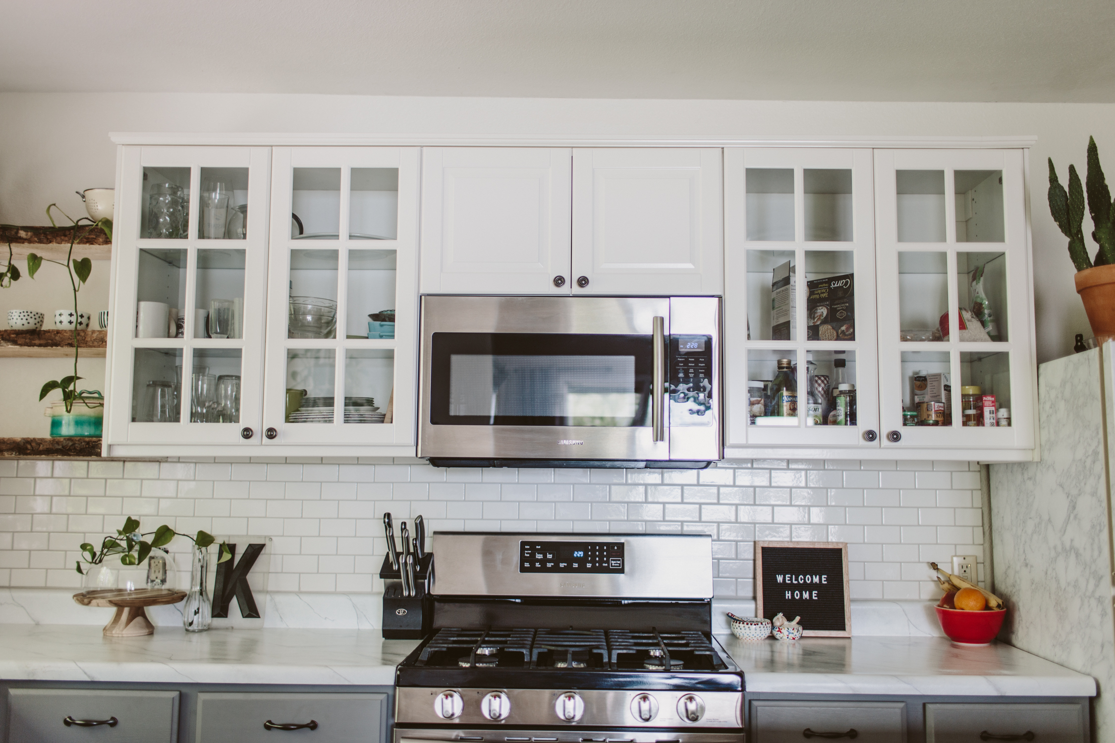
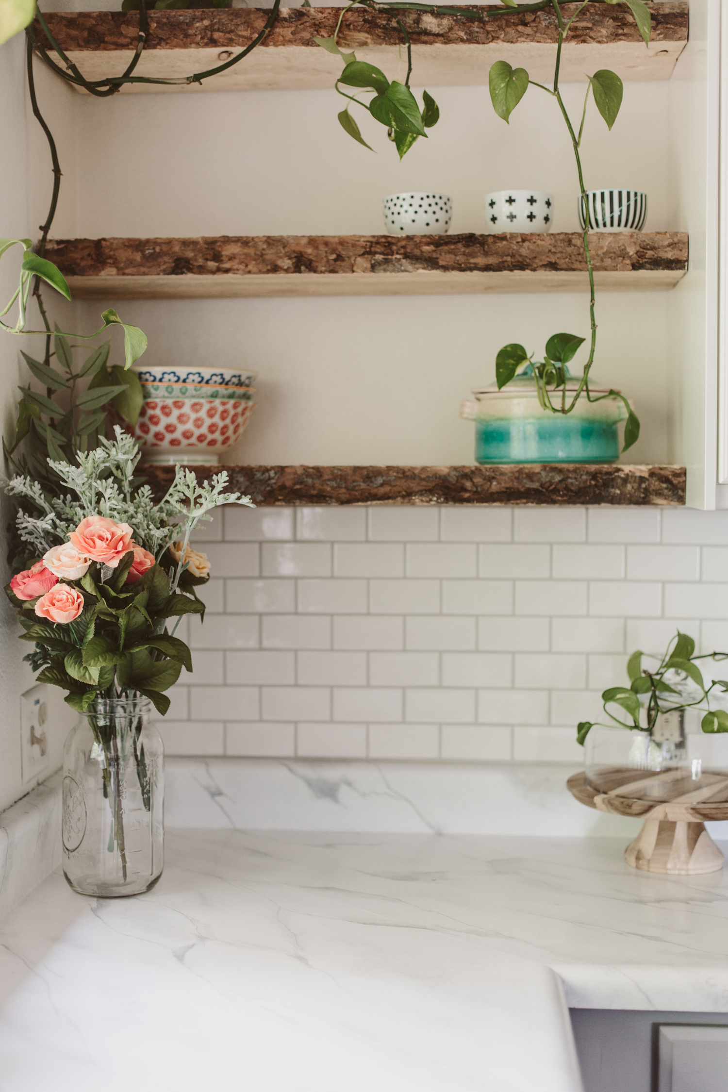
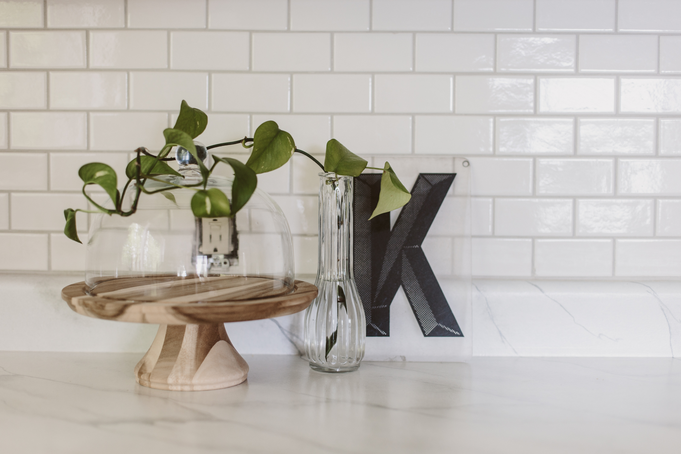
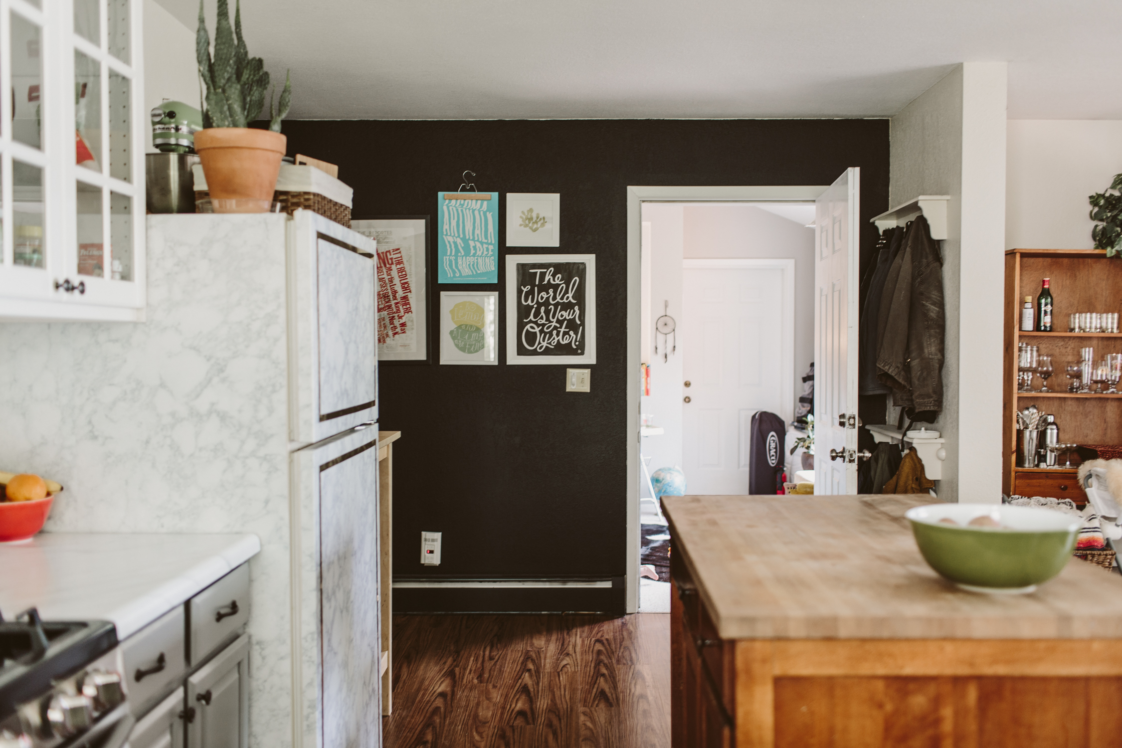
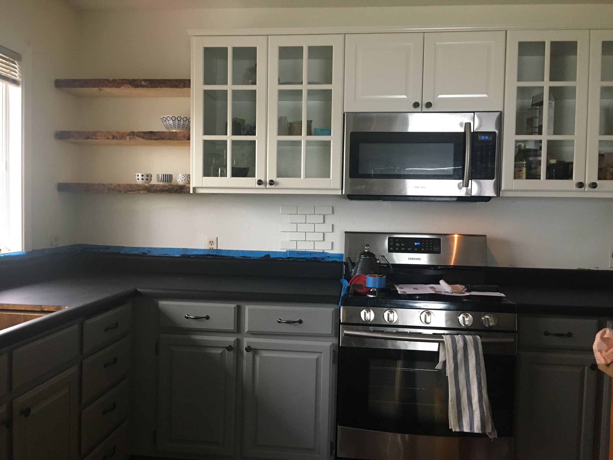
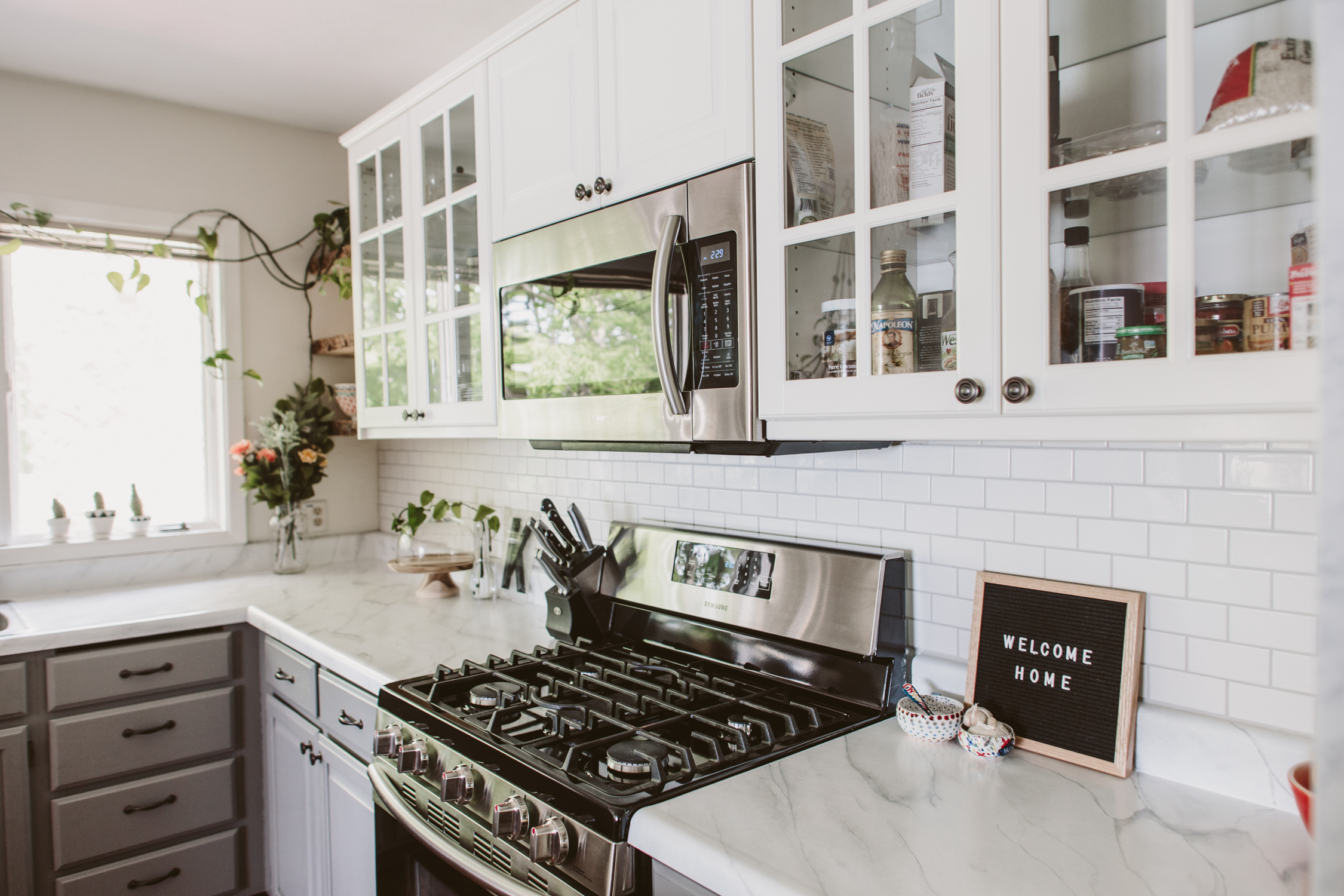
We ended up keeping the lower cabinets and painting them grey, and then we replaced the uppers with Ikea cabinets.  That ended up being more expensive than for those of you near an Ikea because they had to be shipped to Alaska.  The open shelving was DIY.  My dad went to a lumber yard and bought a 20ft plank that had an unfinished edge.  He chopped it into the three pieces for the shelves and installed it.  We also DIYed the subway tile backsplash.  I had never done tile before but I was excited about how straightforward it was.  I'm looking forward to doing more tile work!  

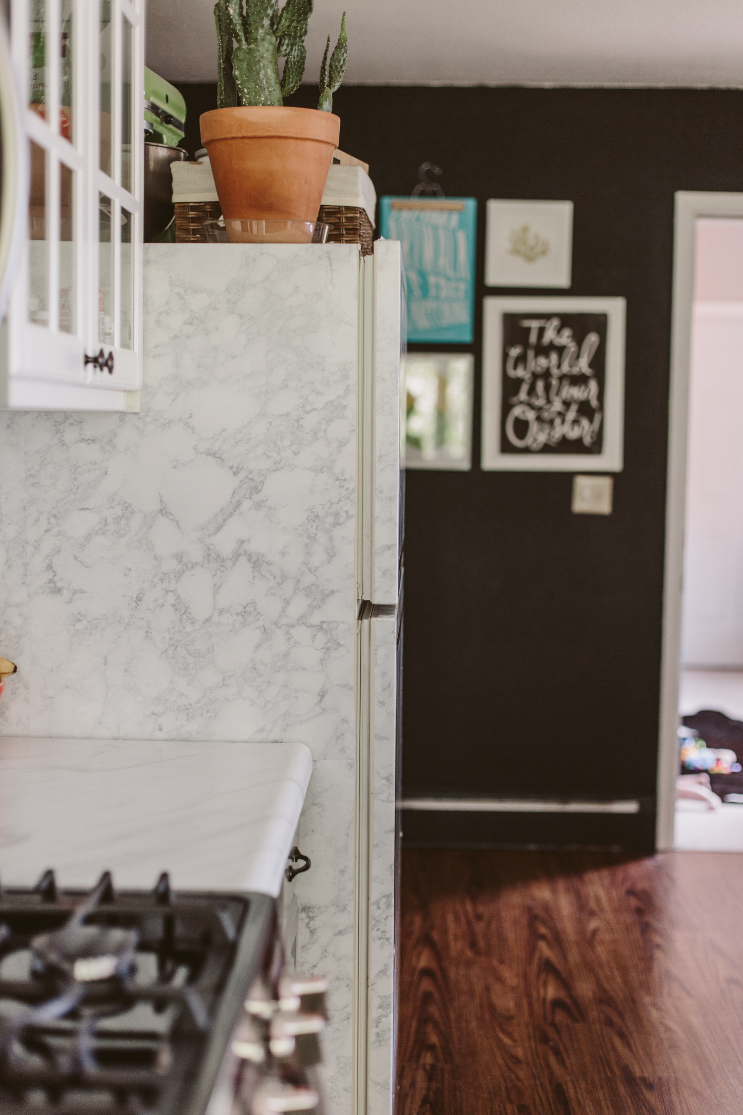
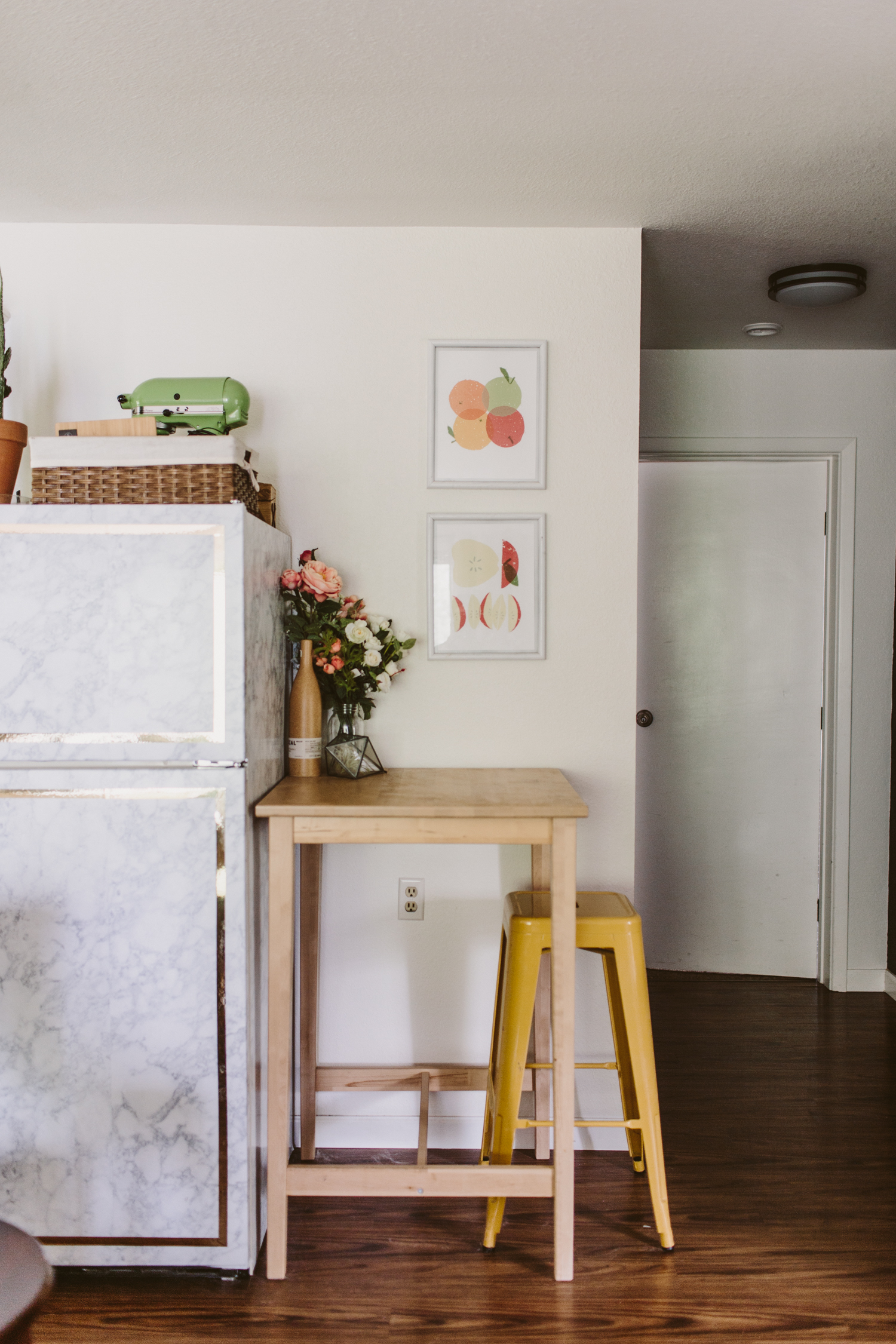
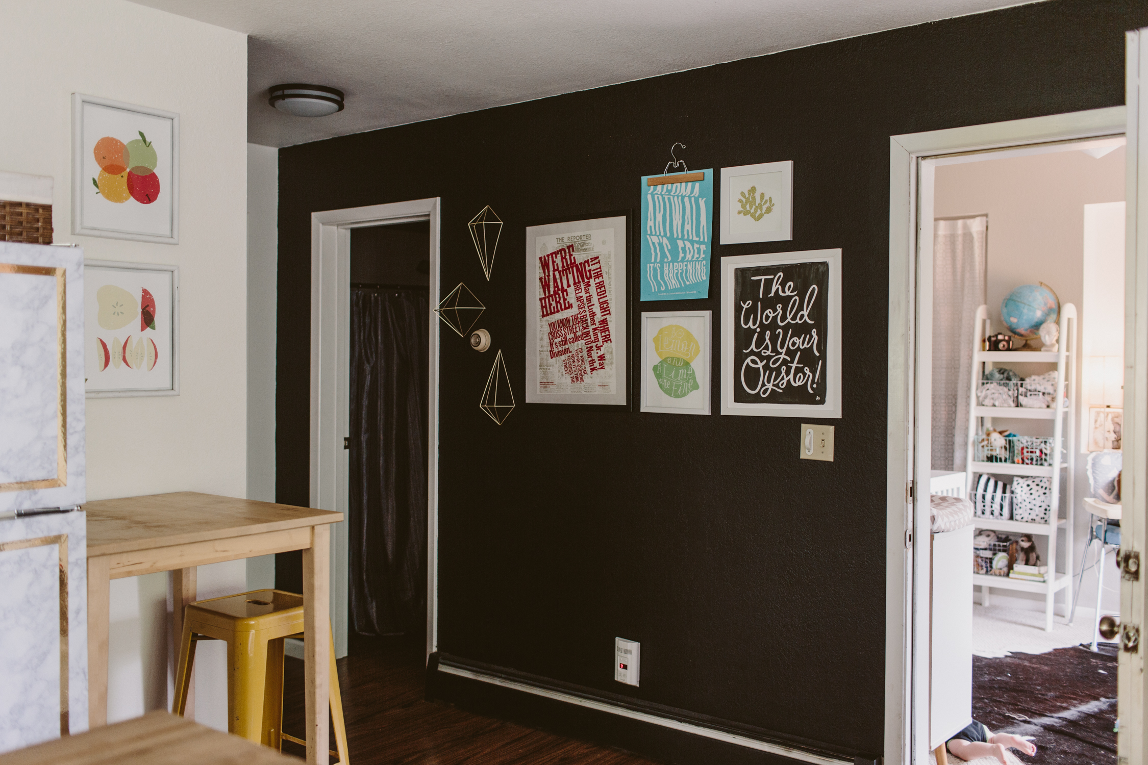
The other super easy, dirt cheap DIY was the fridge.  It was an ugly old ivory fridge, and I just covered it with marble contact paper and gold tape.  It's a pretty durable and quick way to freshen up a fridge without having to drop hundreds of dollars on a new, fancy one.  I've put contact paper on every fridge I've ever had (faux wood contact paper on one, chalkboard contact paper on another, and marble on this one!).  I love how it gives an eclectic and unique look to an appliance that's usually boring.

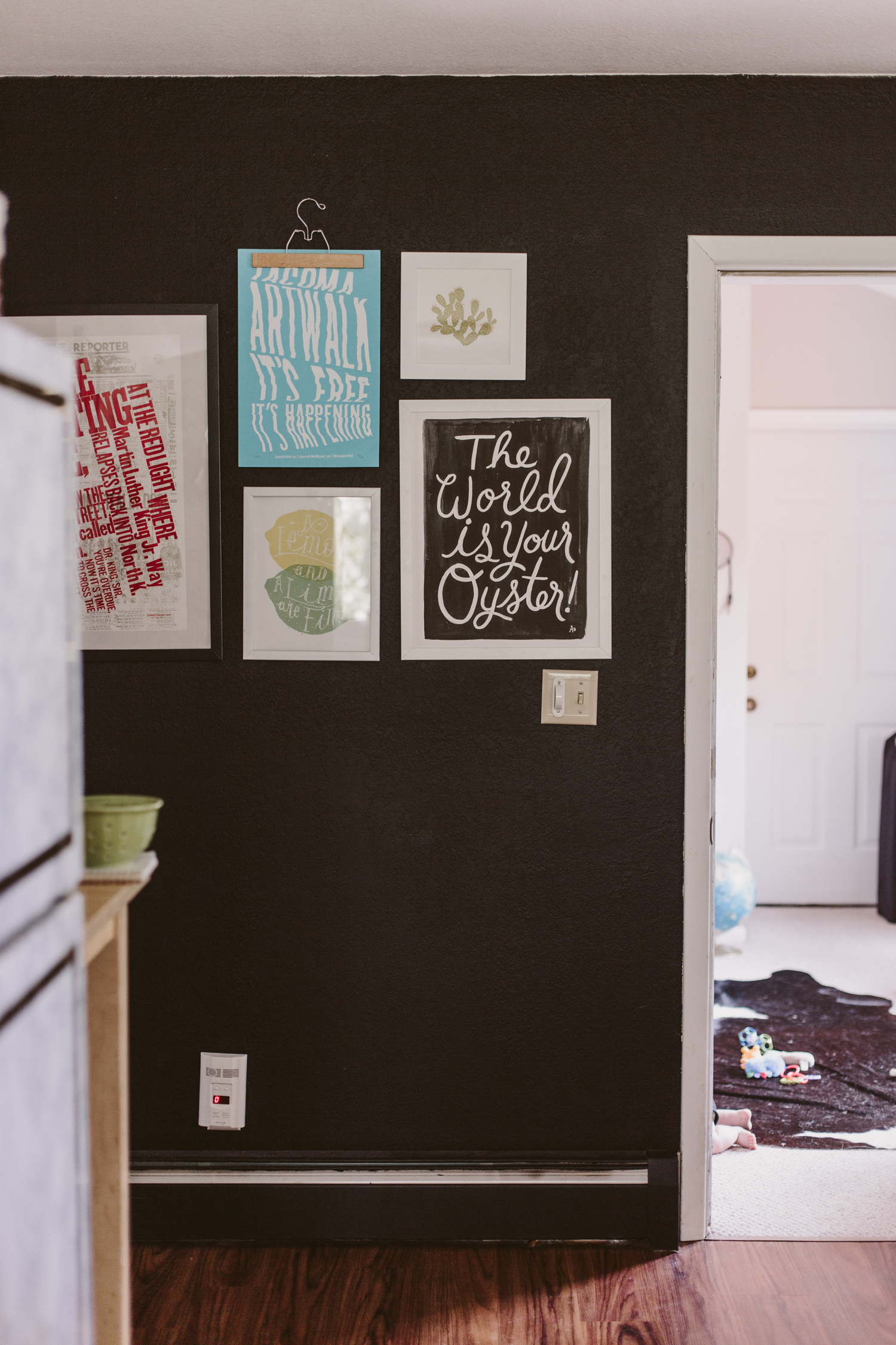
We also painted the room white, and I popped a chalkboard wall in there on the right side (though I never actually put any chalk on it, so it's just a black wall).  

There were definitely things about this space that I would've done differently, had the situation been different.  Knowing that it got destroyed shortly after we finished it makes it easier to feel okay about not doing it 100% the way I really wanted to.  We are planning our current kitchen remodel and I'm excited to be able to do it exactly how I want (and also not have to pay out the ass to ship things from Ikea).

If you have any questions about this remodel, hit me up in the comments! 

Painted Carrera Marble Countertop DIY

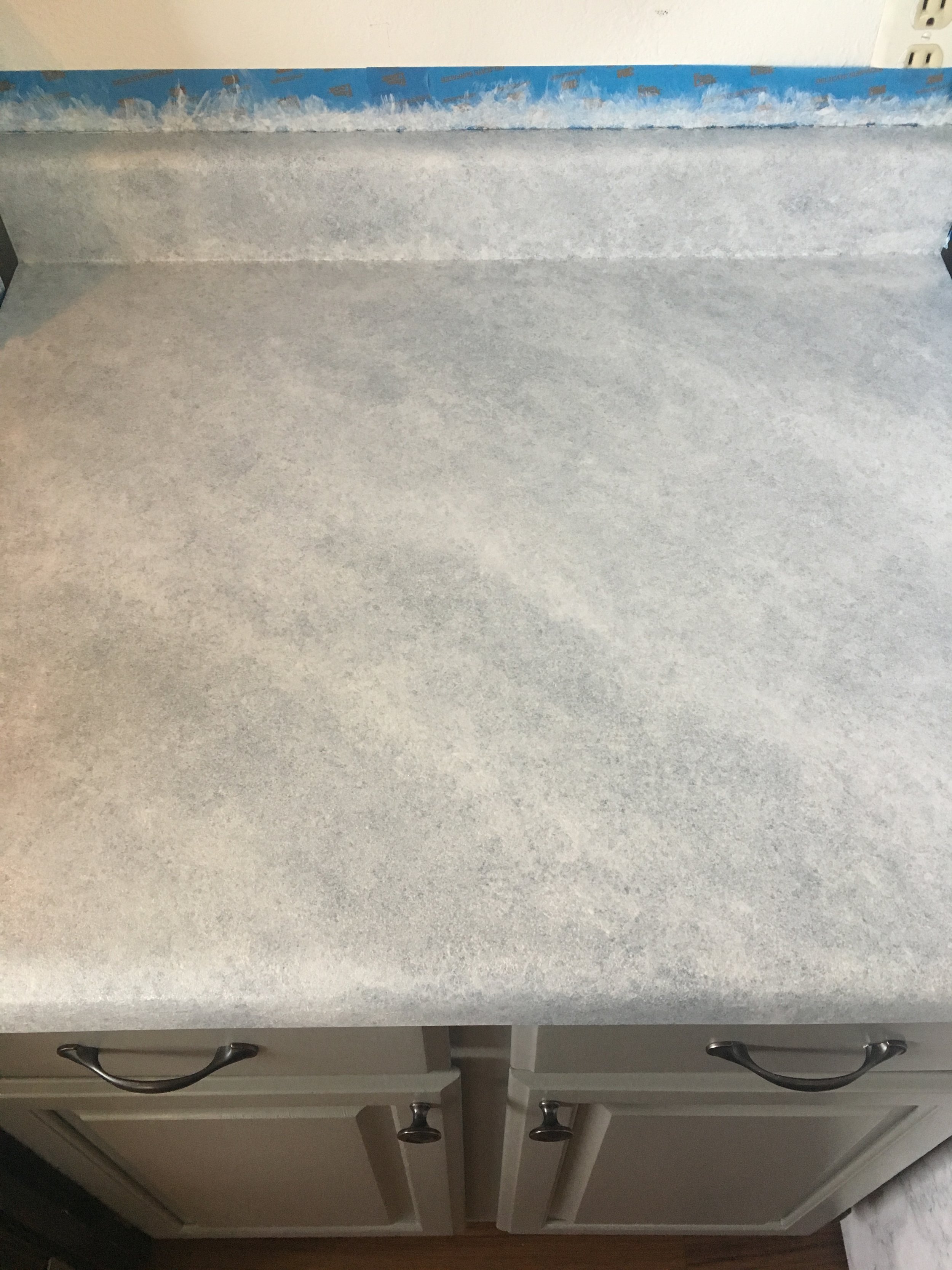
When we were trying to decide what to do with our counters for our kitchen renovation, we knew we didn't want to spend a ton of money.  First, we live in basically a little mother-in-law apartment above the garage of my parent's house, so it's not a fancy joint or anything. We didn't want to put real marble in or anything, and even faux marble was pretty spendy, so we figured we'd try painting the existing formica countertops and if it turned out awful, then we'd rip them out and just shell out for new, faux marble formica counters.  After stalking Pinterest for a bit and looking at various countertop painting DIYs I decided on using Giani's Faux Granite DIY countertop paint in White Diamond to create a faux marble look.

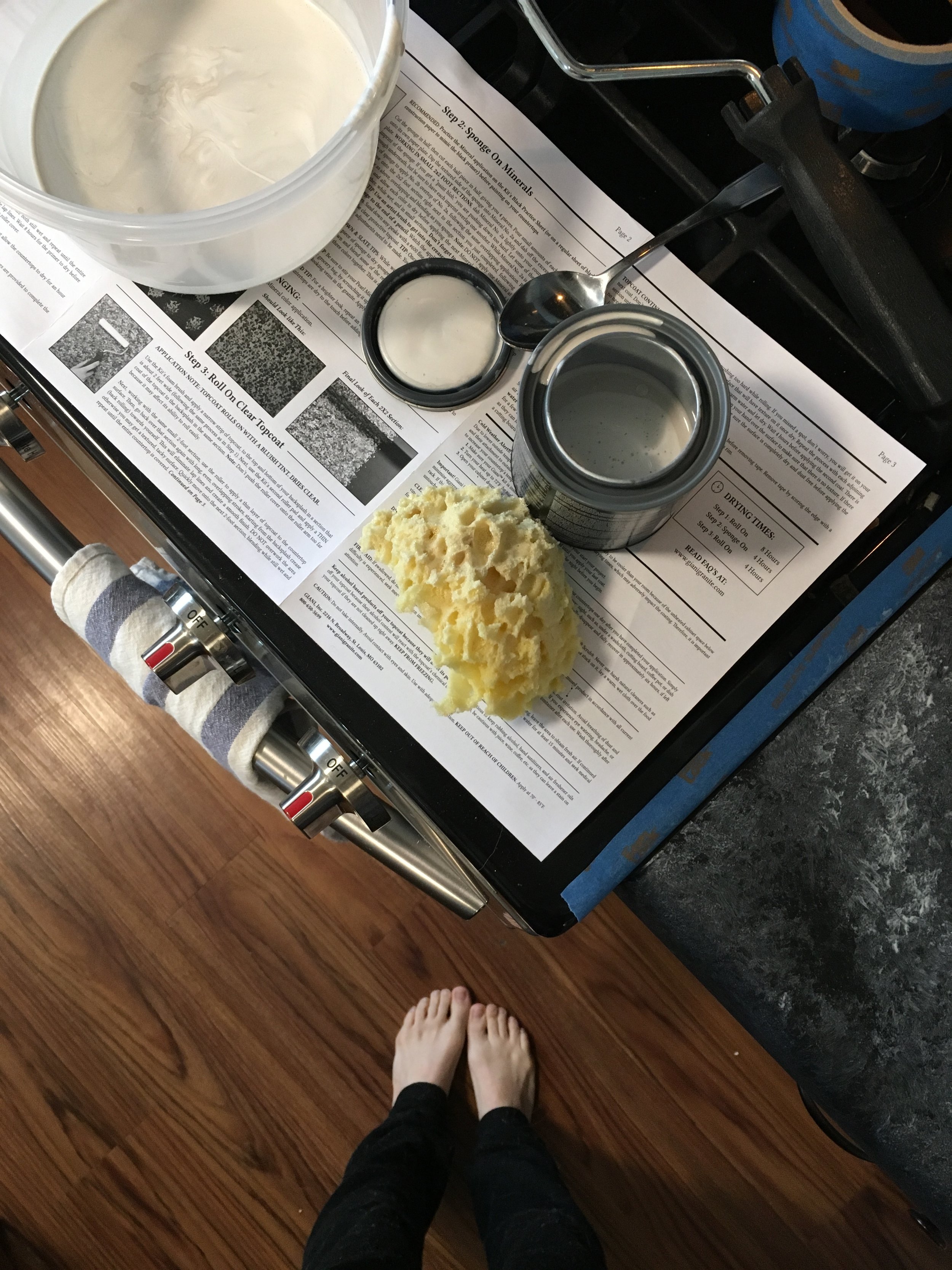
The kit comes with a black primer, a pearl mica paint, two cans of white limestone paint, a metallic gold paint which I didn't use, and a clear top coat.  I would recommend buying two extra white limestone cans if you're going to use the kit to make a white marble look.  I didn't and I ended up just using some regular paint to finish it off (I had a time crunch and couldn't wait for more white limestone to ship) and it worked fine I think, but I wouldn't recommend doing that.  The paint in the kit is more of an enamel type paint (I had a really hard time getting it off my fingernails, whereas the regular paint scrubbed right off), so I think it probably hardens and sticks better.

You start by rolling the black primer on to a very well cleaned counter.  My counter had a little bit of texture to it so I didn't really sand the existing counters first, but if your counter is super shiny and slick, it'd be a good idea to give it some texture with some sand paper before putting down the primer.  I just did one coat and then touched up a couple spots where it was a little thin.

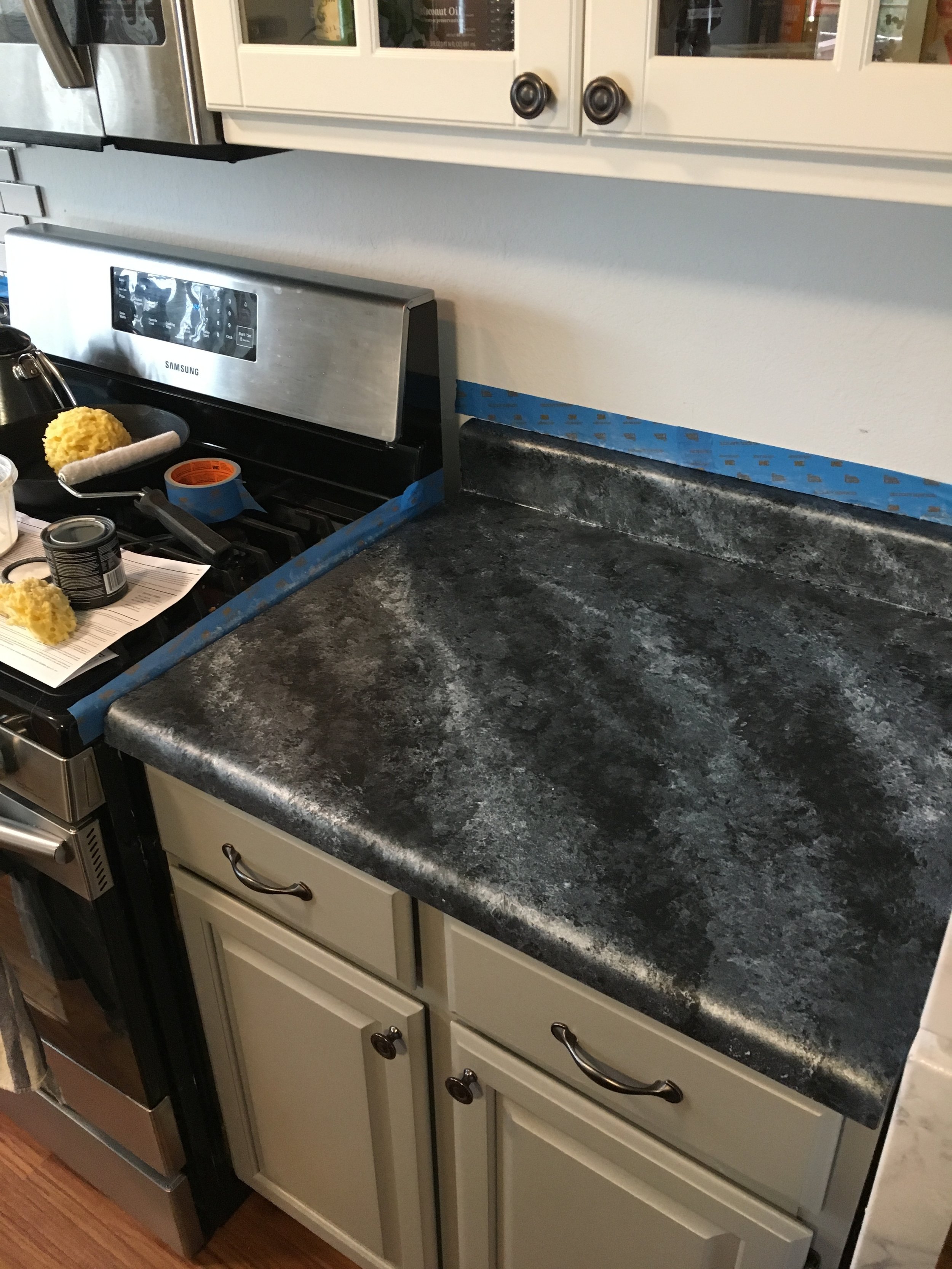
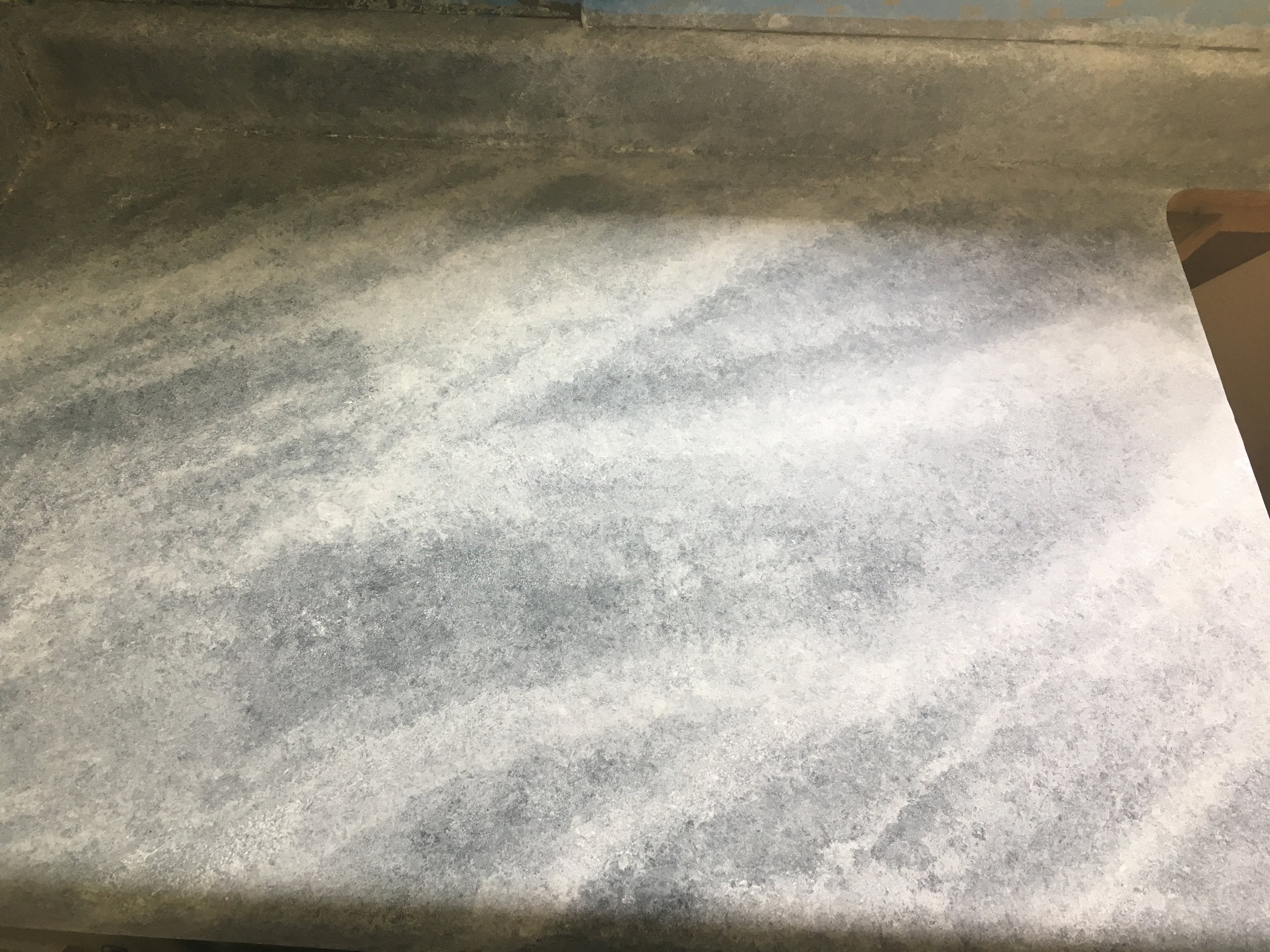
Next, you start layering on the paint.  The kit comes with a sponge you can cut into pieces to sponge on the paint.  I started with the pearl mica.  I started creating the flow of my veining from the beginning, doing a kind of diagonal veining pattern.  After the pearl mica I started the white limestone layers and then you basically do as many layers of the white limestone as you want to achieve the lightness of marble you want.  I think I did about 4, maybe 5 layers. I sort of got lost in a haze of sponging and didn't keep track after like 3 layers.

To do the veining, mix a little of the black primer with the white limestone and use a small brush.  Keep some white limestone handy with your sponge to go over top the veining if you don't like the vein you put in, and also to fade them a bit so they blend.  I google searched for marble slabs and found one that I used as a reference for my veining look.  

The top coat gets rolled on and goes on in 2-3 layers.  You don't want to put anything heavy on the counter for a couple days and it cures fully in 2 weeks.  In terms of durability, it's not the greatest (that being said, I didn't use only the countertop paint, I did those top couple layers of white with non-countertop paint, so I'm not sure about what the durability would be if I only used the kit).  I can tell that if I scratched it with something hard or metal, it'd probably put a gouge in the paint. We had an electrician come in to fix our outlets and he totally scratched through the paint somehow (I think he leaned against the counter with like tools on his belt or something), so that was a bummer, and it does stain if you're not careful.  We have an espresso machine and over by that we already have a couple small yellow-ish coffee stains.  I bet wine and certain spices would also stain it.  We use our butcher block island for most food prep stuff that might be staining.

If you're looking for a stop-gap that's a cheap (but a bit time-consuming) way to get the look you want until you can afford getting real marble (or real faux marble) counters, this is definitely a way to do it.  If you're super rough on your counters, this might not be a great solution.  It'll work for us for the time being though!  You can wipe them down easily, they just recommend not using any harsh chemicals and not scrubbing super hard.

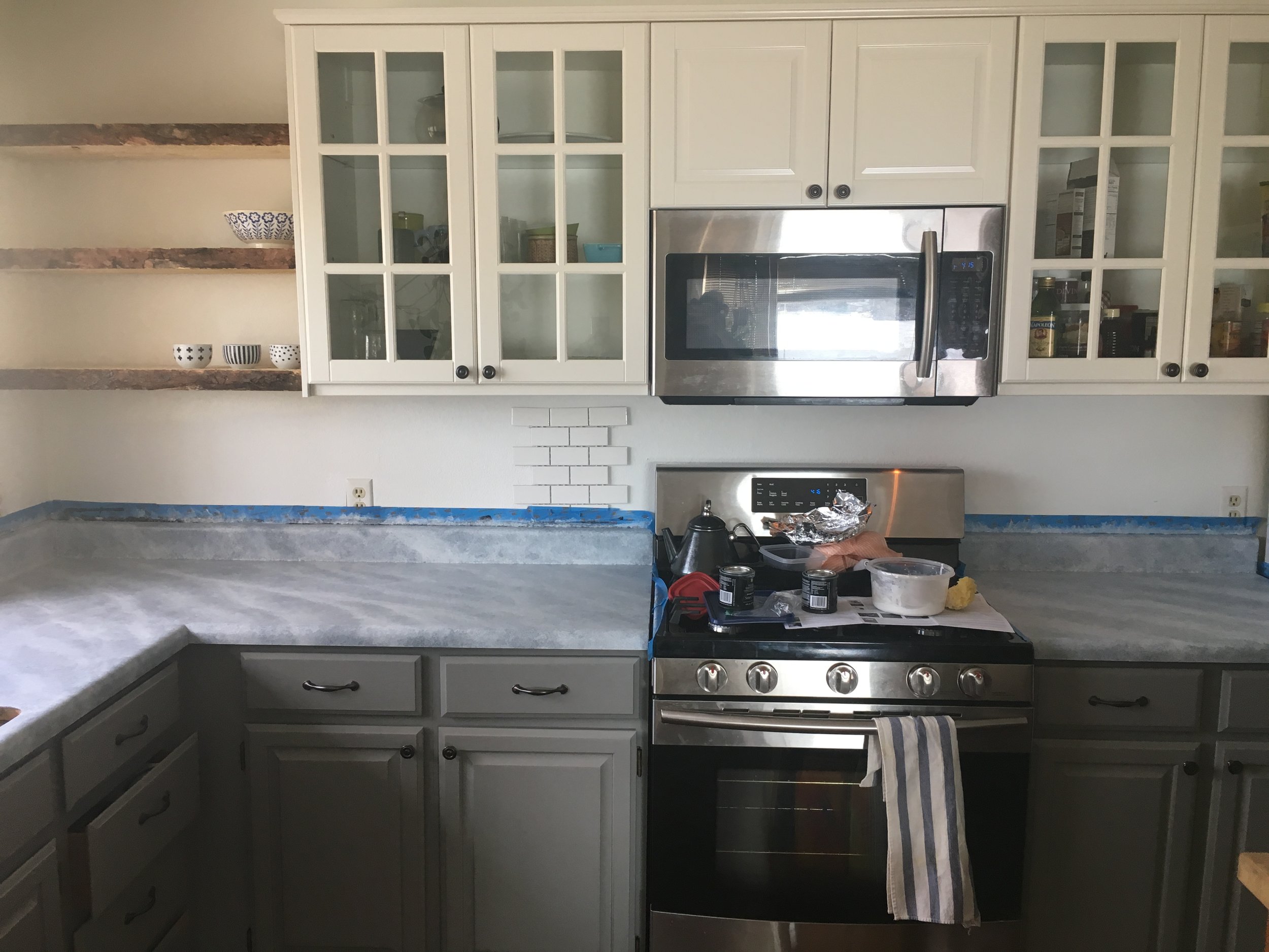
I used one whole kit (plus 2 extra white limestone cans) and we have about 15 feet of counters.  Here's what she looks like before.  Kind of dingy, off-white, ivory:

And after!  Crisp, white, and fresh!:

DYING TO TRANSFORM YOUR OWN KITCHEN, BUT AREN’T SURE WHERE TO START, HOW TO BRING YOUR VISION TO LIFE, OR NEED HELP FIGURING OUT HOW TO MAKE IT ALL HAPPEN? I’VE GOT YOU COVERED! HEAD OVER HERE AND LET’S GET STARTED ON WORKING SOME DESIGN MAGIC FOR YOU!

Living Room Inspiration

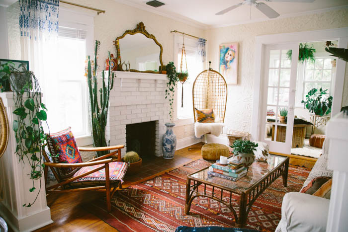
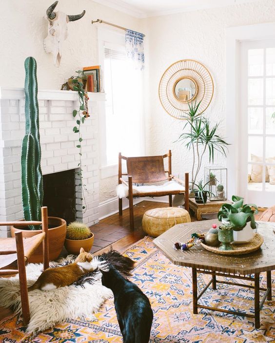
Our new kitchen is a pretty big project that will be a little more intensive, so in the meantime I'm focusing on breathing new life into our living room.  It's already changed a ton since the image below was taken (what it looked like when we moved in), mostly just because our furniture and artwork is in there now, but I really want to give it a fresh coat of white paint (especially on the dark, heavy fireplace), some pops of color and pattern, and lots of plants!

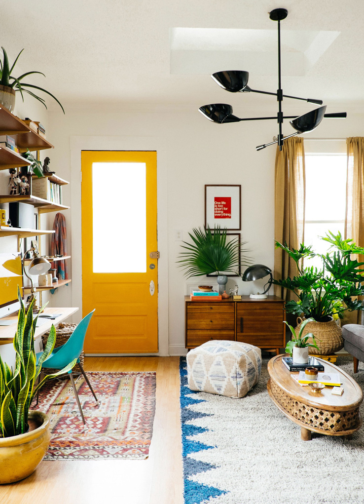
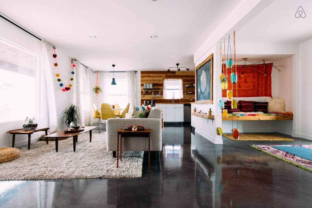
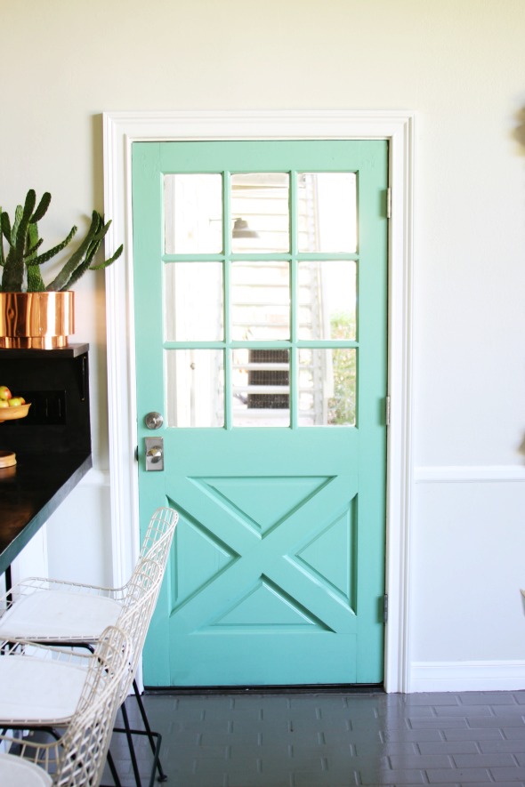
We've got a door with a window similar to the one second to last in this post, and I've already got yellow paint to brighten it up.  I think the other walls will end up with white, but I might do a fun statement wall on one of the smaller walls.  Since we don't live here permanently I can't do super crazy stuff, so I may end up using removable wallpaper from Walls Need Love like I did in our last house, which was a really great way to update without the pressure of committing to a crazy paint job (or committing to a crazy paint job that takes months to finish.  Walls Need Love actually made that pattern into a wallpaper so you don't have to become a crazy person like me).

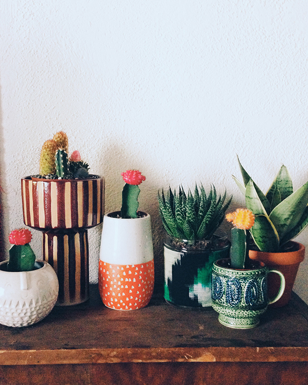
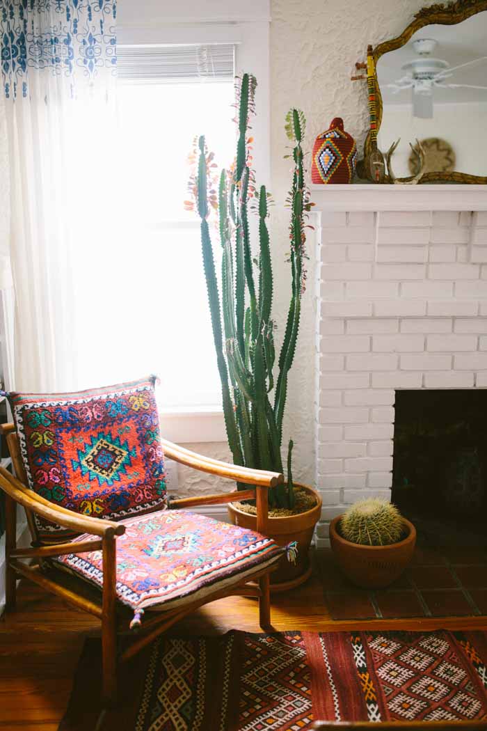
Images sources (except before image below): 1 | 2 | 3 | 4 | 5 | 6 | 7 | 89 | 10

Mostly I just want the space to feel inspiring, bright, and happy.  I want lots more plants (I need a snake plant and super tall cactus, like, yesterday), and I have a couple of vintage chairs that my parents got at a garage sale that I really would love to reupholster to bring them into the vibes of the space I have envisioned.  Luckily their upholstery is super simple (basically just 4 rectangular pads), so I think I can DIY that!  

A super big project that will probably be down the line is putting built-in cabinets/shelving on either side of the fireplace.  As you can see, that whole side of the room has a sort of weird step up that makes it virtually non-functional for furniture, so building in some shelving (much like Elsie's white shelving) would make that space much more useful and I would even love to put some upholstered pads in front of the shelving next to the fireplace for reading nook seating!  Like I said, that's a huge project that probably won't happen in the next few months, but who knows, maybe I'll get a huge burst of nesting energy and go for it before the baby comes!  Now to convince my dad to help me build this cabinetry...

Our Home Tour

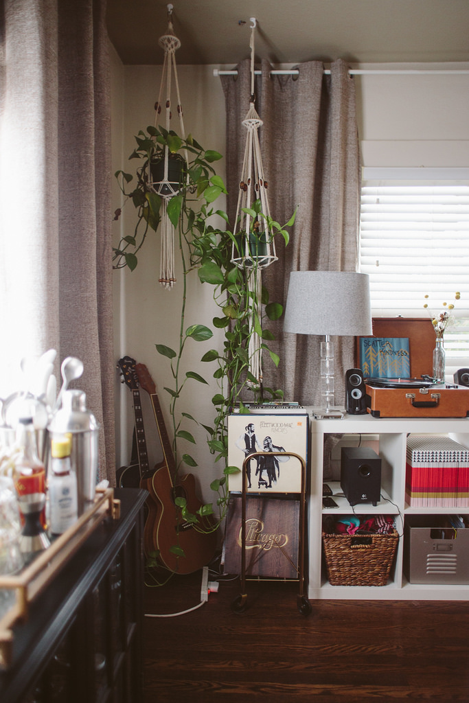
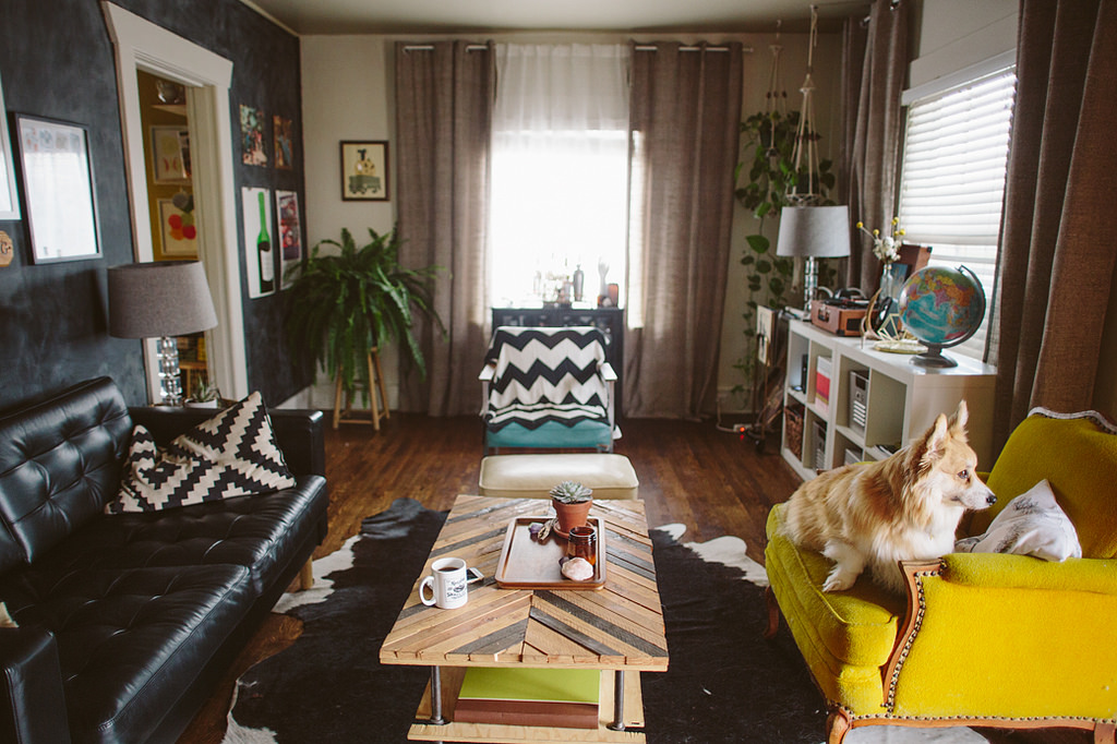
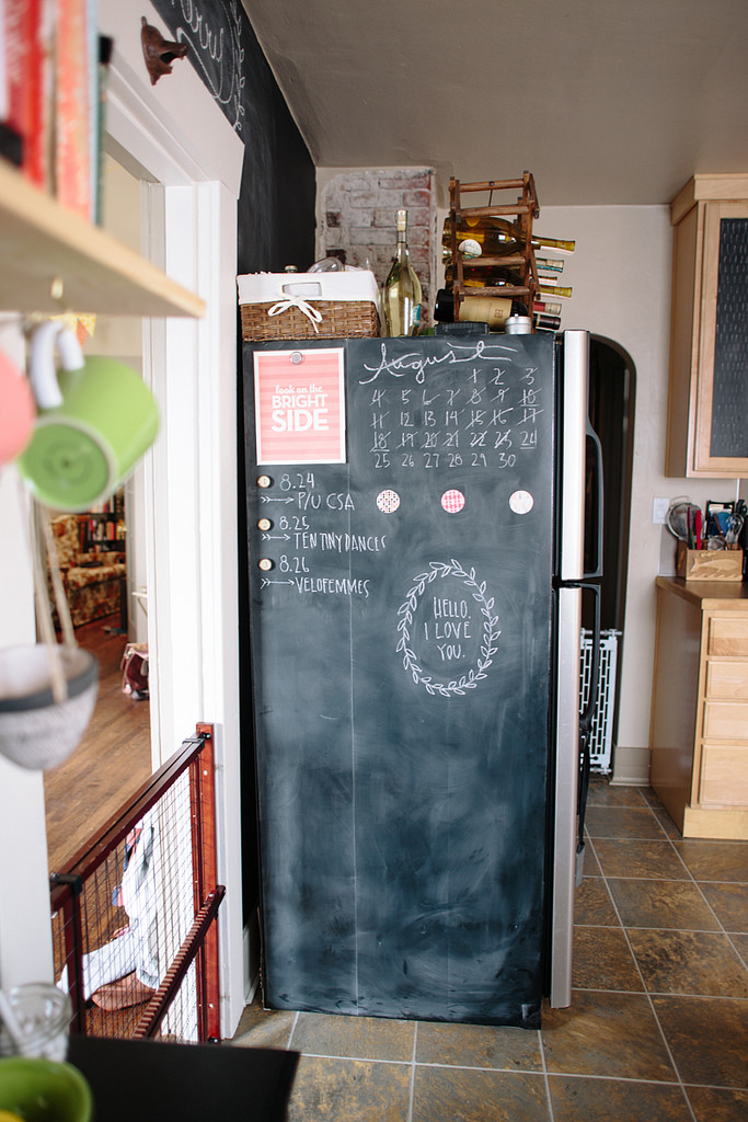
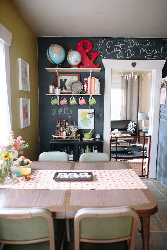
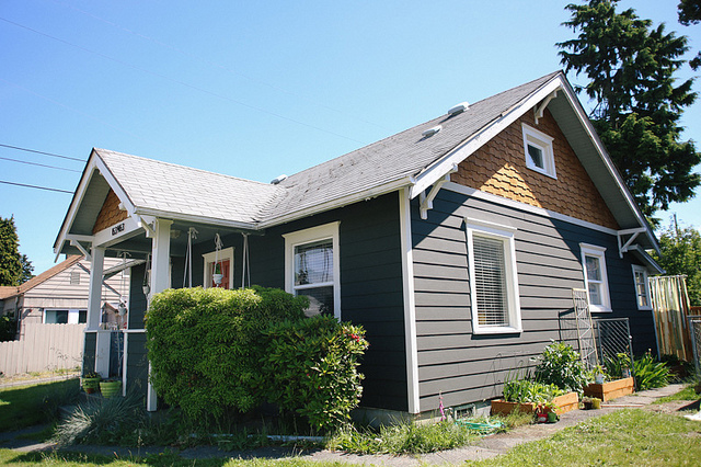
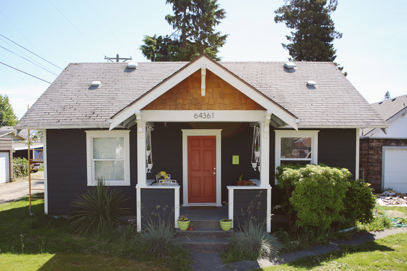
As we roll into our new town and start the process of moving into our new apartment, I wanted to take a look back at our little Tacoma home.  We spent 3.5 years in this house transforming it into something super special and completely loved.  Driving away was tough, but since we decided to rent it for now, there is the possibility that some day we'll come back to this lovely little house.  I've done room tours before, but I've never done a single post with a tour of the whole house, and what better time to do that than now!

Goodbye little house!