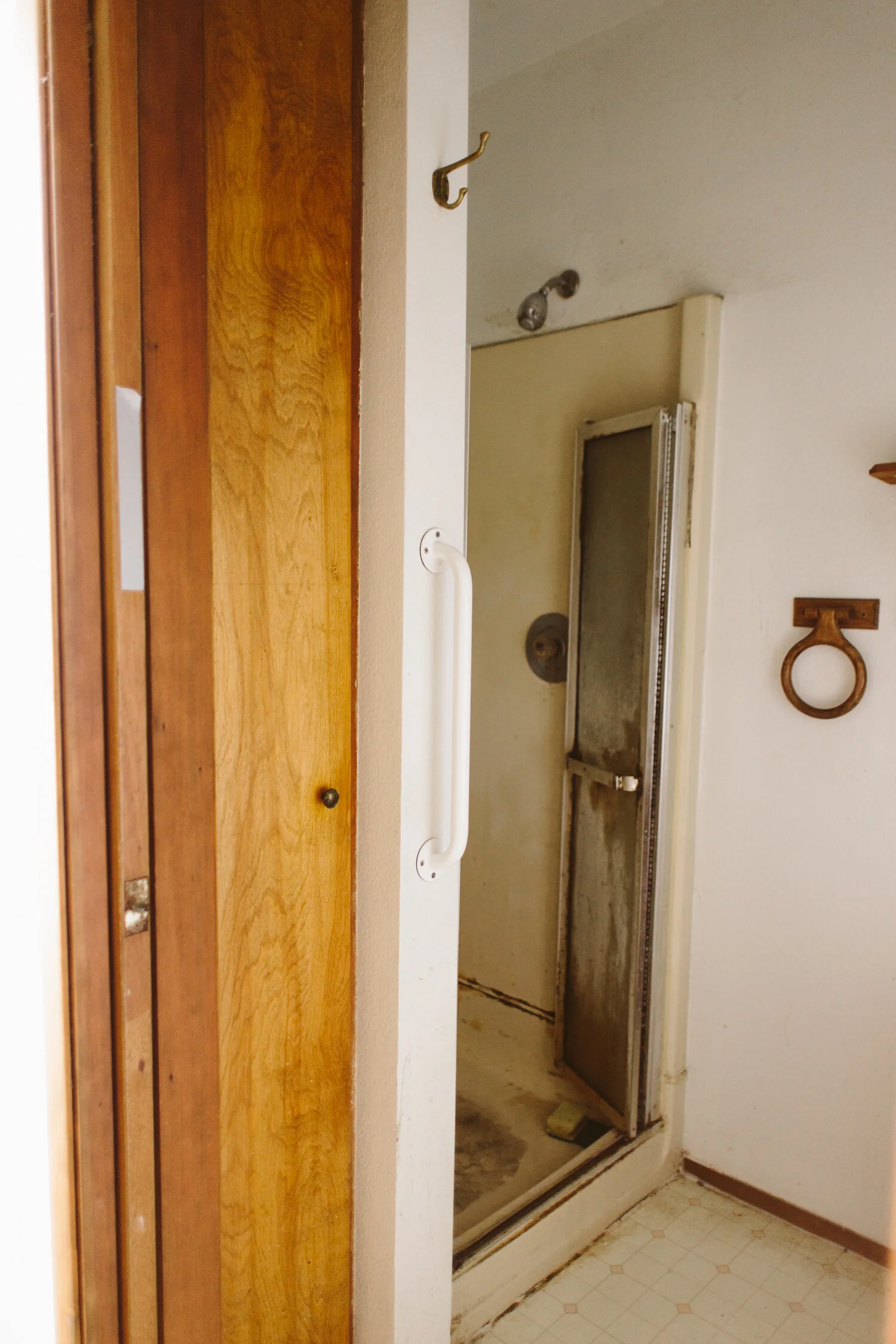
Our Master bath was the one room that we really needed to gut completely and start from scratch. It had a disgusting 3x3ft shower, with a tiny linen closet next to it, an itty bitty vanity and the toilet sat smack dab in the door way. Whoever designed this space was completely insane. We didn’t have the budget to move a bunch of plumbing around, so we are working with what we’ve got for the most part (yes, including the toilet location).
Originally, this bathroom really didn’t feel at all like a “master” bath. It feels like the dingy basement bathroom from my college duplex, only less spacious. So while we couldn’t do a ton with the layout of the space, we could make it feel more like a nice bathroom that was designed in this decade.
Like, you guys, it kind of even gives me the heebie-jeebies just looking at these pictures. There are so many things about this house that made me a little stunned that humans were living here right before we bought it, but this bathroom was definitely high on that list.
We’re also removing the pocket door, and moving the doorway slightly to the left so that the toilet isn’t RIGHT in the middle of the doorway. Look, I love my husband, but I’d rather not have a direct line of sight to him taking a dump while I’m laying in bed. But that’s just me. Taking out the pocket door also allows us to beef up that wall where the pocket was for the door, so it’s sturdy enough to take the tile that we’ll be putting on the shower surround. We still really need a sliding door since our bedroom isn’t very big and a traditional door will take up too much space, so we’re putting in a sliding barn door instead. I got a vintage french door, which I’ll be rehabbing and doing a faux mercury glass treatment on the glass panes for privacy.
Next to the shower was a tiny, 3ft deep linen closet which felt minimally useful, so we decided to tear out that whole side of the room and instead put a walk-in shower. Originally I wanted to do a penny tile floor for the shower, but it ended up being a lot of work to do all that ourselves, so instead we bought a pre-made shower pan that fit the space perfectly. It’s not fancy, so I’m going to make a teak slat floor for the shower that will fit right on top of the shower pan and make things feel way more “spa” like.
The flooring will be completely replaced with large black hex tile, and we are moving the vanity to be on the wall opposite the doorway, next to the shower. Since the shower entrance will now be where the linen closet used to be, we can utilize that wall for a vanity with way more counter space. We’re putting up a gorgeous brass hexagonal mirror and two brass sconces on either side of the mirror!
I’m so excited to have a functional bathroom in our master! We have a second full bath in the house, so we haven’t “needed” it, but it’s going to be SO nice to have a space of our own.
Check out the other One Room Challenge posts!





![This print feels even more relevant today. We all joke about the dumpster fire of [insert year here], but the important message of this image to me is that *we persist* through the horrors. We stand, we fight— maybe for ourselves, maybe for oth](https://images.squarespace-cdn.com/content/v1/574dddd6d51cd4bc35c1609a/1730935170369-03GPKQ5NF73VAE65RHO6/image-asset.jpeg)

