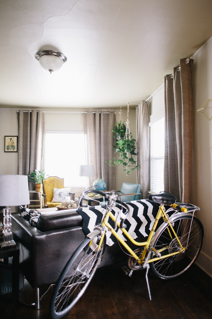
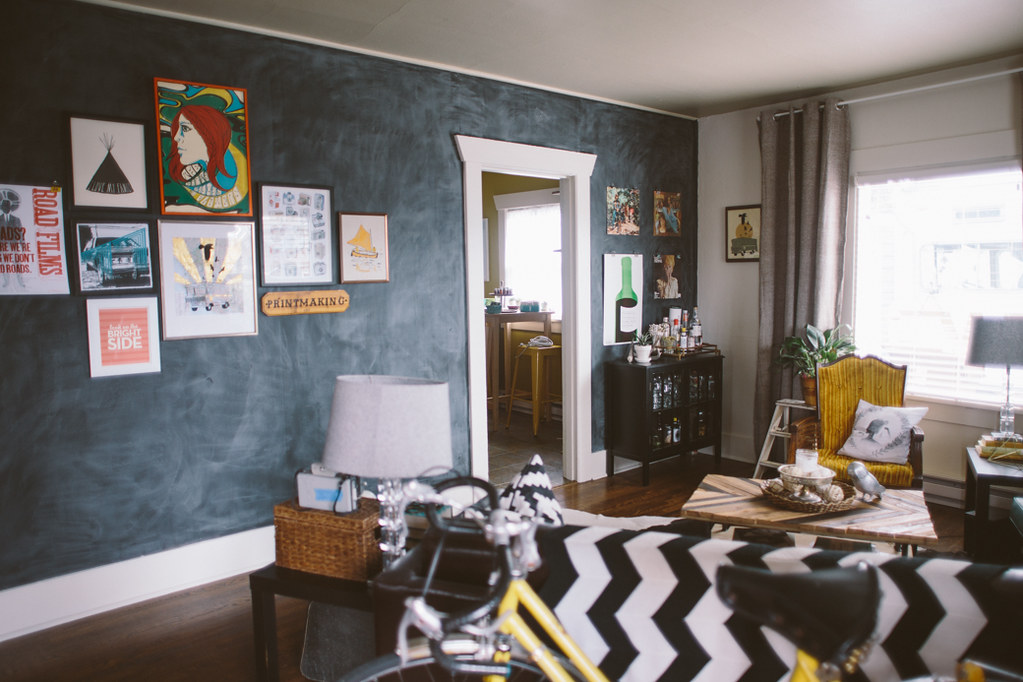
Back in July I painted half the living room white. I was tired of the beige and wanted something fresh and crisp. At the time, though I knew I wanted to paint my big wall something fun, so instead of taking the time to paint it white, I left it beige and proceeded to ruminate on what color I should paint it for months... and months. I knew that I wanted something that would compliment the chartreuse in the kitchen because you see that wall through the doorway, so I didn't want a clashy color. After some thought I ended up just going for another chalkboard wall. After I painted that wall I realized that the majority of the walls in our house are black. The exterior is black, living room wall, kitchen wall, most of the bedroom, and the wall in the bathroom is off-black. I guess I just really like black walls. I'm really in love with it though. We also rearranged the living room a smidge. I think I like
, but it's nice to switch things around and this is the layout we picked when we moved things around to fit our Christmas tree in the corner (where the black cabinet is now). I'll probably move things around again in a couple months.
I took down the bunting that had been up for about a year. I'd put it up for our housewarming party and just never took it down. I loved it but I wanted to see what it looked like without it and I like it just fine. It was fun, but I think it makes the room feel a bit taller without it.
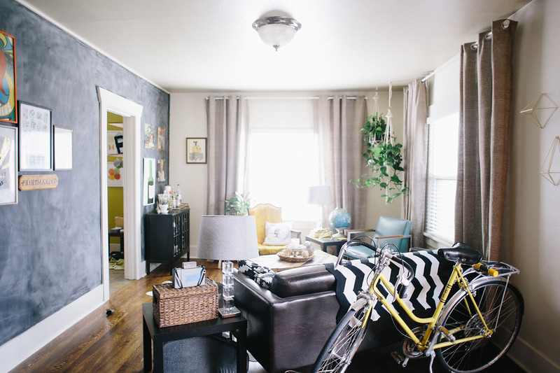

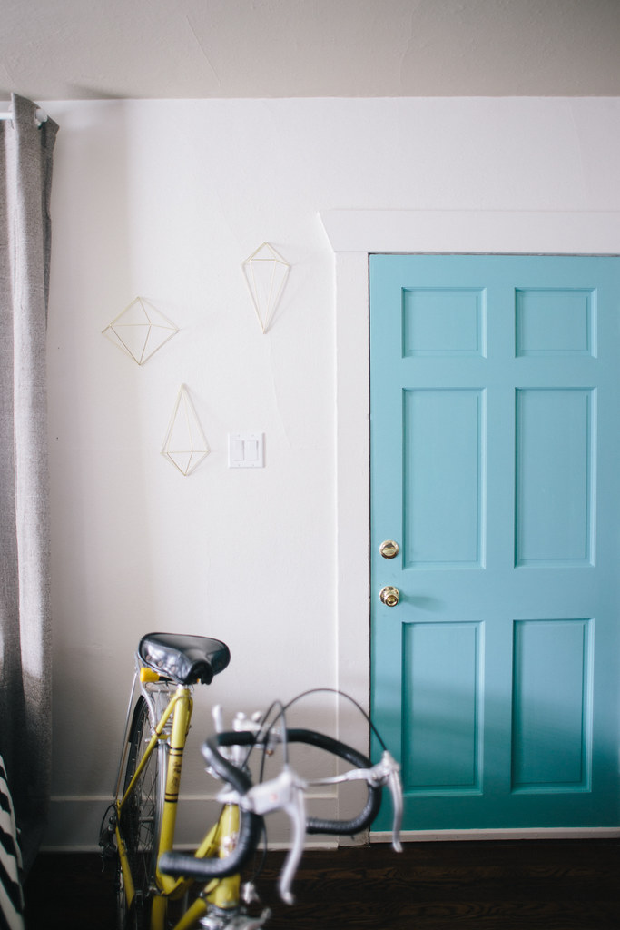
One of my other favorite changes is the turquoise door. When I painted the wall white, the door kind of just disappeared and it felt very stark and plain. The other side of the door is orange, so I figured it needed an alter ego equally as bold. We have quite a few turquoise elements in the room, and I love the color in general, so it was the perfect choice. The nice thing about painting a door is that it's a super minimal investment (all you need is one or two coats, and you'll only need one of those tiny sample sizes from home depot, which is like 3 bucks I think), and it gives you a big impact.
The wall next to the door always felt really empty to me, but it was an awkward place to hang any art, and when I found
these little diamond wall hangings
at Modcloth I knew they'd be just the thing to fill the space and add interest, while still keeping things light. The cool thing about them is that you can snap them together to make them into full diamonds that you can hang or put on a table as a little sculpture piece. I put up three halves on the wall and snapped one together to put on the table by the hanging plants.
Another favorite improvement is the plant life. We used to have a palm in the corner where the hanging plants are now and I killed it. I killed it dead. When I found the macrame hangers at the thrift store I knew exactly where I wanted them to go, but I also knew it would involve keeping living plants alive. So far so good! I love how they fill up that corner and add height and dimension.
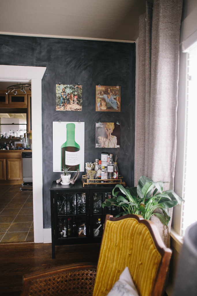
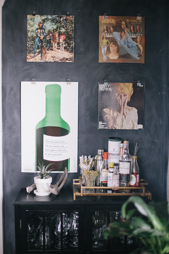

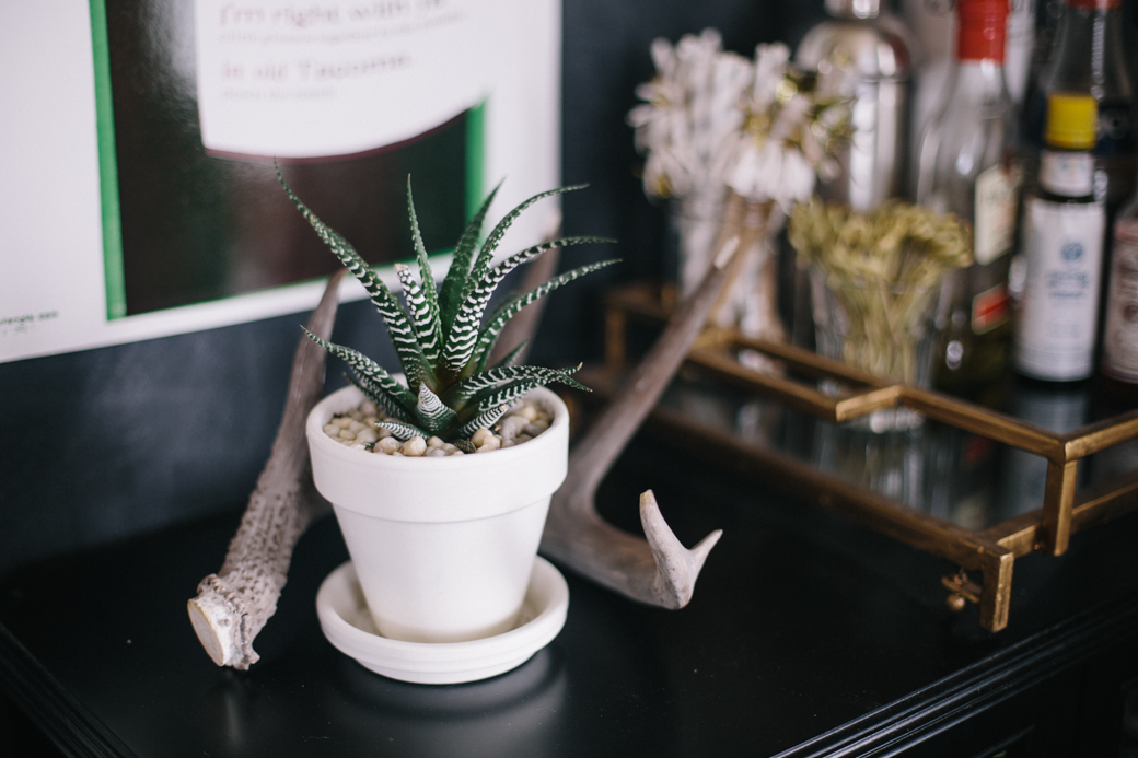
I'm currently in the process of building a rolling island for our kitchen and it's going where this black cabinet used to be. I figured moving the bar to the living room made plenty of sense and I love it against the black wall (though it was against a chalkboard wall in the kitchen too).
I tried to link to most everything, especially new elements, below, but I probably missed some stuff, so let me know if I didn't mention something and you want to know where it's from. A lot of stuff is old or thrifted or handmade.
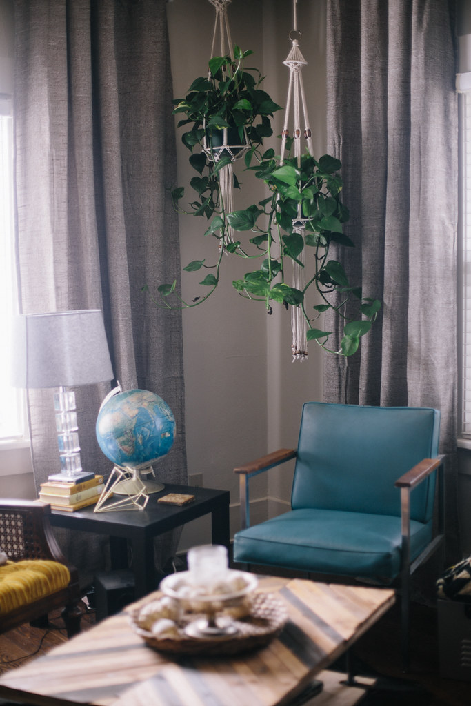
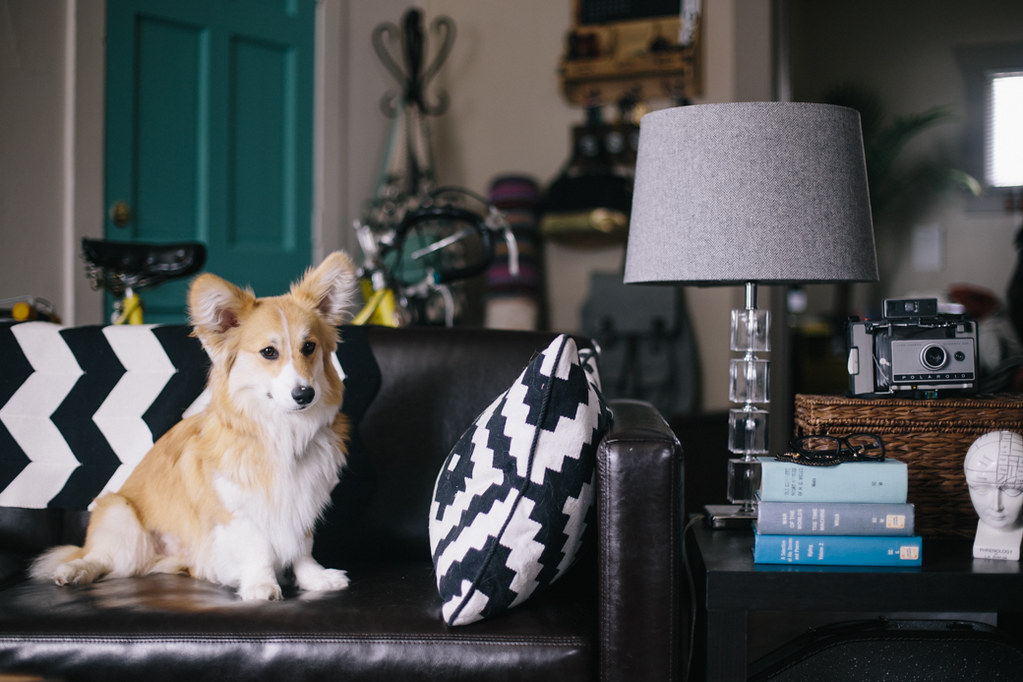
couch + pillows + side tables/ikea :: lamps + bar cabinet/target ::
+
-wall hangings/courtesy of
:: coffee table/
:: macrame plant hangers + chairs + globes + booze caddy/thrifted


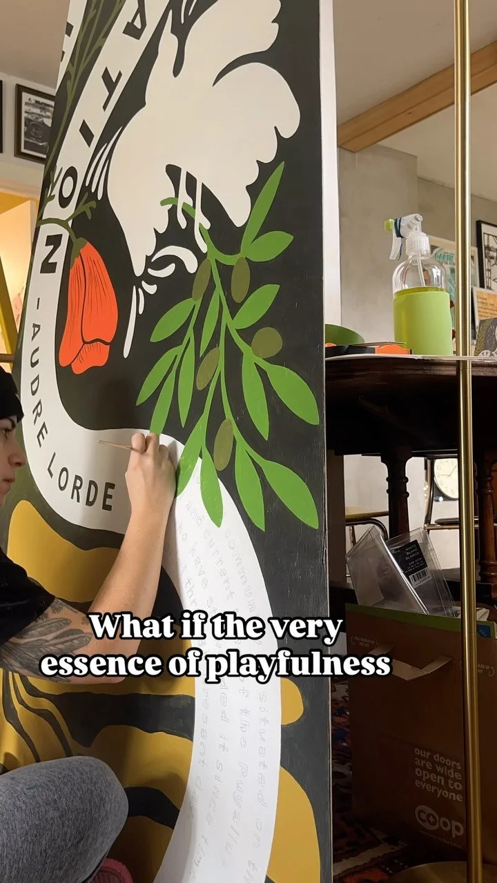

![This print feels even more relevant today. We all joke about the dumpster fire of [insert year here], but the important message of this image to me is that *we persist* through the horrors. We stand, we fight— maybe for ourselves, maybe for oth](https://images.squarespace-cdn.com/content/v1/574dddd6d51cd4bc35c1609a/1730935170369-03GPKQ5NF73VAE65RHO6/image-asset.jpeg)

