
Over the years I think I've gotten about as many comments about my print mixing as I have about my hair, so I'm not sure why it's taken so long to come up with the idea to share some of my print mixing tips. This certainly isn't a comprehensive list of ways to mix print effectively, but hopefully it'll those of you intimidated to mix prints to just go out and do it!
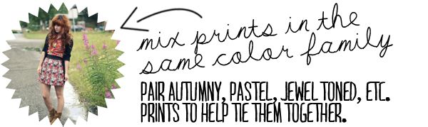
Keeping the prints in the same family of color keeps them from competing against one another. While the fabrics will have different prints on them, the color family gives them a continuity that draws the prints together.
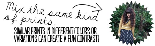
Put a floral on a floral, stripes on stripes or dots on dots. The difference between prints that are similar, but aren't the same, will create interest and can be pretty fun! If you're afraid of this being too wacky, try applying some other print-mixing tips like keeping the two similar prints in the same color story.
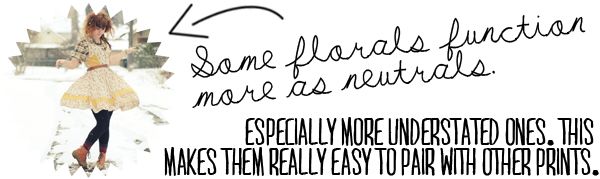
I have a few floral pieces in my wardrobe that seem to mix well with a ton of other prints (you'll note that the dress I used in this example shows up in this post a ton of times...). They usually aren't super bold florals, and tend to be more understated, but the print gives them enough texture to be more interesting as a pairing option than just a plain colored item. I have a feeling I'll end up mixing prints with this dress a lot too!
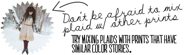
I think plaid tends to freak people out a lot, especially when it comes to mixing plaid with other prints or (gasp!) other plaids! Plaids are pretty easy to mix with understated prints, but you can also mix plaids with eachother, with florals, with stripes, with stripes and more stripes, and with some crazy other prints. I'm kind of just a fan of plaid, so it tends to work it's way into being mixed with everything in my closet. It's a pretty bold textile, though, which makes it intimidating to mix, but give it a go!
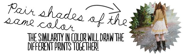
A pretty easy way to mix prints is to keep them in the same color. Marigold prints with marigold prints, navy prints with navy prints, etc. The color immediately connects the prints and creates continuity. This outfit does this with mint green, and also incorporates the next tip...
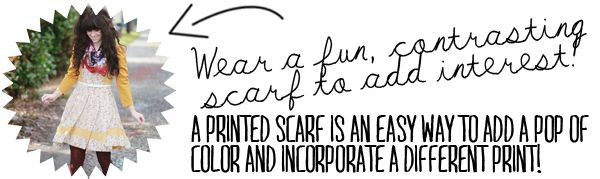
Sometimes something simple like a scarf can create some drama in an outfit. Plus, since most scarves have a print, it's an easy and inexpensive way to experiment with mixing prints. You can go for something bold like the scarf in the example, or pair a scarf of the same color as your outfit, or something understated.
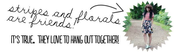
I think stripes and florals just like hanging out. It might be some sort of conspiracy between the two, but they always seem to go well together. I don't know if it's the juxtaposition of the straight lines of the stripes against the organic lines of the florals, but I just love how they look against one another!
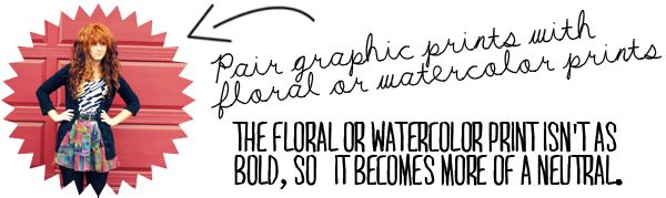
When you pair a really bold graphic print with one that is more understated, like a light floral or watercolor type print, the print that is more intense will draw the attention, leaving the less dominant print to act as more of a neutral background. Plus, paring a graphic print with a dissimilar print like a floral creates an interesting contrast!

Let be real, it's silly to be scared of mixing prints. They're just patterns on fabric, they can't hurt you! And so what if you're wearing a crazy outfit? It's fun! Sometimes it's just one of those days where looking like a fabric store threw up on you is just the ticket. Have fun!


