Okay, clearly my feelings regarding the Anchorage Style Guide are not hidden. I wrote an article for it because I'm going to grad school for Fashion Journalism and frankly, the more I can get my work out there, the better. But I must say, I'm kind of embarrassed to even be involved in this "publication" (in parenthesis because I think other publications might be ashamed to even be mentioned in the same category).
I'm a huge believer in excellence. What I mean by that is that I think that when you do something, anything, you should try to do it to the best of your abilities. You should take training to excel and hone your skills, and you should always be looking to make yourself better. I have been a barista for about a year and a half and I can't tell you how much it drives me insane to see people making shitty espresso. Not because I drink coffee religiously or even because I care that much about my own coffee, but because I think when you don't care about your craft, it says something about you. I don't plan on being a barista for the rest of my life, but I don't want to be ignorant about anything I do. I learned how to make excellent coffee and every time I pull a shot or steam milk, I'm training to be better.
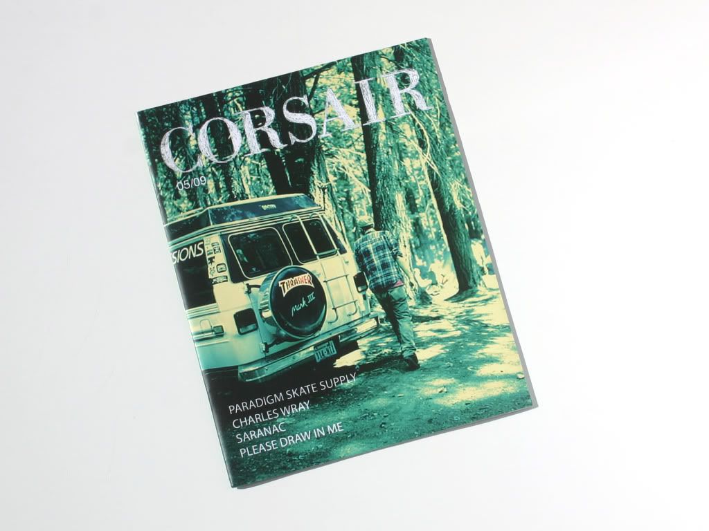
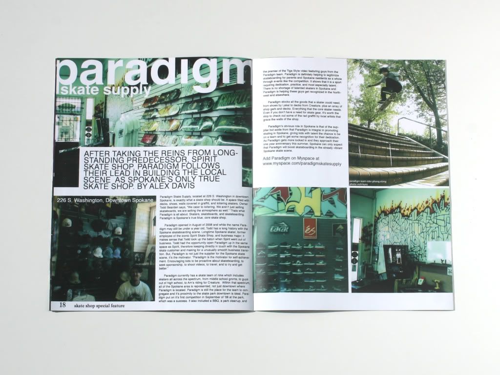
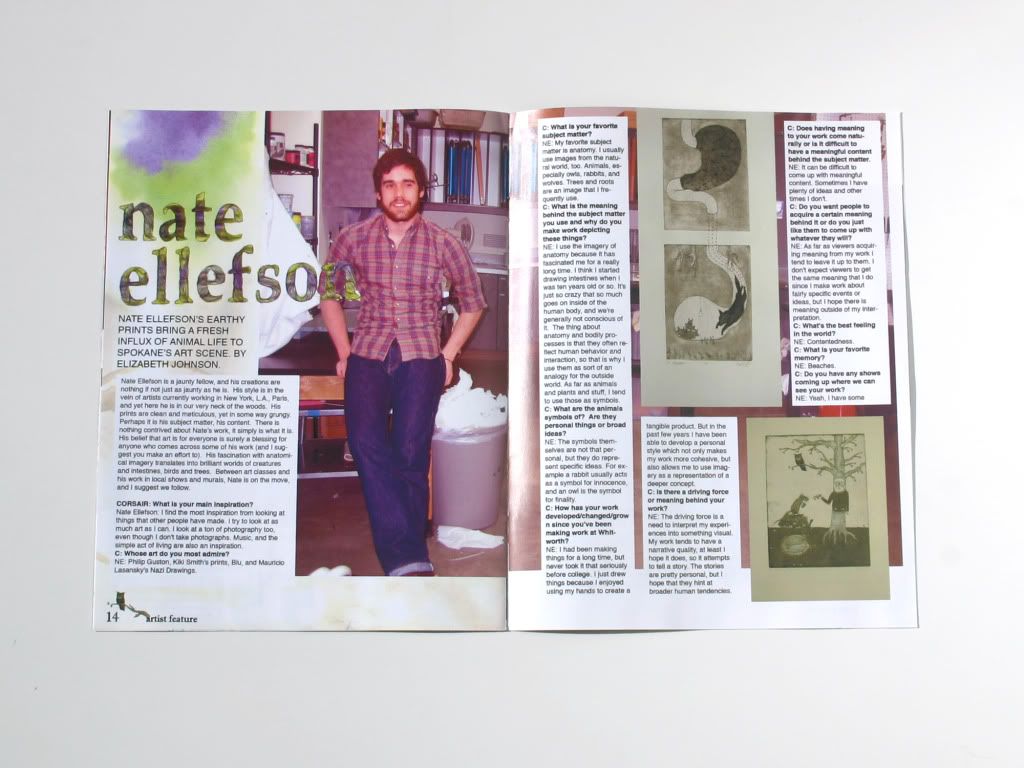
That is all to illustrate my philosophy on pretty much all of life and to give you a basis for my critique. Now, on to the Anchorage Style Guide. On a continuum of magazine quality, from your ugliest, worst designed, most terribly written publication to, say, a Vogue or NYLON type magazine... ASG falls millimeters from the "ugliest, worst designed, most terribly written" end. I know, I know, I'm being pretty harsh -- I have high standards, people. And I've done this before, so I know this can be done better. (I no longer have a scanner so you'll have to deal with my photobooth photos and facial responses...)
The design is atrocious. I don't even know where to start, or if I even want to. Backgrounds= all pixelated. Which I find to be quite a feat for a half size magazine. Full spreads are only 11 inches! I don't know what resolution these people are using , but it's decidedly unsatisfactory. Lets keep it concise: Fonts=horrifying. Layouts=repulsive. Photography=mediocre at best. It's a shame because I'm sure there are talented people in Anchorage, but this magazine is not representative of any of them.
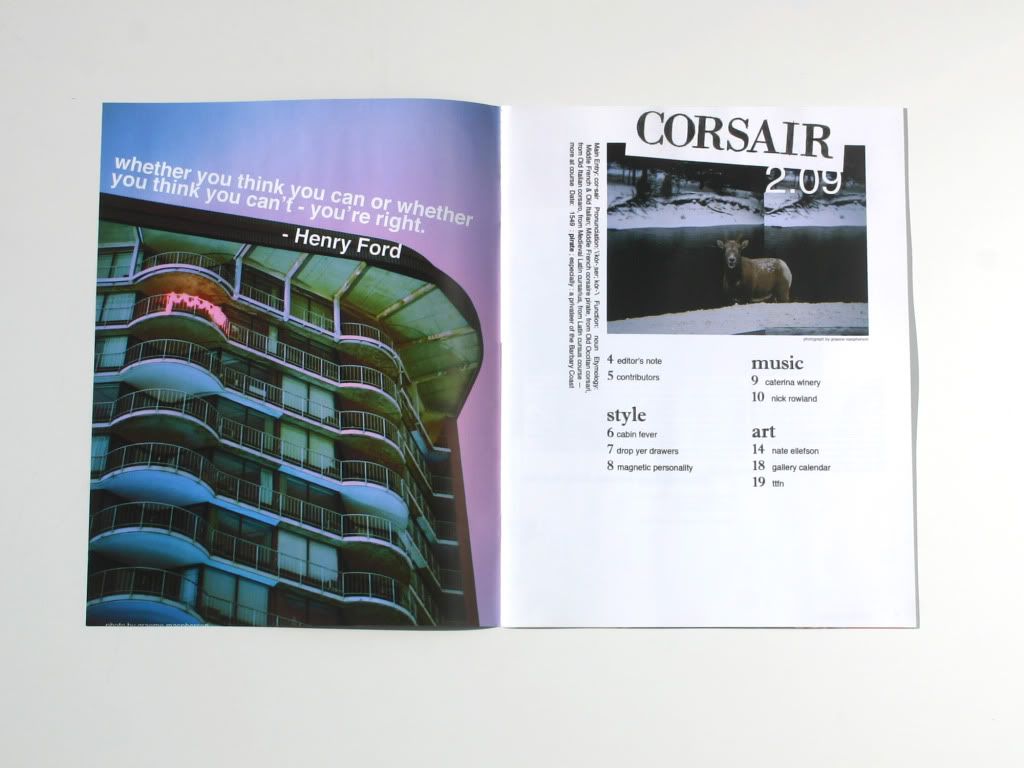
Secondary issues:
The fashion commentary in and of itself is just not great. Winter must-have accessories are over-the-knee boots, purple stuff, and cool headphones. I'm on board with the boots, but purple? Headphones? There weren't two other things that were more "must-have" than purple accessories and cool headphones? I'm baffled.
Photography. Granted, a good layout can make mediocre photography look better, but pair mediocre photography with an awful layout, and the result is terrible images. I'm not even a professional photographer and I know that I could have produced better images. And since we live in Alaska, why not take advantage of the incredible scenery in your images? Only one image in the whole magazine is outside, and it's on a lawn.
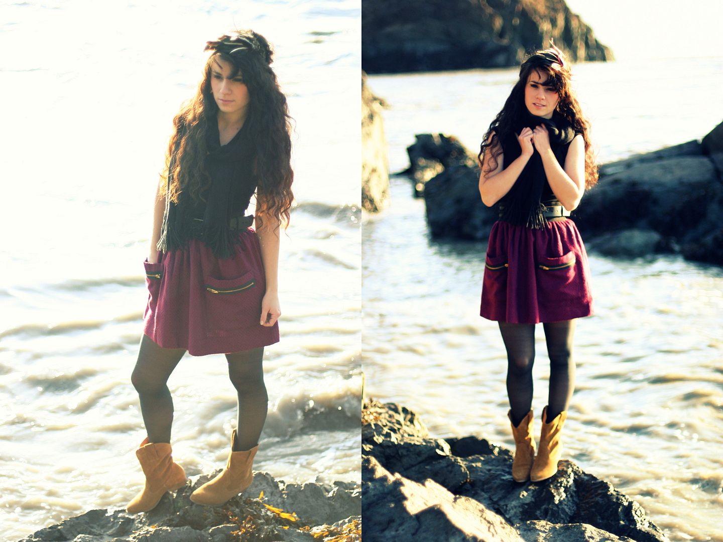
I love these images we took out at Beluga Point and in my own backyard. Why are there none of these kinds of images? Why, I say, Why???

I will say one positive thing about ASG. They picked a damn good make-up artist. Tess Weaver did my make-up for my photoshoot with Josh Newton and she's just a doll.
Anchorage Style Guide, do not feel singled out (well, do, but understand why). I will shred to bits any publication which is sub-par. Especially ones which are sub-par while attempting to be anything but (for example, the Wheels n Deals is exempt from my wrath). Things not exempt include the fonts Papyrus and Curlz, all fashion/style/art/music publications, almost all websites, newspapers, etc.
Perhaps I'm so disappointed because this is my hometown. I wish great things for this little city in the north. It hurts me so when people bring it down by doing things like this ASG. It deserves better. I almost want to say, "screw grad school" and give this city a magazine it deserves.
Okay, I got that out of my system.
Etsy update anyone?
I have a couple of new bootstraps up, and I still have my fascinators up, which would make great Christmas presents for fashionable friends and loved ones! I think I'm going to shut down ye olde etsy shoppe, as I doubt I'll be able to keep it up at school...
| Etsy: Your place to buy & sell all things handmade elcamino70.etsy.com |


