Interior Design

OUR HOME // bathroom before + after

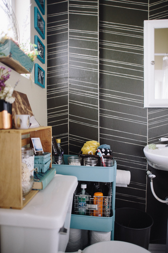
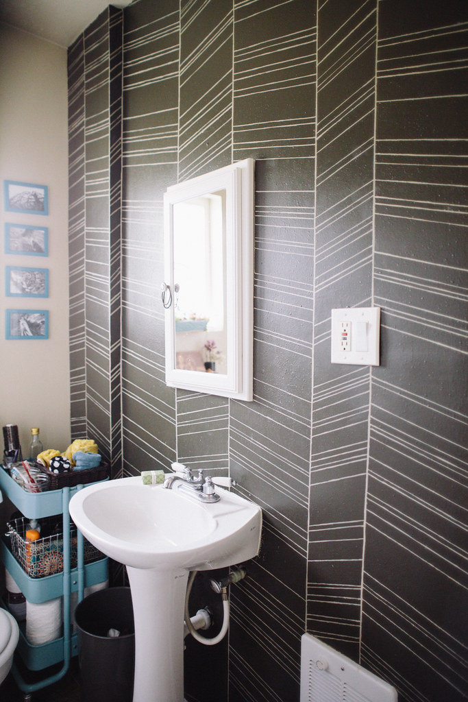
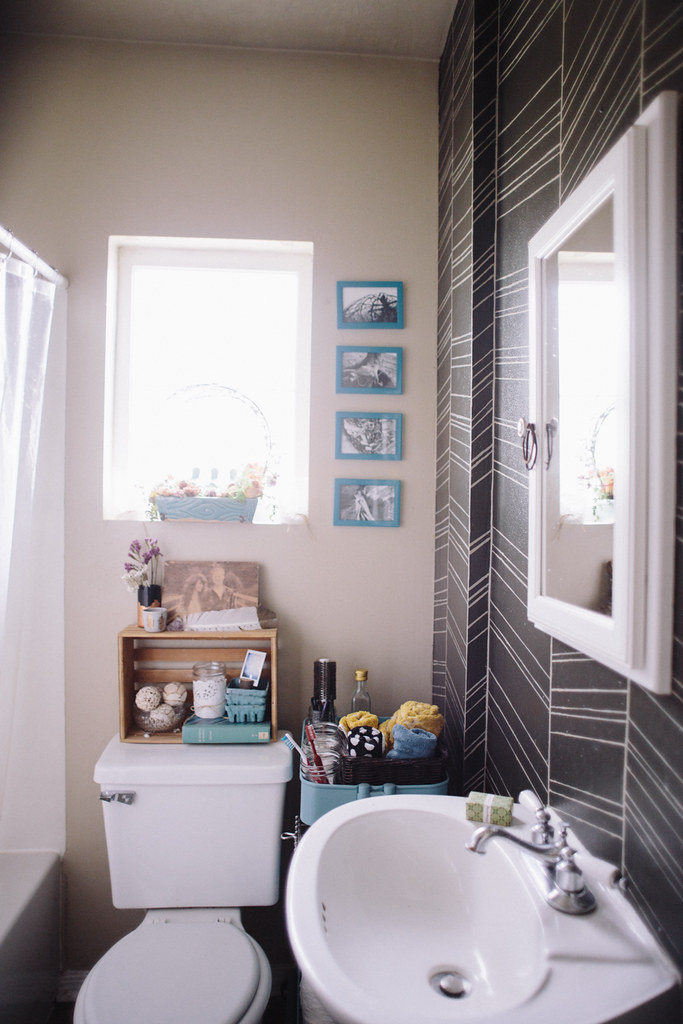
I'm pretty excited to share this with you guys because it's taken about ten months to finish this room, and the only reason it took that long was my crazy paint undertaking.  If I'd gone at it in one go, it probably would've only taken a week, but I started it right before my family got here to re-side the exterior.  Once we started that giant project the herringbone paint job was put on the backburner and I didn't return to it for months.  It was half done for most of this year.  I can't tell you how good it felt to put that last line up.

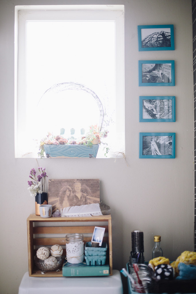
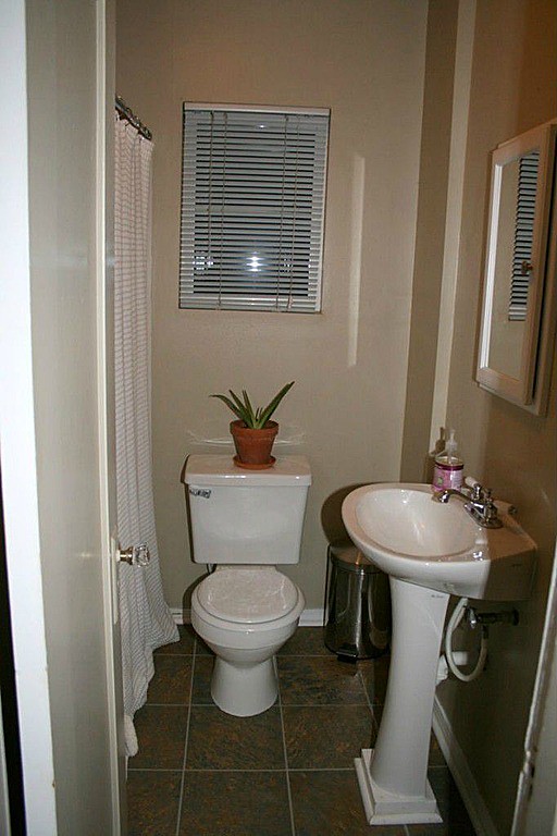
This before picture is a shot from the listing before we bought it.  The sad, lonely toilet plant was not my doing. I hated the blinds, mostly because they're impractical.  I never want them closed because the bathroom is so tiny that I need as much natural light as possible coming in.  But obviously I want them closed while showering so no peeping toms get a show.  I solved that problem by taking the blinds down and putting up an etched glass contact-paper-esque window covering that made it so I could have all the natural light and none of the peeping toms.
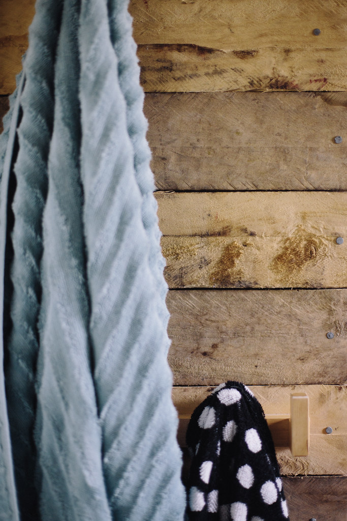
We didn't really have a place to hang towels, and there was an awkward tiny wall behind the door next to the shower which was begging for some hooks to be installed.  I didn't want to just throw up some boring old hooks so I covered the wall with reclaimed wood from pallets and then put up some natural wood hooks from Ikea.

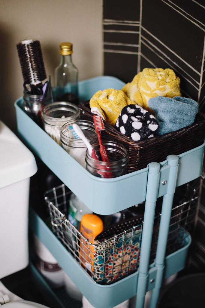
Also from Ikea is the little cart next to our toilet and sink.  The bathroom is rather tiny and it's the only one in the house so we really needed more storage for our daily items than the little medicine cabinet behind the mirror.  It fits

perfectly

between the toilet and wall and it holds everything from hair products, to spare toilet paper, to our toothbrushes, q-tips, and cotton balls.
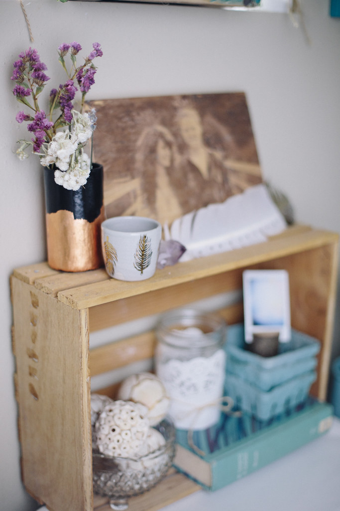
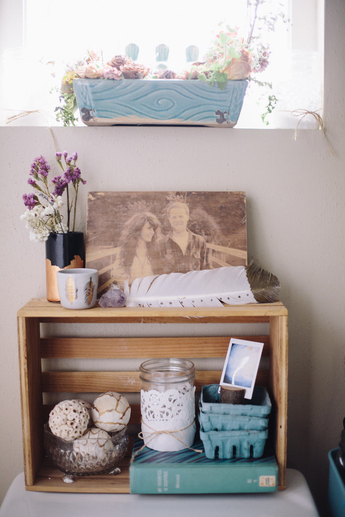
The little vessels on top the toilet are from

Moorea Seal

!  When did her product shoot at my home back in July, my wish list grew exponentially.  I basically coveted every little thing she brought to the house to shoot.  Of course, I'd go broke if I'd

actually

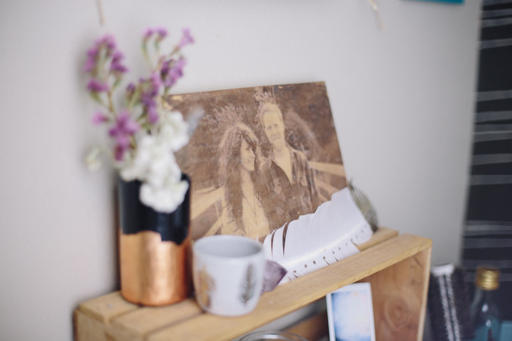
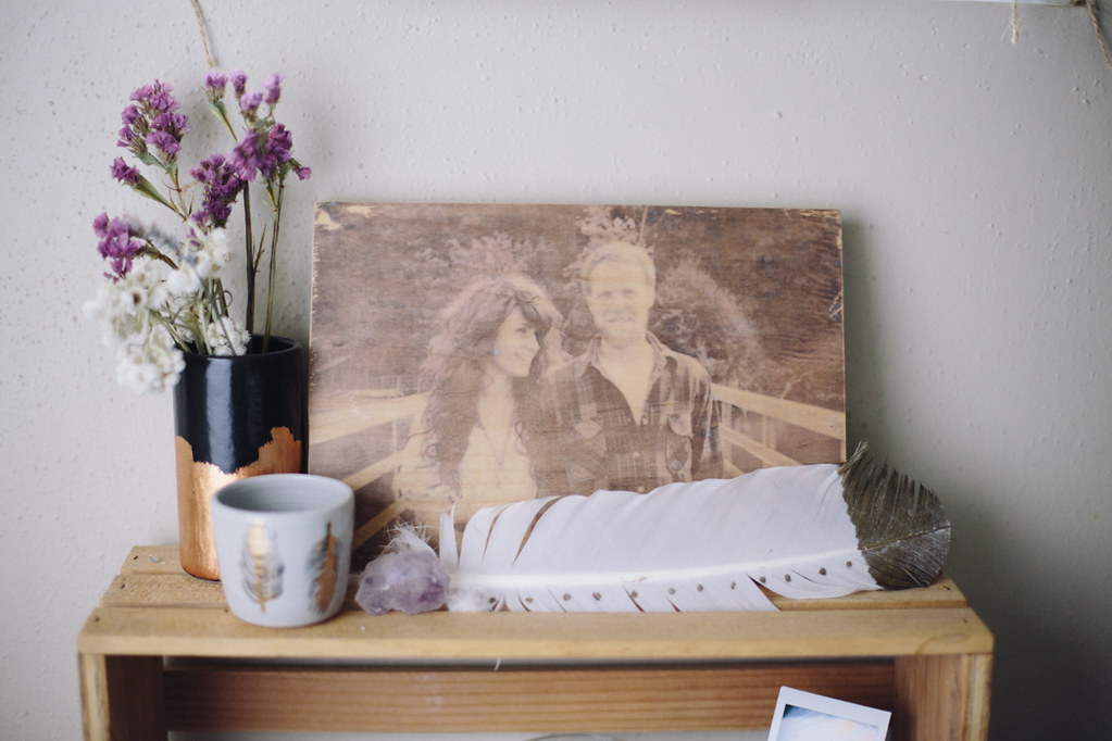
bought everything.  I settled for just a few items and this gold and black vase and feather vessel were two of the pieces I picked out.  

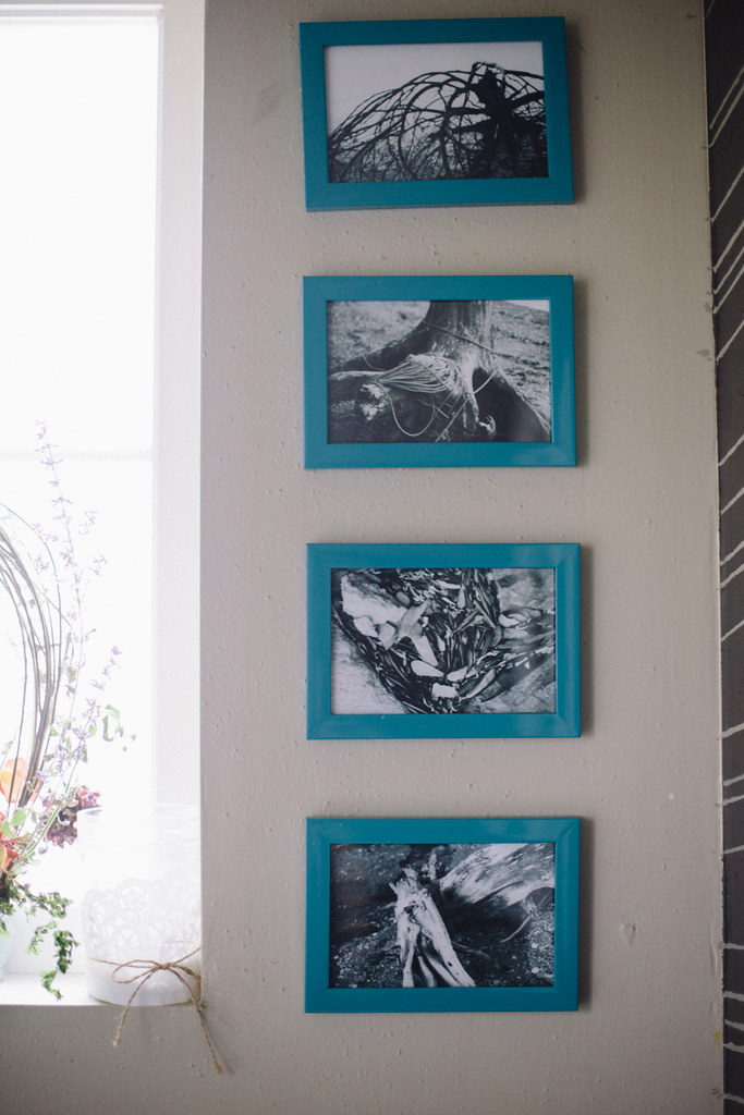
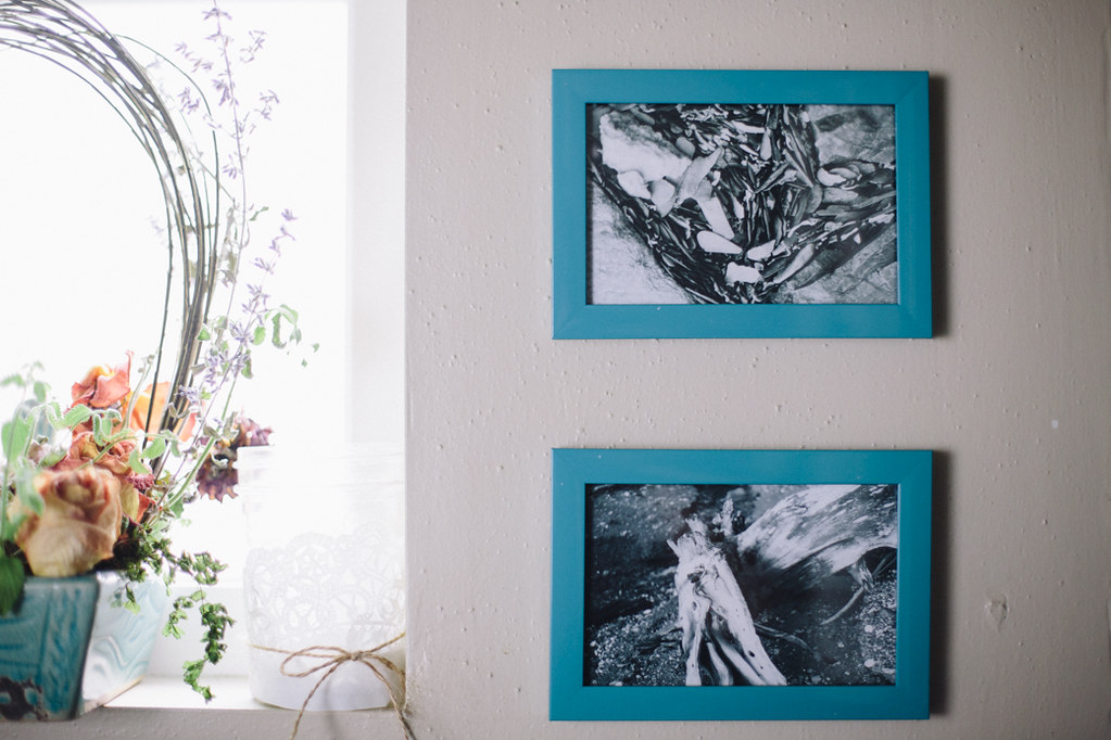
The photo on wood was a Christmas present from my little brother the year Dan & I got married.  He made it himself after googling tutorials and a ton of trial and error.  It's definitely one of my most treasured items.  The photos next to the window are photos I took at my grandparents' house in Juneau many years ago on my mom's old Olympus OM-1.  They've always been some of my favorite photographs, so I'm glad I finally got to display them!
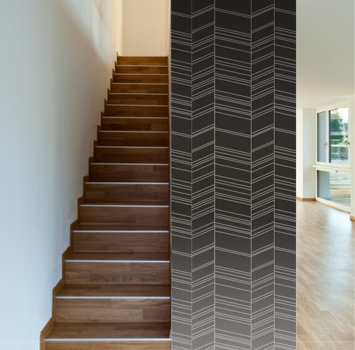
I know that you guys probably don't have any desire to spend hours and hours with a tiny paintbrush replicating my herringbone wall, and the good news is... you don't have to!  I partnered with WallsNeedLove.com to create a

vinyl removable wallpaper version

based on my hand painted design!
Bathroom Before + After

Sweet, right?  All of the herringbone, none of the cramped hand and hours crammed against the wall meticulously painting hundreds of tiny lines!  Although if you're looking for a way to watch all of the seasons of Grey's Anatomy, I highly suggest going the painting route.  Because it took

multiple

seasons of Grey's to finish that project.  So, it's your choice.  Binging on Grey's and cramped, painty hands or ... binging on Grey's while... drinking wine or something.

mini feather vessel

/
moorea seal

::

black + gold vessel

/
moorea seal

::

turquoise cart

/

ikea

towel hooks / ikea :: wall design / handpainted (but buy the wallpaper version

here

!)

turquoise

+ polka dot towels /

target

::

gold towels

/

anthropologie

OUR HOME // kitchen before + after

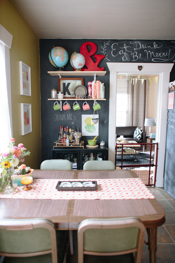
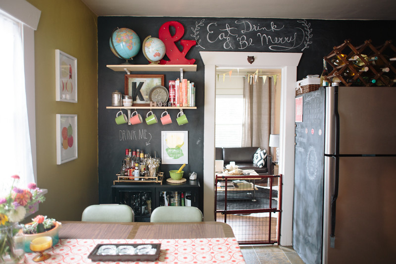
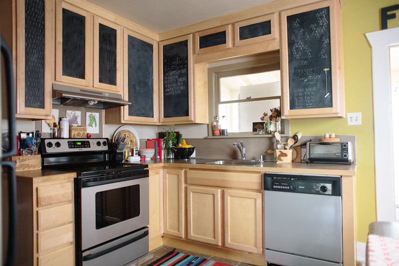
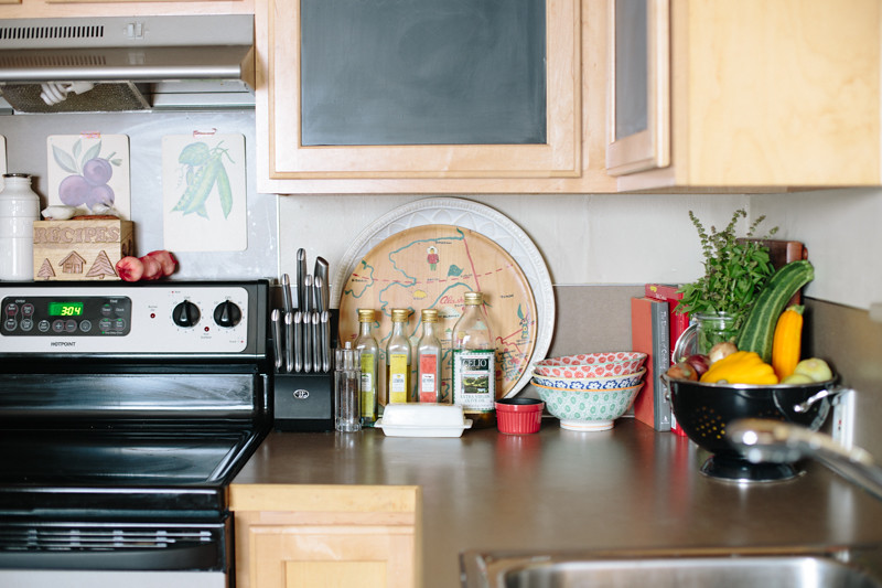
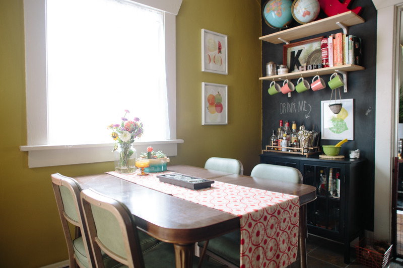
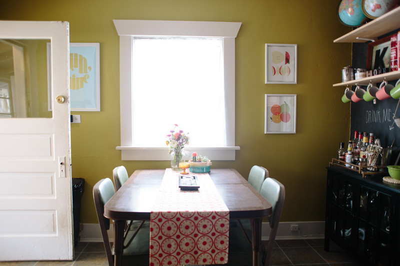
The kitchen was the room I worked on first when we moved in.  For me, the kitchen is where I spend most of my time, simply because it's the hub of activity in our home.  In the morning we hang out and make breakfast and I work on my computer, I work out in the kitchen, Dusty currently spends most of her time in the kitchen (while we housebreak on the linoleum), it's just the room we all gravitate towards.  I hated that our whole house was painted in shades of beige, and was really eager to get something more bold and bright in there.  Since chartreuse is kind of my current color obsession I couldn't resist painting it chartreuse.  And I've always wanted to have a chalkboard wall in my house, so I painted a whole wall in chalkboard too.  It's not a very accessible wall, since the fridge and the cabinet and shelves cover most of it, but the texture and boldness perfectly balance the chartreuse.  I painted the trim white to a make it pop.  I love the trim in old craftsman homes, and it kind of disappeared when it was beige.  Our friend thought we'd put up new trim after we painted it because it looked so different!

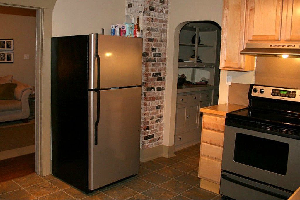
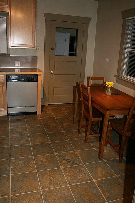
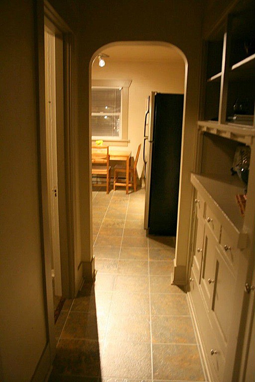
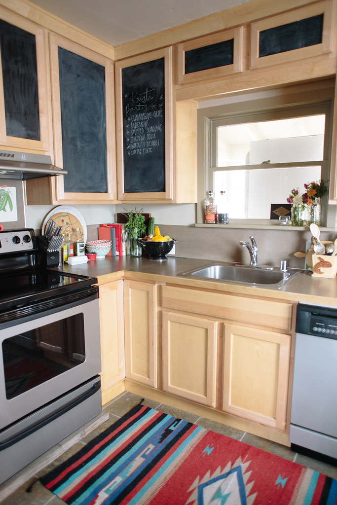
I'll start off with some before photos.  These are photos from before we bought it, just taken off the listing.  Super basic and boring, but nice.  The kitchen had clearly been re-done recently with new cabinetry and appliances, which was nice, but since they're new they don't need replacing with prettier, less boring ones.  I really wanted to paint the cabinets bright white, but they have a coating on them that would be hard to strip and paint.  If we end up staying here long enough we have big dreams for knocking down half the wall between the kitchen and living room to open things up, and if we do that I might replace the cabinets.

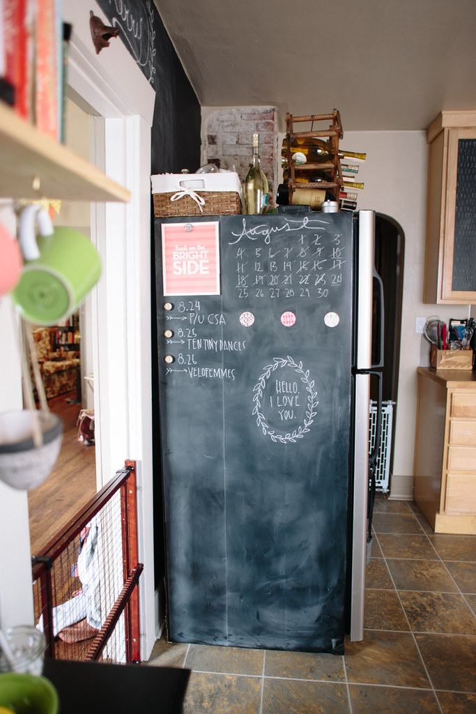
Because we didn't get a ton of space where we could actually use our chalkboard wall,  I decided to put chalkboard contact paper on the side of our fridge, and I'm so glad I did!  We use it all the time, and it's a great spot for our calendar since we spend most of our time in the kitchen.  Also: love notes.

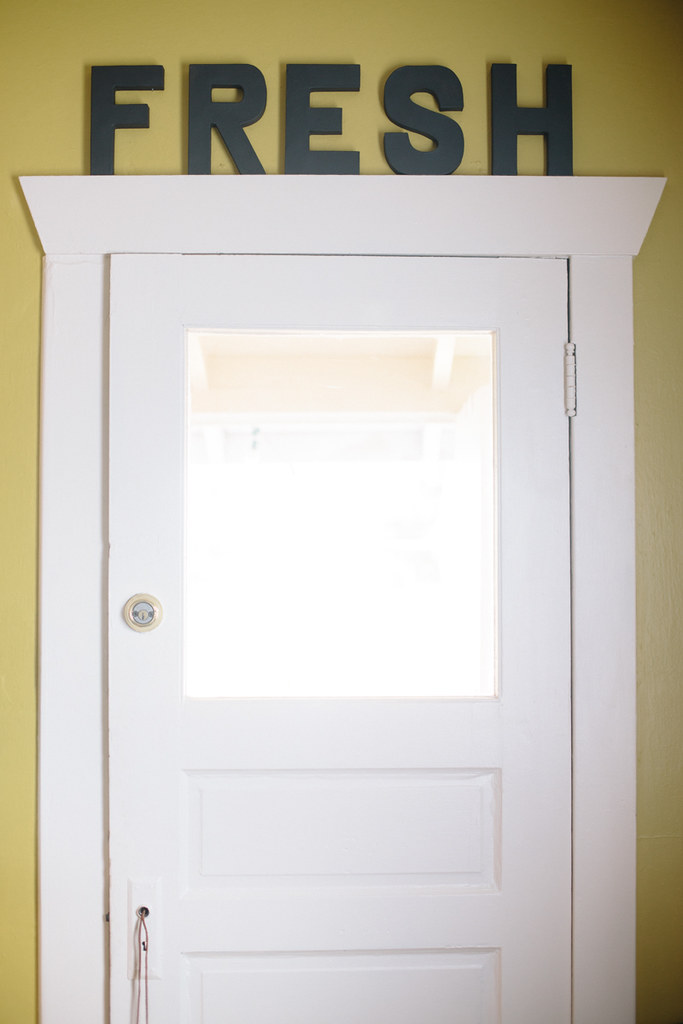
Above our back door there was a little space that was begging for something fun, so I went to Jo Ann's and got some of those cardboard 3D letters, painted them black with the leftover chalkboard paint and propped them up on the trim above the door.  It was a super quick and easy little project but it's one of my favorite details from the room.

I've become a little obsessed with collecting globes.  I have two in my kitchen, two in my living room and two in my studio.  Anytime I see a cool one at the thrift store I have to get it, especially because they're usually super cheap.  

The black cabinet beneath our shelves was originally going to double as a coffee/liquor cart, but the liquor area took up too much space, so we moved the coffee accoutrements to inside the cabinet instead of on top.  We just do pour-over coffee so it doesn't involve anything more that filters, beans, and a grinder.  The prints in this corner of the room are another favorite detail.  They're made by an amazing local print studio, Slide Sideways, and I got them at a craft fair where they had a booth earlier this year.

A little over a month ago, I was at the Fremont Market with

Julie

when she was in town visiting and I found some vintage food prints, and I love how they sort of match the Slide Sideways prints.  I hung the vintage prints above my stove and they fit perfectly there!

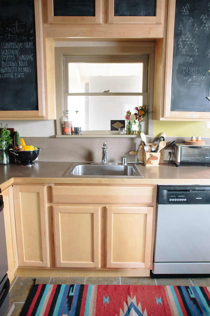
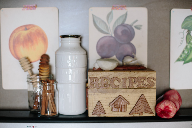
Some of my favorite personal details in my kitchen are the Alaskan infusions.  My grampa made all the little boxes on the counter.  One holds my spoons, some of which he carved by hand, one holds my other kitchen tools, he made the recipe box and my grandma filled it with recipes, and then the wooden plate with the map of Alaska next to my stove is from their house.  My grampa's carvings are some of my most precious items and I love having them out on the counter to enjoy.

Since the cabinets are new and difficult to prep for painting, I opted to just put chalkboard contact paper on them instead of permanently altering them with paint.  I love how it's a really quick and non-committal way to add a bold look to cabinets, plus it matches my other wall, which ties them together nicely.  I can remove the contact paper whenever I want in order to change things up, too!

milk bottle measuring cups

+

floral painted bowls

/

anthropologie

:: fruit prints /

slide sideways

rug/roadside shop in WA :: chalkboard contact paper/amazon 

ampersand

 + sun shine print/courtesy of

modcloth

 :: globes/thrifted

chartreuse paint/Behr "lemongrass"

(if you guys have questions about where anything else came from let me know and I can add it)

OUR HOME // exterior before + after

I was hoping to write this post much sooner, but hey, house projects always take longer than anticipated, right?  Honestly, our garage still doesn't have any siding on it after 6 months, and you can still see the scaffolding up on the left (still finishing some trim paint), so we're definitely not done, but it'll happen.  Someday.  But!  For all intents and purposes, we're basically done with the hard stuff.

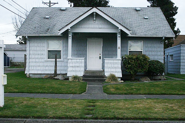
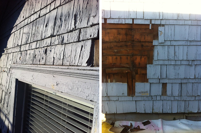
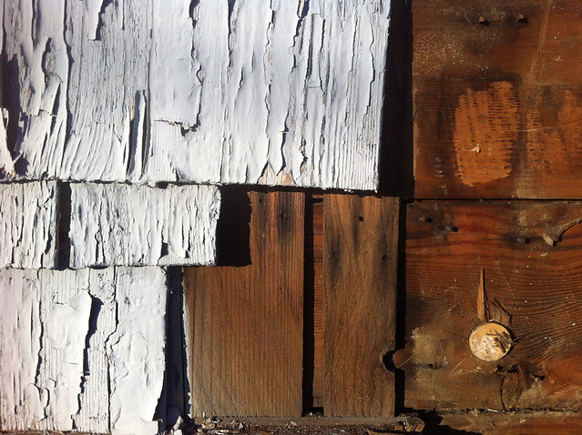
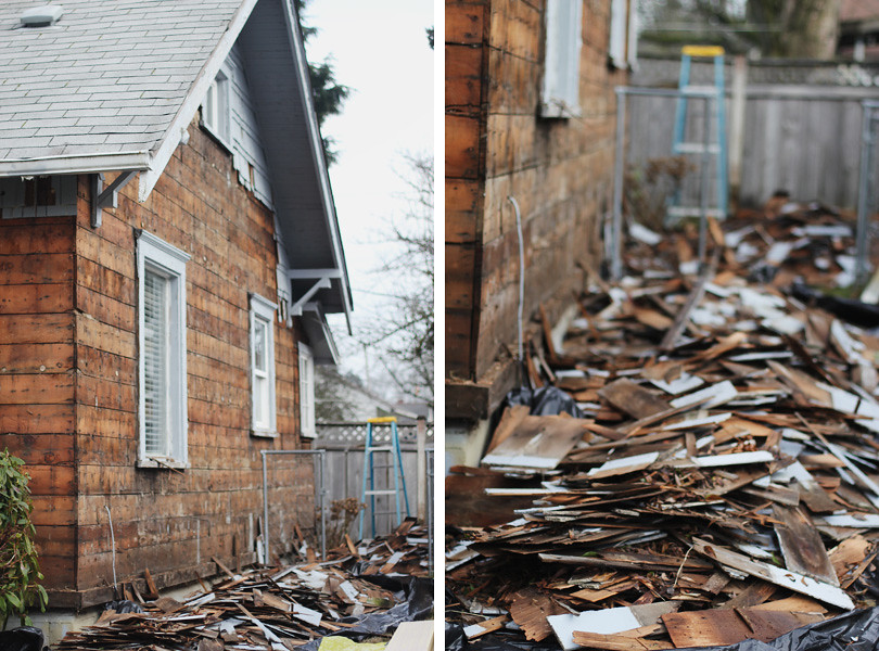
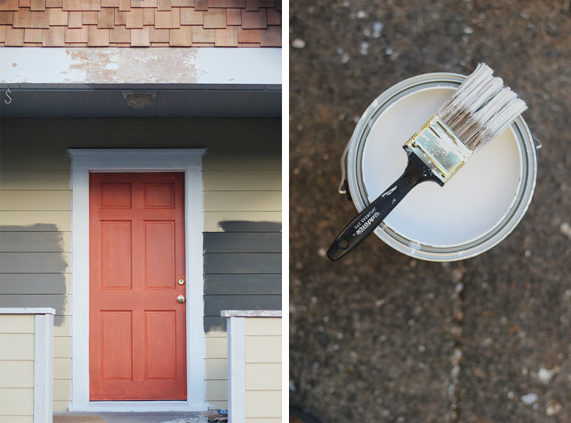
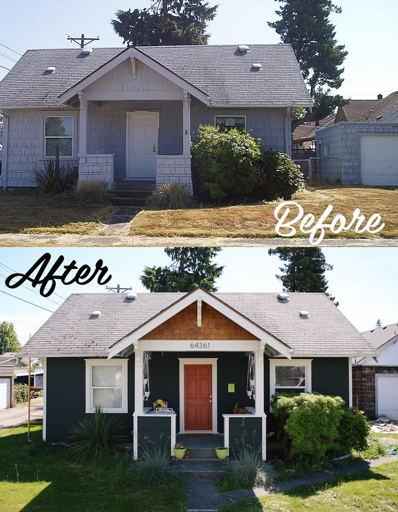
When we were looking around for a house, we were looking for a project, mostly because we wanted a cheap house.  Like, really cheap.  And in Tacoma's housing market, that's not too hard, especially if you're ready to put in a little elbow grease to get the most out of your cheap house.  We had looked at the house behind the one we ended up buying, but the interior was awful.  It needed to be completely re-done.  The exterior was fine, but the interior was pretty bad.  We decided to pass on that one and as we walked home, we saw the house we ended up buying.  It looked like a dump.  The exterior was in sorry shape.  We didn't even bother looking at it because we figured with an exterior like that, there was no way the interior was decent.  Well, we were wrong, and the interior had been completely remodeled.   Unfortunately someone had done a terrible job of keeping up the exterior shingle siding and  had done the worst paint job I've ever seen on a house. they barely even masked off the windows and doors and sprayed a thick coat of paint right over paint that was already peeling.

before

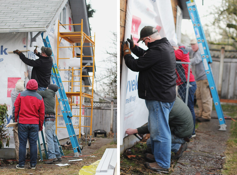
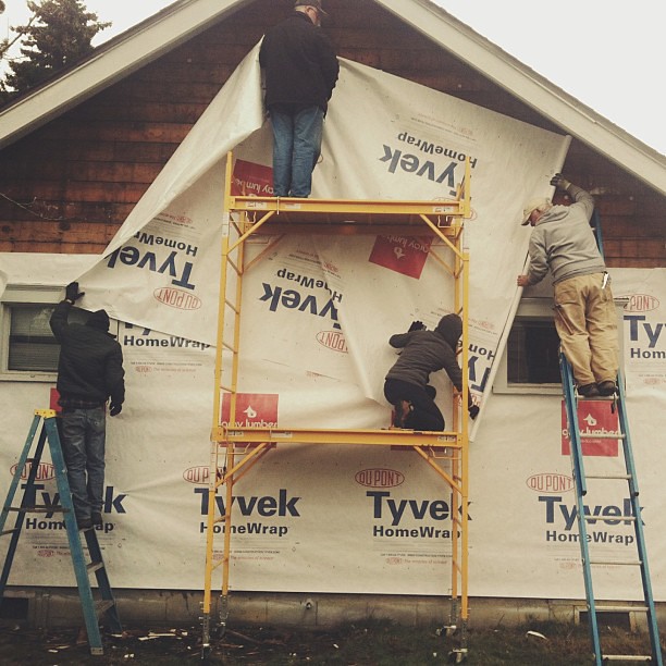
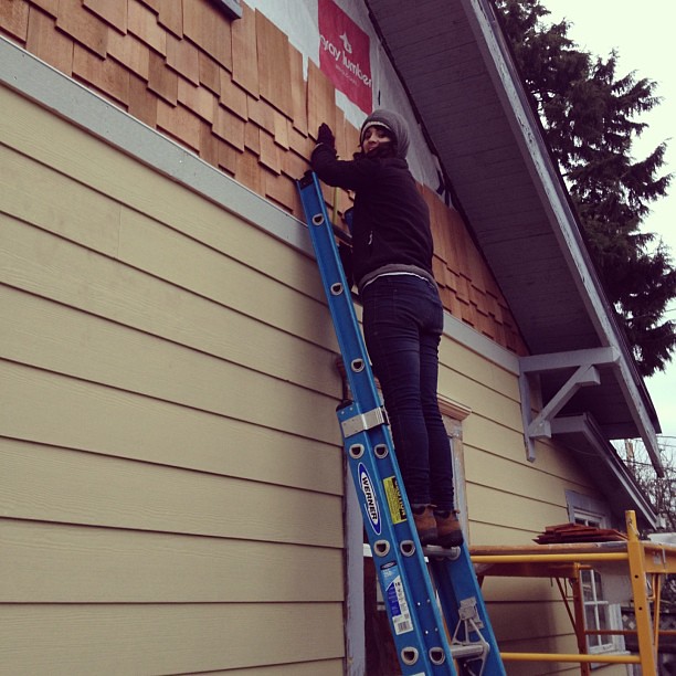
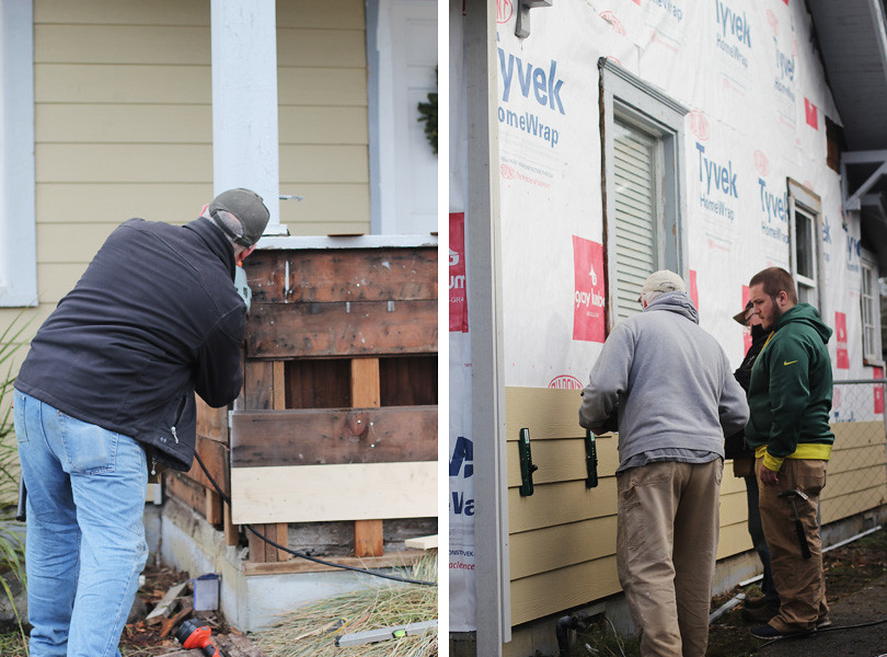
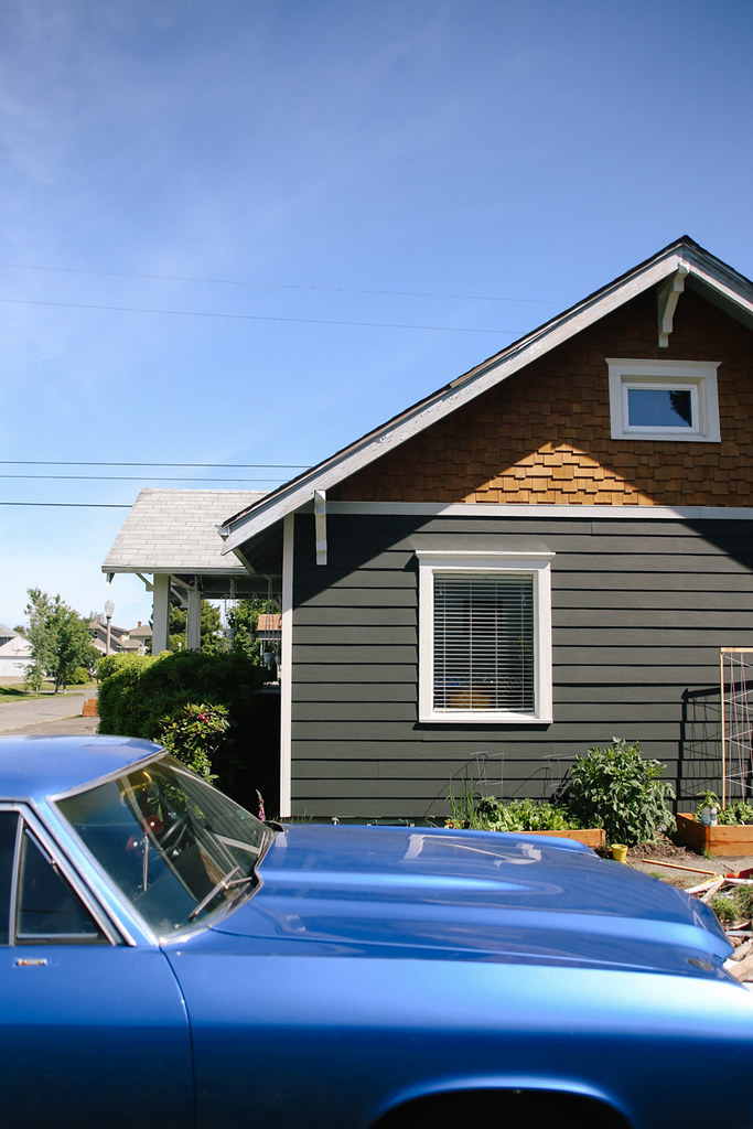
So in January, we ripped it all off.  After looking into some construction companies around town and getting some estimates, we ended up just doing it ourselves.  My Dad and Uncle came down from Alaska, along with my brother, who was heading back to college after being home for Christmas break, and then my cousin and other brother drove up from Portland to help as well.  My Dad and his brother worked with my Grampa for years doing construction on houses, so it was almost a reunion tour of my Grampa's old construction business, Auke Bay Builders!  It actually felt really cool to be able to work alongside my family like that.  Anyway, Dan & I did all the demo before they showed up, so when they arrived we got right to the siding... after hauling 600 lbs of old shingles to the dump.

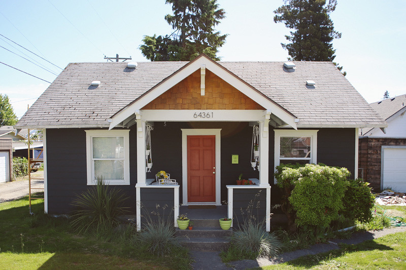
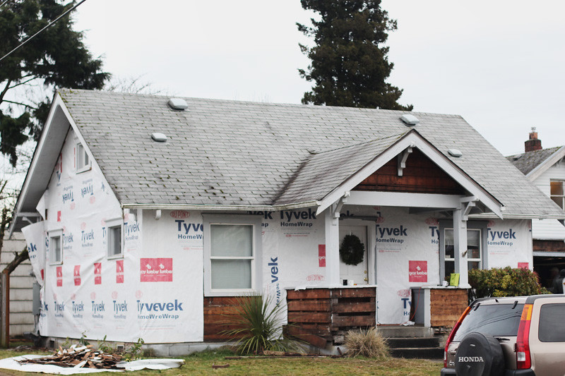
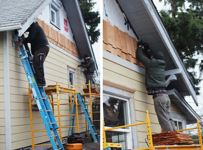
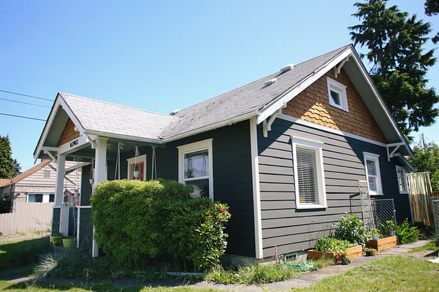
It took about two weeks total.  There were a couple snafu's to fix after taking off the old siding.  The front porch had some weird off-kilter-ness to it, so my Dad squared it up.  But many hands made light(ish) work, and I was so thankful to have the expertise of my Dad and Uncle available.  Replacing the old shingle siding with new shingle siding would've been too expensive, so we went with HardiePlank Lap siding, which is nice because it's not actually wood, it's fiber cement material.  This makes it fire-resistant, among other things, which is nice.  Plus, you only have to score with a knife and then snap in order to cut pieces, rather than sawing each one, which saved a ton of time.  I love the look of shingles, and it fits the style of our house, so we decided to do cedar shingles in the gables, which I think looks super sharp.

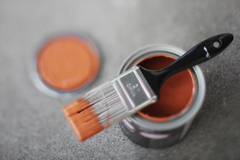
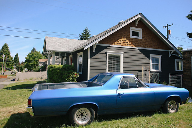
We decided to paint it a dark charcoal.  After seeing some darker colored houses around town, I thought it looked both modern and classic.  I figure there are so many houses painted "safe" colors like beige, I wanted to do something more unique and bold.  We tested a couple shades of charcoal and ended up with a near-black shade, but after painting the whole house, I'm in love with it.  I feel like we've got the snazziest house on the block!

Since the interior of our house isn't in need of immediate renovation, our next project (well, other than finishing the siding on the garage to match the house...) will probably be fencing in our side yard in front of the detached garage to give us more enclosed, private yard space.  I got

these patio tiles

at Ikea the other day from the As-Is section (35 tiles for only $1 each!!), so I'm excited to start installing them soon!  I'd like to make some more raised beds to expand our veggie garden, too.

I'm so proud of the work we've done in less than a year.  I always get sad seeing all the run down craftsman homes around town that obviously used to be so beautiful.  When we were looking for a house, I wanted to be able to revive one of those homes back to it's former glory, so it's been really fun actually getting to do that.  Our house had sat vacant for years before we moved in with no one taking care of it.  Thankfully the interior hadn't fallen into disrepair, so we've been able to focus all our energies on fixing up the exterior.

living room inspiration

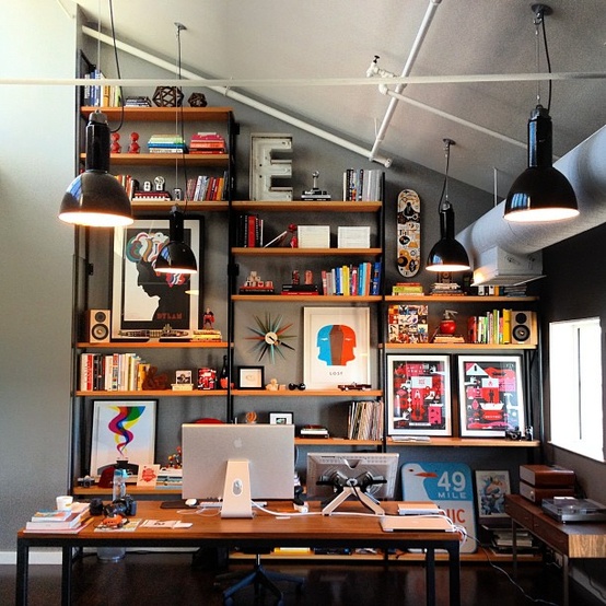
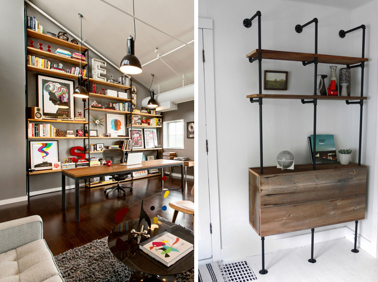
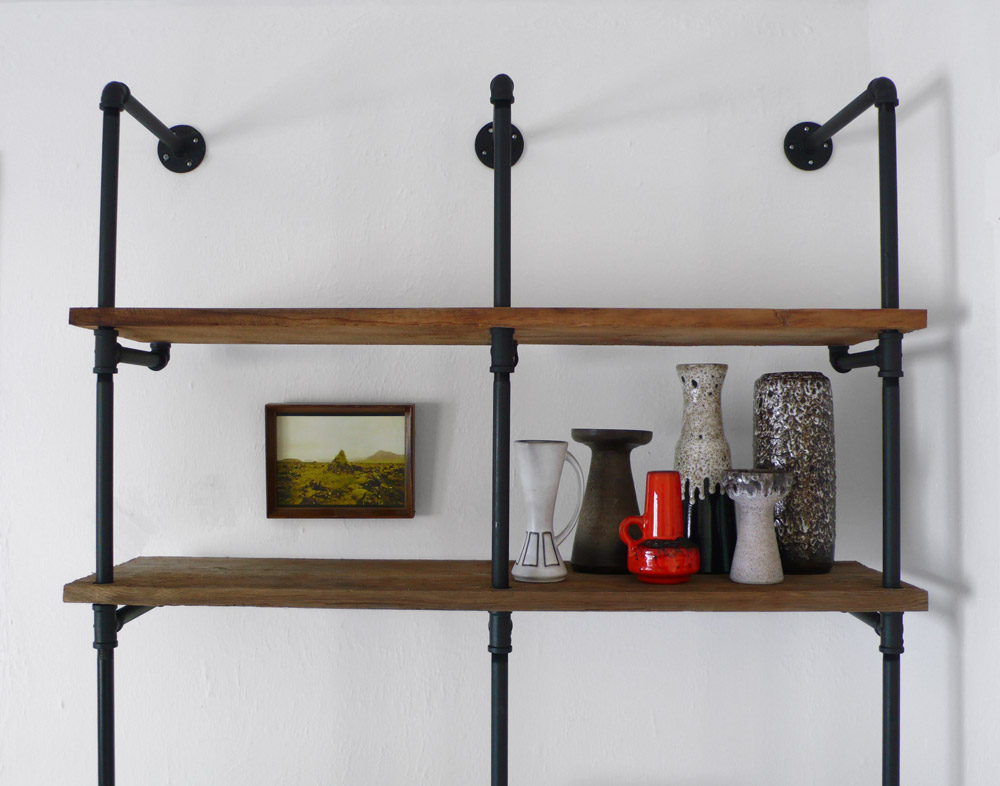
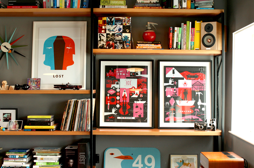
After we finish cleaning up the exterior of the house, the next big project in my sights is a huge DIY bookshelf in the living room.  We've got a sort of awkward wall that I haven't been able to figure out what to do with, but after seeing these images of Mattson Creative's studio space, I knew that I wanted to make a shelving unit out of pipes and wood shelves to hold art, books, and cool knick knacks.  Not only will it function as a great way to make that space beautiful and interesting, but it'll also be an awesome way to display prints!  I've got a few prints of my own, and some prints from other artists that I love, and I think a cool shelf like this would be the perfect way to show them off.  I love how the shelving at Mattson Creative has that perfect balance of art, books, and interesting, eclectic pieces to fill the space just right.  

ampersand light

// 

sunshine print

 // 

camera print

 // 

teepee print

the earth laughs in flowers print + winnebago print are my work

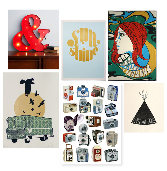
I've been slowly acquiring prints and artwork, and a few of the pieces I know I'll want to display are the ones above.  I just got the "I love my family" print for Christmas, and got the camera print a few years ago.  I just got the ampersand lamp and sunshine print the other day and I'm excited to see them in action.  I love big letters saved from old signage, and while the ampersand is new, not salvaged, I think it still has that vibe.  I definitely want to find some more big letters/numbers as I absolutely love the graphic, bold look that they have.  The Winne print is one I made a couple years ago during my Brave trip, and I made the "earth laughs in flowers" print back in college.

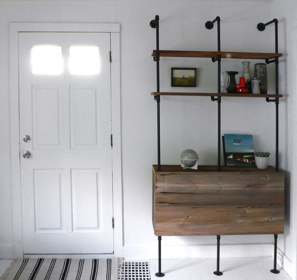
We're planning on doing a small test run version of this in our bedroom that looks more like the smaller version below.  I want to thrift a little dresser as the base and start the shelves on top of that, and then go for the bigger, living-room version after we've figured out all the kinks!  

inspiration images via

Mattson Creative

+

Hindsvik at Home