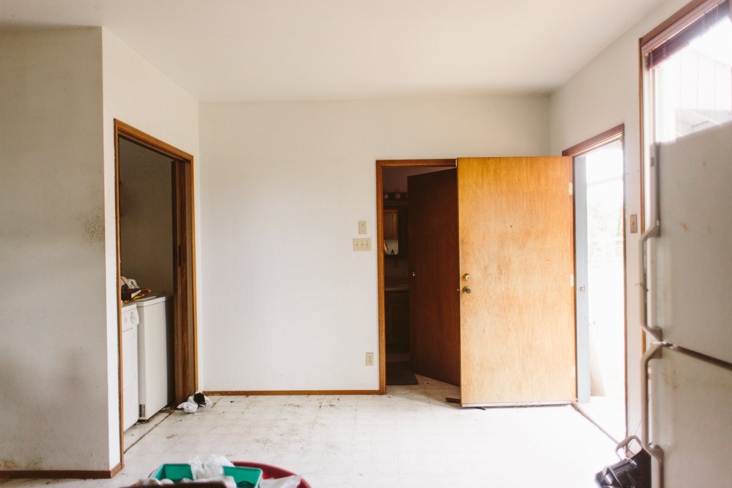
There’s a lot about the floorplan of this house that doesn’t make much sense, and the dead space in the kitchen/laundry closet area was definitely one of the more glaring instances. Since the back door is right there, it became an odd catch-all junk space that you had to wade through to do laundry. Despite the fact that it was open square footage, having that floor space in the kitchen never felt like it actually added anything because there wasn’t much you could do with the room other than fill it with random stuff.
Annoyed with the total lack of a laundry room in the house, I realized that it wouldn’t take much to build a couple of walls that encompassed that awkward dead space and turn it into an actual laundry room.
Material Sources
Wainscoting paint: Behr Paint— Broadway (eggshell)
Sheen mural paint- Behr Paint— Broadway (matte and high gloss)
Cabinets- unfinished cabinets from Home Depot
Cabinet paint- Behr Paint— Lemongrass (eggshell)
Cabinet hardware- Liberty black bar pulls from Home Depot
Ceiling Wallpaper- Zebra Marble gifted from Tempaper
Light fixture: Vinluz 8-light Sputnik chandelier from Amazon
Rug- Buckman flatweave rug from Rejuvenation
Counter- Walnut butcher block from Home Depot
French Door Paint - Behr Paint— Emergency Zone (eggshell)
Backsplash tile - Floor and Decor— Maravilla Basalt Black Stacked Mosaic
Floor Tile- Floor and Decor — Concrete Grey Ceramic Tile
Washer/Dryer- Kenmore (secondhand via Craigslist)
French Doors- second hand from Second Use Building Materials
I pulled out the doorway drywall and framing, then got to work framing out the new walls, adding and moving some electrical outlets and switches, added a ceiling light in the new room, and got the drywall up.
The design for the room, finish-wise, evolved over time, especially as I added the mural on the outside of the wall, which then impacted what I wanted the inside of the room to look like, considering you could see into the room through the glass french doors.
The Lemongrass cabinet color was a last minute decision and I’m really glad I went bold with the cabinets, especially since I went black with the rest of the walls. I love the pop of color and the added lightness in an area that could’ve ended up being a dark corner.
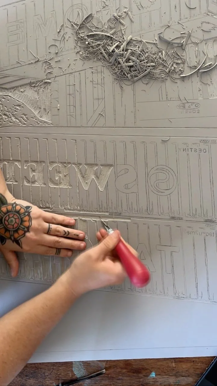
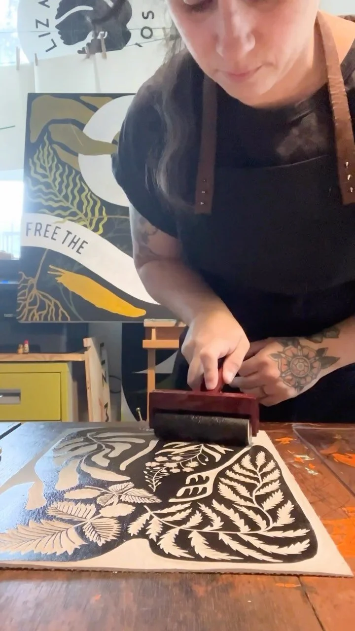
I loved the mix of curved and straight lines of the mural on the outside of the laundry room, and I wanted something that echoed that design without being a direct replica. I ended up doing a mural playing on sheen instead of colors, opting to use both matte and high gloss sheens of the same black I used for the the quarter-circle mural outside the room.
For the ceiling, I knew that I didn’t want a plain ceiling. I love utilizing that wall for a design element, especially in a smaller space. I saw this Zebra Marble removable wallpaper at Tempaper and knew it’d be the perfect design to finish off the room.
Since we have a brass sputnik chandelier in the kitchen, I wanted something that had a similar feel but wasn’t exactly the same. I love this one because it’s more modestly sized, basically flush mount so it doesn’t hang down at all, and it looks especially fancy against the backdrop of the wallpaper!
I think my favorite thing about the whole room is that it feels like it’s always been there. Sometimes I forget that it didn’t even exist when we first moved in. Projects that seamlessly integrate into a house always end up being my favorite because of that reason. It feels like you’re honoring the house itself, creating something that belonged there all along.
And at least now I can feel a little fancier when I’m doing laundry!


